A fun look at “scary” typography in the pop-culture occult over the last 125 years or so: Ouija boards, comic books, TV shows, and movies. Original article is here.
 SPOOKY, KOOKY TYPOGRAPHY
There’s serious occult, and then there’s pop-culture occult. Pop occult is both scary and approachable, fun spiced with danger and excitement. And from the Ouija board to comic books to TV show titles, pop occult has its own typographic tropes. If spirits had need of typefaces, would they use the mundane Helvetica or Times New Roman? No.
Pop occult type is instantly recognizable: elongated letterforms with pointed terminals (like claws or knives sharp enough to draw blood); wavy outlines (so scared they’re shaking, like the hand of the terrified illustrator who drew them); outlines that melt and drip (soon the candle will burn out and you’ll be left in the dark, where the monsters can get you).
The feeling of the uncanny conjures a sense of unease or dread, even in the context of something so innocuous as typefaces. And so pop occult typography offers the visual equivalent of nervous jokes to smooth things over: We’re speaking for the dead, but we won’t hurt you. This comforting veneer of humor (or what passed for humor at the time) allows us to experience the uncanny without scaring ourselves, well, to death.
THE OUIJA BOARD
One of the most commercially successful pop occult items has a varied typographic history. Introduced by the Kennard Novelty Company as the “talking board,” later christened the Ouija Board, it was patented in 1891. “Talking board” referred to its purpose as a way to speak with the dead. This belief in beyond-the-veil communication was a tenet of America’s 19th-century Spiritualist movement. Part of Spiritualism’s popularity was that it offered comfort to the bereaved during an era when many people died, often suddenly, before the age of 50.
Early boards and planchettes (the teardrop-shaped pointer, usually with a window, that moves about the board to spell out answers) were made of wood; contemporary versions are made of cardboard with a plastic planchette.
The configuration of the lettering on the board hasn’t changed since the Ouija Board was introduced: The alphabet is arranged in two arcs in the middle, the words yes and no in upper corners and good-bye centered at the bottom. However, type styles have ranged from simple to complex.


Early examples of the talking board type styles.
Lettering on the earliest boards was applied directly on the wood with brass stencils. Others had split serif lettering based on the ornamental Tuscan display styles dating to the 19th-century advertising boom.
In a common act of cultural distortion and appropriation, some versions of the board used letters meant to mimic the brushstrokes of Chinese calligraphy. Bones made up the letters on the Black Magic Talking Board, which included a racist illustration of a cannibal dancing between two cauldrons.


The “other-ness” of the occult was often portrayed in offensive racist stereotypes; for example, letters meant to mimic the brushstrokes of Asian calligraphy, and appropriative and distorted imagery.
SCARY COMICS
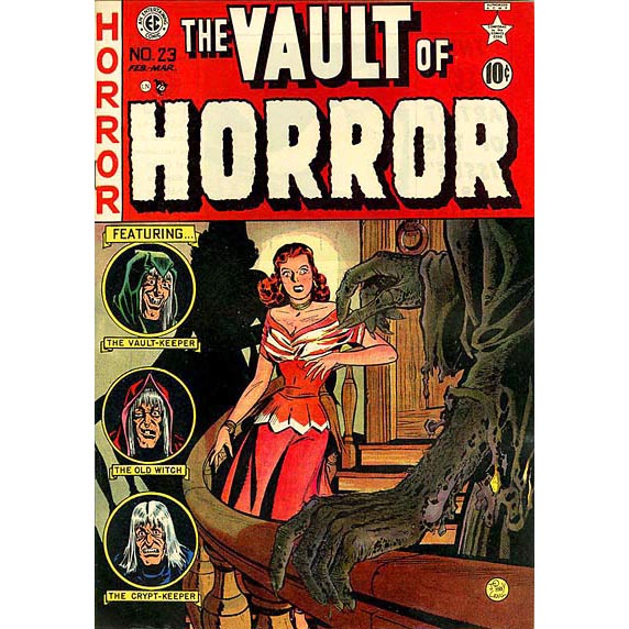
Entertaining Comics was an American comic book publisher churning out volumes of horror fiction and science fiction from the 1940s through the mid-1950s. EC’s “Tales from the Crypt,” “The Vault of Horror,” and “The Haunt of Fear” series featured the era’s best freelance illustrators, including Jack Davis, Frank Frazetta, and Basil Wolverton, along with adaptations of horror stories by the likes of Ray Bradbury.


These comics may have sent a chill up the spines of young mid-century readers, but today the type looks endearingly goofy.
The comics’ beautifully drawn covers featured prominent hand-lettered titles. The altered shapes of the letters hint at altered states of being—ghosts and the undead and all sorts of paranormal activities. They set the reader up to be good and scared, but also to be entertained. There’s something endearingly goofy about them.
The decades that followed brought horror comics “Eerie” (and its sister titles “Creepy” and “Vampirella”) to an eager readership. A ghoulish host character, Cousin Eerie, introduced each issue and served as a sort of spirit guide, a familiar figure to lead the reader through the unsettling tales within. The wavy, ghostly title lettering featured a sharply pointed inline surrounded by wobbly forms that appear to float and drift. Later titles became solid and square but hung on to chipped edges and shaky outlines.


Which type treatment gives you the creeps?
THE OTHER TALKING BOARD
Ka-Bala, a form of talking board manufactured and released by the Transogram Company, was another pastime said to relay information from the otherworld, although it came along in 1967, long after American Spiritualism had lost its mass following. The box featured lettering reminiscent of Legende, designed in the 1930s by Friedrich Hermann Ernst Schneidler for the Bauer Type Foundry, to spell out Ka-Bala. Although the heavy letterforms lack Legende’s light grace, they still impart a feeling of exotic other-ness. The board itself is a hodgepodge of design and type elements borrowed from the Ouija board, tarot cards, and the kabbalistic school of Jewish mysticism, with the 12 zodiac signs thrown in for good measure. (If a little occult is good, a lot is better.)

The game board is made of green glow-in-the-dark plastic and uses a black marble spinning around a circular track, rather than a planchette, to spell out answers. The track runs between a ring of Bookman capital letters and the twenty-two major arcana cards of occult tarot supplied with the game.
Ka-Bala’s most notable feature is the “Eye of Zohar” mounted in the board’s center: a giant plastic eyeball that wobbles and spins as it seems to keep tabs on the players. The reference to an all-seeing eye is inescapable, something that perceives the answers we can’t, and also has echoes of a fortuneteller’s crystal ball. By this point in the 20th century, unlike the Spiritualism of the previous century, no clear belief system or widespread movement guided the seeker of answers from beyond the grave, and the game’s typography reflects that.
POP OCCULT TV
The 1960s ushered in an era of pop occult TV shows inspired by scary comics. The Munsters and The Addams Family, which ran from 1964 to 1966, abandoned all pretense of scaring anyone or of communicating with the dead and took pop occult fully into the world of high camp. “More roast dragon, Grandpa?” asks Lily Munster solicitously at dinner, prodding the roast as flames shoot out of its mouth. The opening credits for The Munsters are spelled out in hand-lettering drawn to look like dripping candle wax. How many old monster movies feature a scene where the only source of light is a lone candle burned down to a stub that gutters, sputters, and finally blows out, leaving terrified protagonists in the dark and at the mercy of unseen forces?

The Addams Family series, based on the characters in Charles Addams’ New Yorker cartoons, also embraced the humorous view of the occult; they were harmless and fun, despite a home that contained Thing, a severed hand in a box; Cousin It; and a couple of freakish children. The hand-lettered titles look as though they are scratched into wood—perhaps by someone buried alive trying to get out of a coffin.

The era of pop occult traced an arc from the mid-19th century through the mid-20th century, from earnest roots in Spiritualism to high camp. By the time The Exorcist came out in 1973, people were once again genuinely frightened by the paranormal. The movie’s vaguely ecumenical, blood red title lettering, designed by Dan Perri and typeset in Weiss Titling, sets up audiences not for light fun but to be seriously scared.

It’s worth noting that Regan, the girl possessed by the devil in the film, kicks it off by using a Ouija board that puts her in contact with a malevolent spirit.


