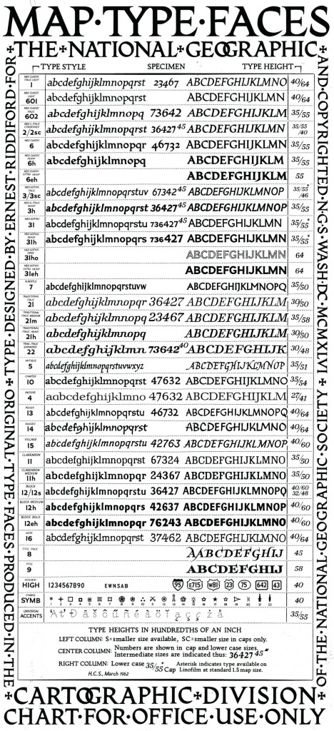
National Geographic’s Cartographic Typefaces

By Juan Valdes from nationalgeographic.com: Our maps have long been known for their distinctive typefaces. But few outside the Society know little of the history that lies behind them. Until the early 1930s, most of our maps were hand-lettered—a slow and tedious process requiring great patience and even greater skill. An alternate process—that of setting names […]
Type-o-philes Scour NYC for Urban Signage Project

By Jakob Schiller from Wired.com: [Ed. Entertainingly, this article was originally titled “Type-o-PATHS Scour NYC for Urban Signage Project.”] New York City is such a sensory overload, it’s easy to miss the details — like the graphical symphony of typography that’s playing under your visual field. Nyctype.com aims to bring that symphony to the surface […]