Future Font Friday 1
A handy how-to to make any word look like it’s from [cue theremin music] THE FUTURE! Via Dave Addey at Typeset in the Future. I’ll be watching his blog for more posts on sci-fi type. How To Make Your Text Look Futuristic We’ve already seen how Eurostile Bold Extended is spectacularly effective at establishing a movie’s timeframe. But if […]
Future Font Friday 2
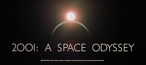
A gloriously obsessive examination of the typography in 2001: A Space Odyssey. This post stars Albertus, City Medium, Eurostile Bold and Bold Extended, Futura, Gill Sans, Microgramma, Spartan and Univers. Please also see my post Future Font Friday 1. Now, over to Mr. Addey: 2001: A Space Odyssey – Stanley Kubrick’s 1968 sci-fi masterpiece – seems an […]
Fabric Font Friday
I saw this framed fabric at Britex Fabrics in San Francisco. Britex is an amazing emporium of all things fabric, from single buttons to $200-a-yard sequinned loveliness. Yes, I know, I should get a bunch of the font fabric and upholster my house in it!
Fear Font Friday 1
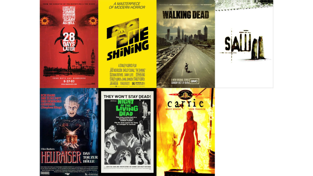
Puttin’ the frighteners on ya! Here are seven classic posters—lots more at fontmeme.com. Not to be confused with my post Fear Font Friday 2. 28 Days Later Font 28 Days Later font here refers to the font used in the poster title for the movie 28 Days Later, which is a horror zombie movie that […]
Finance Font Friday
Financial institutions have traditionally wanted to create a feeling of stability and trust, but more recently some consumer banks have opted for a feeling of vibrancy and energy. Either way, banks et al. therefore spend a great deal of time and money on their branding: cool, dark colors and serif fonts for the traditional logos, […]
Funny Font Friday 1
Here are five movies (of many) from fontmeme.com to make you giggle, laugh, or perhaps snort. See also my post Funny Font Friday 2, a silly alphabet book ca. 1850. Parks and Recreation Font Parks and Recreation is an American television sitcom starring Amy Poehler as Leslie Knope, a perky, mid-level bureaucrat in the parks […]
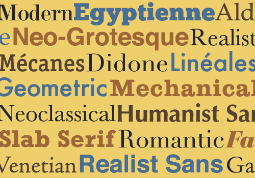
Extreme Typographic Nerdery, Part 2: Making Sense of Type Classification
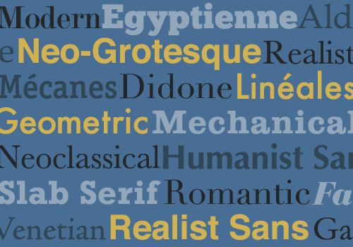
By Joseph Alessio from SmashingMagazine.com: In the first installment of this two-part series on type classification, we covered the basics of type classification — the various methods people have used, why they are helpful, and a brief survey of type history, classifying and identifying typefaces along the way. Unfortunately, we only got as far as […]
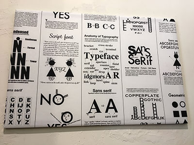
Extreme Typographic Nerdery, Part 1: Making Sense of Type Classification
By Joseph Alessio from SmashingMagazine.com: In my previous article on Smashing Magazine (“Understanding the Difference Between Typography and Lettering”), I wrote about how understanding type terminology can help us better appreciate the arts of typography and lettering. This article again deals with terminology, probably more specifically than most designers are used to, and the title […]