F’n Huge Font Friday (Helvetica in Space)
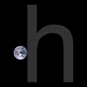
From kottke.org: Ben Terrett wrote a post about how many instances of the word “helvetica” set in unkerned 100 pt Helvetica it would take to go from the Earth to the Moon: The distance to the moon is 385,000,000,000 mm. The size of an unkerned piece of normal cut Helvetica at 100pt is 136.23 mm. […]
Food Font Friday 3
Fontmeme.com provides font sources and information for typography in many fields, from airlines (see my post, Flight Font Friday) to movies to sports. See also my previous posts Food Font Friday 1: a typographic map of American foods, and Food Font Friday 2: Typografische Schokolade (Typographic Chocolate). Food and Drinks Fonts Page 1 / Page […]
Fortean Font Friday
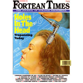
Fortean Times is a British monthly magazine devoted to the anomalous phenomena popularized by Charles Fort. Previously published by John Brown Publishing (from 1991 to 2001) and then I Feel Good Publishing (2001 to 2005), it is now published by Dennis Publishing Ltd. As of December 2014, its circulation was just under 14,300 copies per […]
Flesh-Free Font Friday
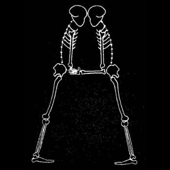
Skeletons! A classic Halloween visual. Here’s a skeleton font from a new-to-me source: home machine embroidery. How the embroidery works: you install software from a website or disk and it tells your home embroidery machine—your enhanced sewing machine or dedicated device—how to make the letterforms or designs. This alphabet was developed by trishsthreads.com and is […]
Foot Font Friday
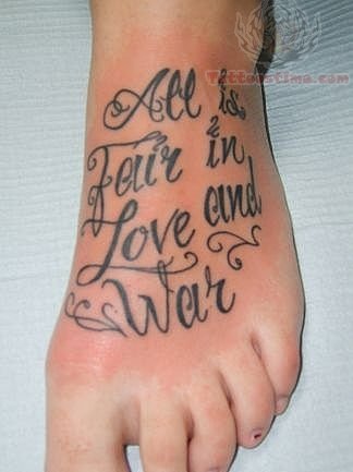
A lot of people seem to get type tattoos on their feet. Judging by images online, most of the tattoos are on women, and are inspirational (“Live Laugh Love,” or a serotonin molecule labeled “Stay Positive”). Some are foot-specific (“These feet are made for dancing”) and a few are names (“Amanda”). Many of them use the […]
‘F is for The Flash’ Font Friday
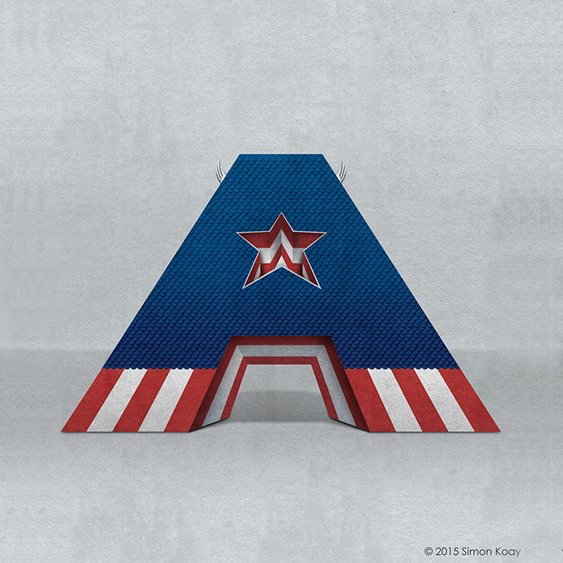
Alphabet created by Simon Koay, from SimonKoay.com: Superbet ‘Superbet’ is a typographic exploration of alphabet design by reimagining each letter of the alphabet as everyone’s favourite superheroes and supervillains. Each letter has been created with inspiration from characters who share that same initial in their name.These would be great for kids, or as CNet put it, “perfect for any bedroom wall or […]
Fleuron Font Friday
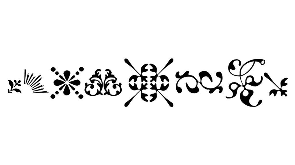
A fleuron, or flower, is a decorative typographic character. The category of fleuron includes some characters that are not floral in design. Also known as a printer’s flower or floret. Flowers are in a category of characters known as ornaments or type ornaments. Scroll down or jump to here for a short essay on fleurons. […]
“Hanging by a serif” by John D. Berry
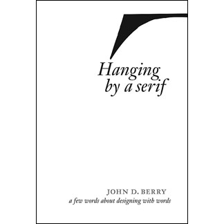
A big shoutout to my friend John D. Berry, whose book Hanging by a serif has just been released. Click on the pages for a closer look. Hanging by a serif A few words about designing with words Text & design by John D. Berry A small book of epigrams, insights on the […]
Extreme Typographic Nerdery, Part 1: Making Sense of Type Classification
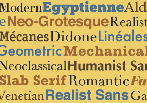
By Joseph Alessio from SmashingMagazine.com: In my previous article on Smashing Magazine (“Understanding the Difference Between Typography and Lettering”), I wrote about how understanding type terminology can help us better appreciate the arts of typography and lettering. This article again deals with terminology, probably more specifically than most designers are used to, and the title […]