 By Pasquale D’Silva from Medium.com
Designers love to sweat the details. Much time is spent pixel-fucking buttons, form styles, setting type, & getting those icons as sharp as a tack. A+, great job, don’t stop you guys.
…but there’s little consideration about how it all fits together outside of a static comp. You tap a button and the form just …appears? You swipe to delete an item and it just vanishes? That’s super weird and un-natural. Nearly nothing in the real world does anything as jarringly as just swapping states. It would feel like a glitch.
Oh, ok sweet. You made some notes — it just “slides in.”
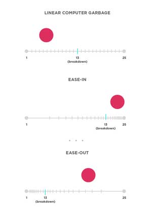
How? Quickly? Does it bounce back? Cushion in? Static design doesn’t provide context between states.
Folks keep throwing around the word “delight” when referring to animation and cute interactions. Cool and great for those guys. Guess what though? Animation can be used functionally too. It’s not just an embellished detail.
Animation leverages an overlooked dimension — time! An invisible fabric which stitches space together. You don’t have to be a math dork to understand this.


