Sigh. Apple’s garish new iOS 7 is deservedly getting terrible reviews all over designer-dom. Here’s one, with suggested redesigns from TristanEdwards.com:
When Apple recently showed how they had redesigned iOS, I was shocked like many other UI designers. Not because it was “flat” (we all expected it to lose some of its skeumorphic elements) but because it looked terrible and seemed so unpolished. I couldn’t believe this interface came from Apple, the company that had been praised for so many years for its legendary ease of use. After downloading the Developer’s Preview on my iPhone, I was even less enthusiastic, not only did it look bad, but it worked bad as well. The ease of use that defined iOS was gone.
Some would argue that it’s just a new style and takes some getting used to. I’ve tried for several days now to “get used to it”, I’ve used my phone more intensely than ever, but it just doesn’t work. The design is bad. Some things, like good symmetry and combining the right colors, never go out of style, it’s just good taste.
For that reason, I started creating a mock-up of my own version of iOS 7. This is how I believe Apple should have done it.
The home screen
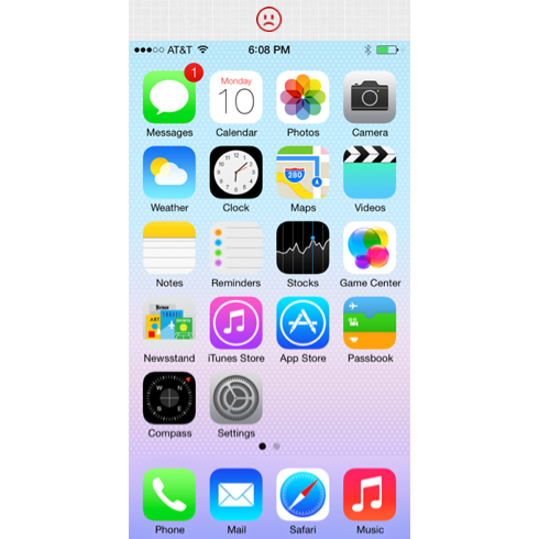
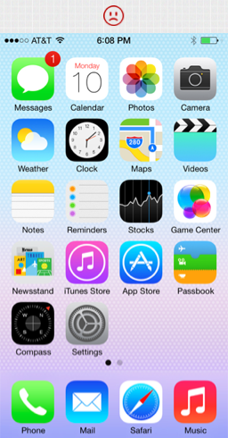
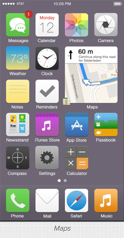
Okay, let’s get started, this is what the home screen currently looks like on iOS 7. Yikes! What’s up with those neon colors and the horrible glyphs?!
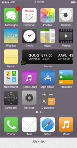
This is what I’m suggesting:
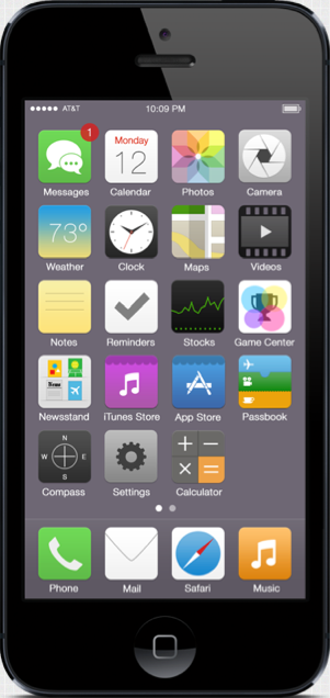 A short walkthrough of the most important icons:
- Photos: This one was largely inspired by Philipp Antoni. I think it looks so much better without all the white space, it feels more like a flower, and less like the NBC logo.
- Weather & Clock: Both should display live data like widgets. The clock icon actually does this in iOS 7, but it still looks bad.
- Notes & Reminders: These ones seem almost too easy, but Apple still managed to blow it. A post it note for Notes, and a checkmark for Reminders, it’s so simple!
- Game center: I don’t really get the colored blobs, but I guess they’re supposed to be “playful”. However, Game Center is all about ranks so I believe the icon should reflect that, hence the use of a trophy.
- iTunes Store & App Store: The circled icons that Apple used in iOS 6 aren’t bad, but I think a subtle awning makes them feel even more like shopping apps (+ they look cleaner!).
- Settings: This one also seems impossible to mess up if you’re going for a “simple” style, but Apple decided to use… something really weird instead.
Why it’s better: By using a more “matte” style instead of flat neon icons, third party apps can still blend in with the default apps. This is crucial if Apple wants the OS to continue to look consistent, because there is no way all developers are going to go back and redo the icons for all of their 900 000 apps!
Widgets
It’s amazing that Apple still doesn’t seem to understand the power of having home screen widgets, even after 7 different versions of their mobile OS.
I absolutely love Max Rudberg’s resizeable icon concept, so I decided to share some ideas on how Apple could use it in some of their apps:
The first app that comes in mind when you think of widgets is of course Weather. I believe this approach would make iOS 7 feel fantastic:

iOS Widgets should of course have a few standard sizes (relative to app icon sizes) in order to keep the OS clean, like 2×2, 3×1… etc.
Here are some other ideas I came up with:
Why it’s important: Widgets are one of the top reasons why many people choose Android over iOS today. By extending the flexibility of the home screen, Apple could do some amazing things and open up an entire new world for developers as well!


