By Seth Kadish from Vizual Statistix:
This blog is a product of my passion for data visualization. The data shown here are sourced from other websites, but all statistical operations on these data and the resulting graphics are original. I take requests and am available for freelance work. If you have a suggestion for a graphic or need support on a project, email me. To learn more about me, visit my LinkedIn profile, and send an invitation to connect.
Thanks for visiting!
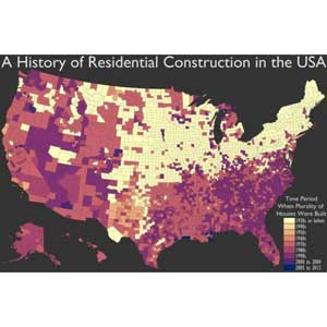
Before moving to Portland, OR, where we bought a house built in 2006, my wife and I lived in Providence, RI, in a condo built in the 1930s. Both construction eras have their plusses and minuses, but I have to admit that I really don’t miss fixing all the things that used to break in the 1930s condo. The contrast between the structures got me thinking about the distribution of residential construction, so I’ve mapped/graphed it in this post.
The map shows what time period the plurality (mode) of houses was built in for each county. As you can see, much of the Midwest and Northeast are dominated by older homes (1930s and before). The southern states and states west of the Rockies tend to have more 1970s through 1990s houses. There are only two counties in the entire country where 1940s houses are the mode: Anderson County, TN, and Cottle County, TX. There are three counties where 2005-2013 homes are the mode: Cameron Parish, LA, Plaquemines Parish, LA, and Hancock County, Mississippi. Here is the full distribution of the number of counties by which time period is responsible for the plurality of its residential construction:
1930s or before (1161 counties); 1940s (2); 1950s (87); 1960s (43); 1970s (881); 1980s (266); 1990s (754); 2000 to 2004 (24); 2005 to 2013 (3).
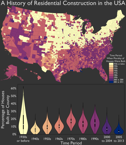
The violin plot reflects this distribution, with a post-1940 building peak in the 1970s to 1990s. The white dots in the violins represent medians for each time period. So the typical county in the US (if such a county existed) would have a plurality of its houses built in the 1970s, followed by an approximately even distribution of pre-1940, 1980s, and 1990s houses, then an approximately even distribution of 1950s, 1960s, and post-2000 houses, and the smallest number of houses from the 1940s. The violins also shows that a select few counties (20, to be exact) have a true majority (>50%) of their houses built before 1940. Eight of the 20 are in Nebraska; no other state has more than three!
Data source: http://factfinder2.census.gov/ (Table DP04)


