Christian Boer designs typeface for readers with dyslexia
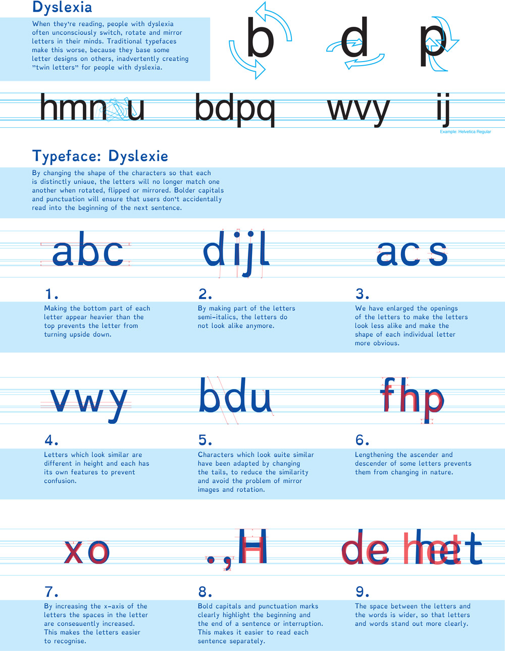
“When they’re reading, people with dyslexia often unconsciously switch, rotate and mirror letters in their minds,” said Boer, who is dyslexic himself. This “anti-flip” typeface is designed to reduce that possibility.
Istanbul Design Biennial 2014: a typeface created specifically for dyslexic people by Dutch designer Christian Boer is on show at this year’s Istanbul Design Biennial.
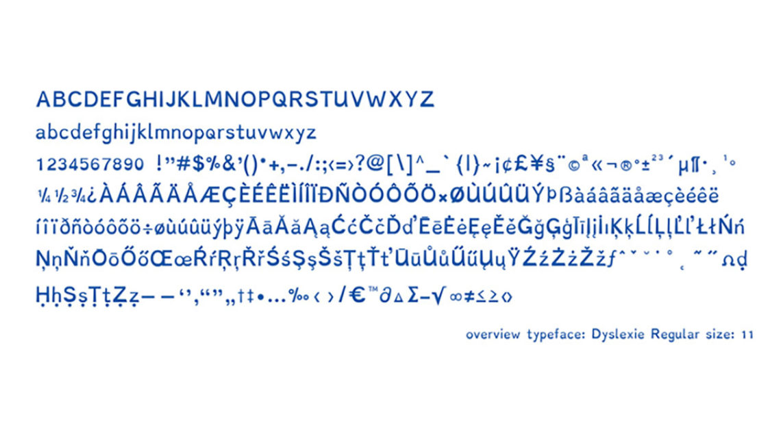
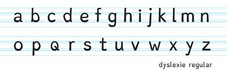
Although it looks like a traditional typeface, Dyslexie by Christian Boer is designed specifically for people with dyslexia – a neurological disorder that causes a disconnect between language and visual processing making it difficult for the brain to process text. Dyslexia is estimated to affect 10 per cent of the world’s population, according to UK charity Dyslexia Action.
Related story: The Average Font combines hundreds of characters into a single typeface
“When they’re reading, people with dyslexia often unconsciously switch, rotate and mirror letters in their minds,” said Boer, who is dyslexic himself.
“Traditional typefaces make this worse, because they base some letter designs on others, inadvertently creating ‘twin letters’ for people with dyslexia.”
The 26 letters in the Roman alphabet are commonly derived from a set of vertical, horizontal, diagonal and rounded strokes.
These abstract forms are usually replicated for neatness and consistency across a typeface. This means the letters become more similar, making it harder for dyslexics to distinguish between them.
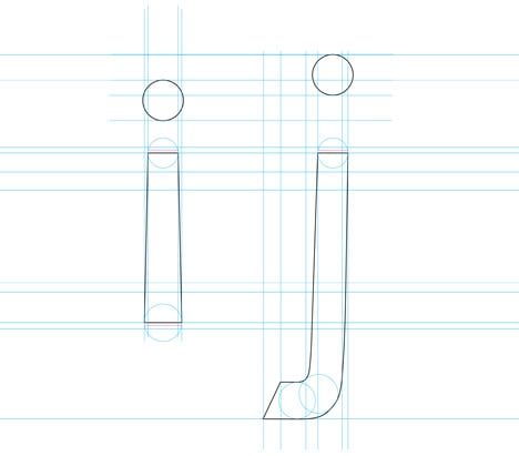
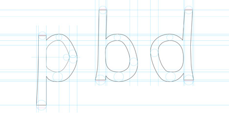
For example in Swiss typeface Helvetica, the letter “n” is used upside down as a “u”, “d” is a back to front “b”, and “q” is a mirrored “p”.
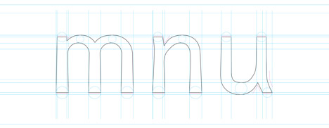
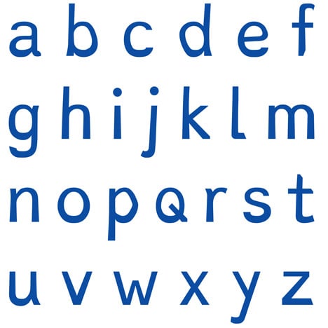
In Boer’s typeface, the letters are designed with heavier bottom portions to prevent the reader’s mind from turning them upside down.
Lengthened ascenders and descenders – the portions of the characters that stretch beyond the two main horizontal guides – also makes them easier to tell apart.
Letters that usually appear similar are subtly italicised and have added tails where possible, so they no longer look alike and pose less risk of the reader mirroring them.
Boer has also added larger spaces between letters and words, as well as bold capitals and punctuation marks so the start and end of sentences can be better differentiated.
“By changing the shape of the characters so that each is distinctly unique, the letters will no longer match one another when rotated, flipped or mirrored,” Boer said. “Bolder capitals and punctuation will ensure that users don’t accidentally read into the beginning of the next sentence.”
Boer first designed the typeface for his thesis project at Utrecht Art Academy in 2010 and presented it during a TED talk in 2011. The project is currently on display for the second Istanbul Design Biennial, which continues until 14 December.


