From the Public Domain Review
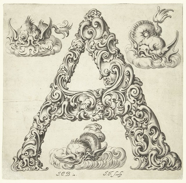
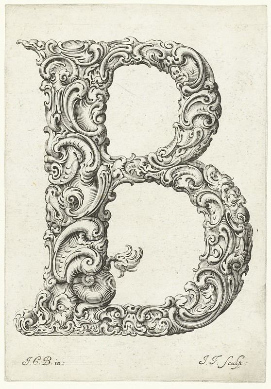
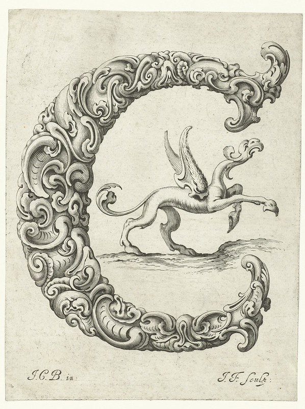
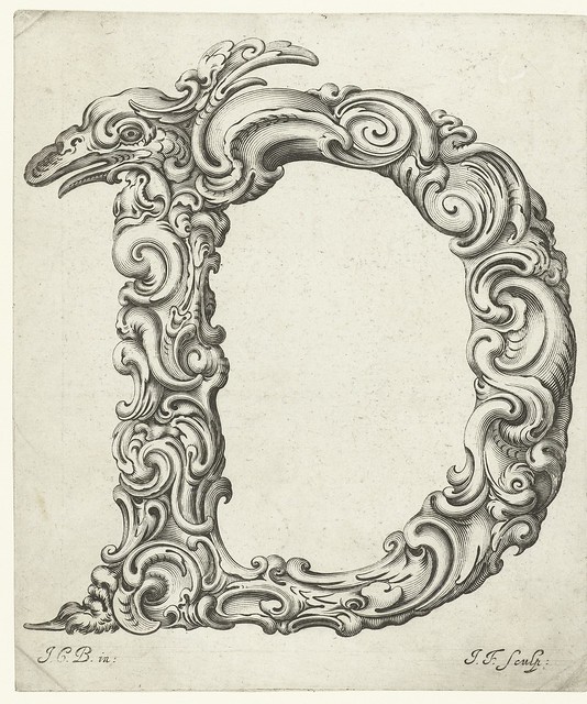
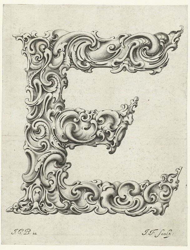
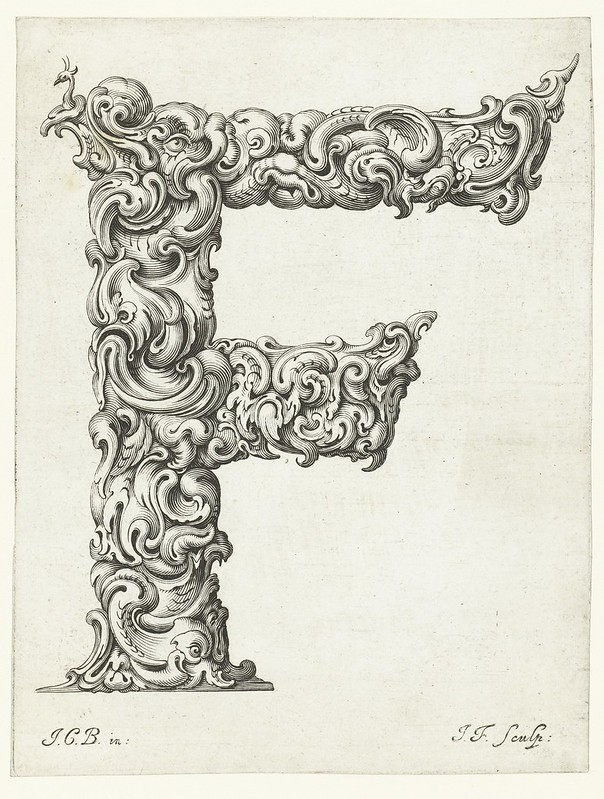
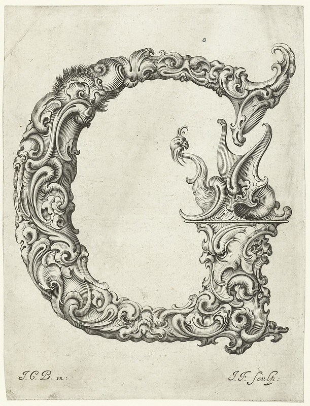
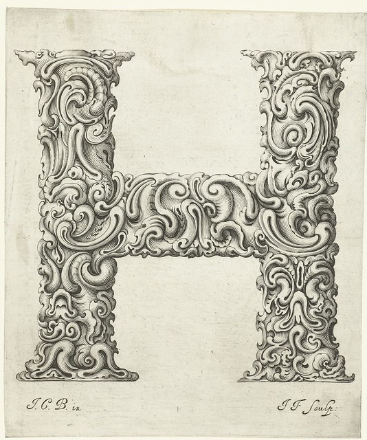
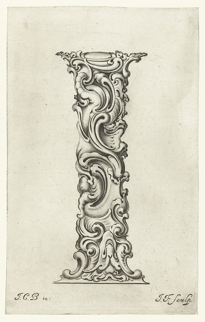
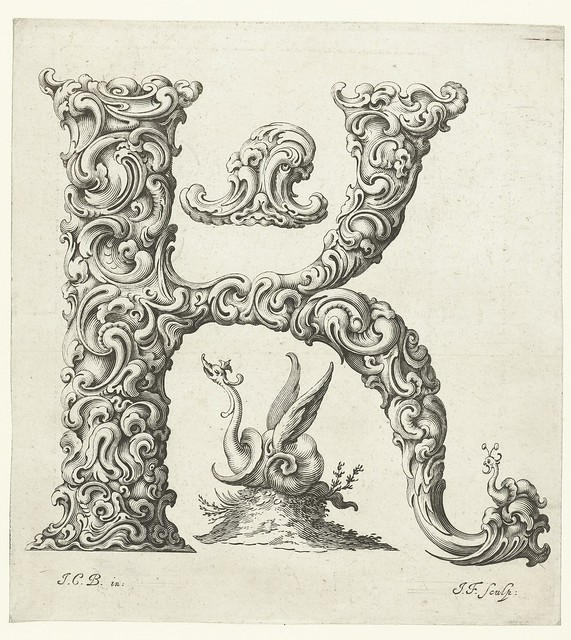
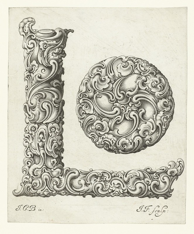
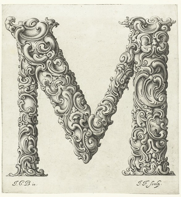
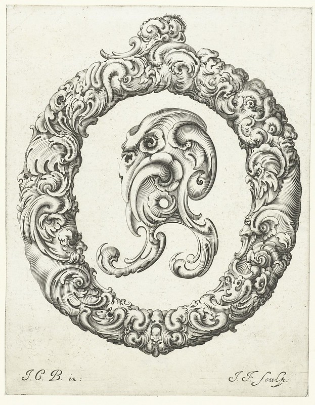
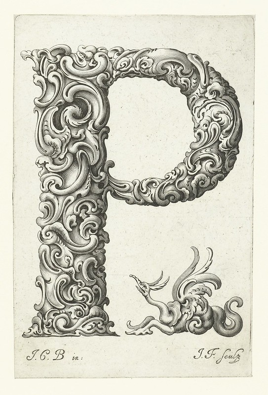
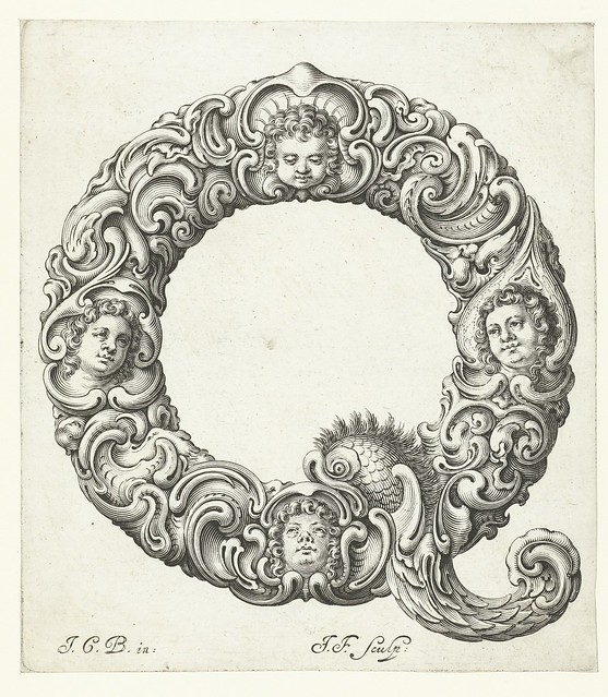
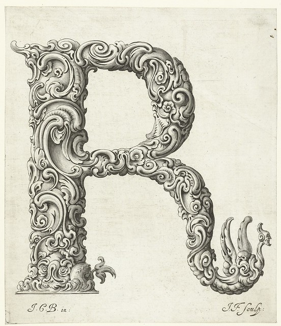
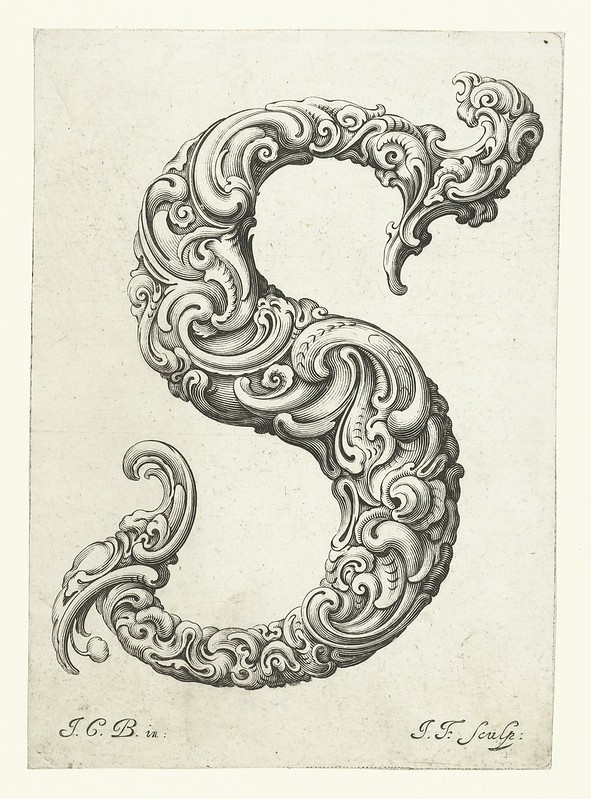
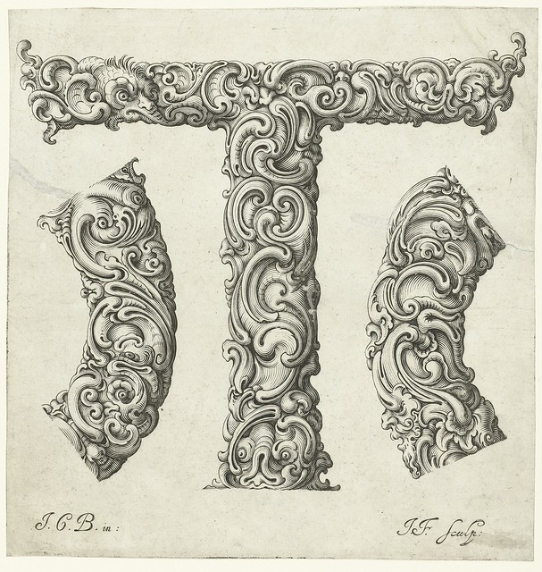
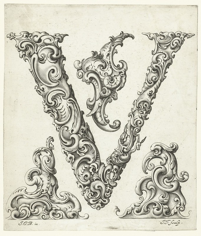
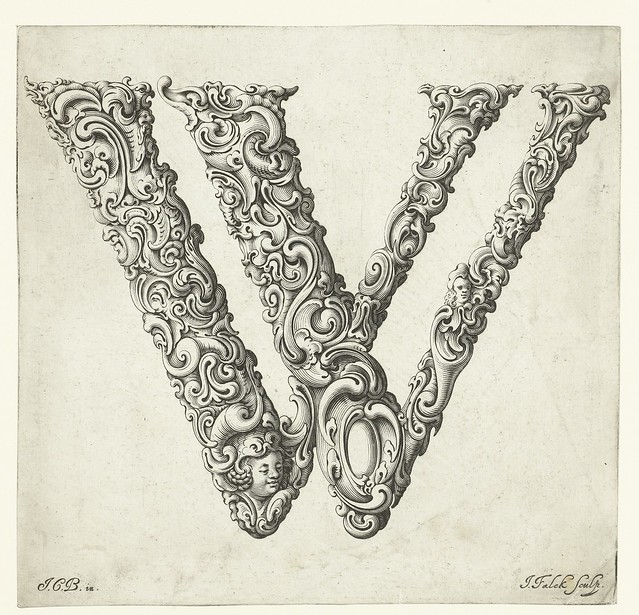
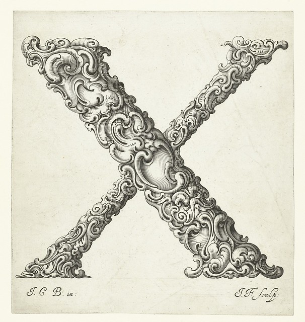
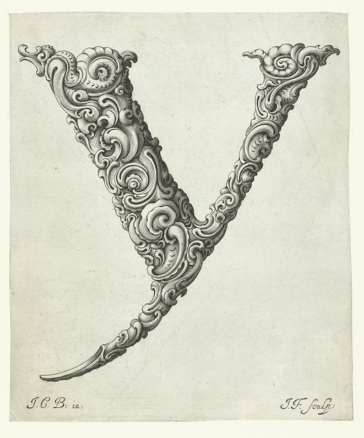
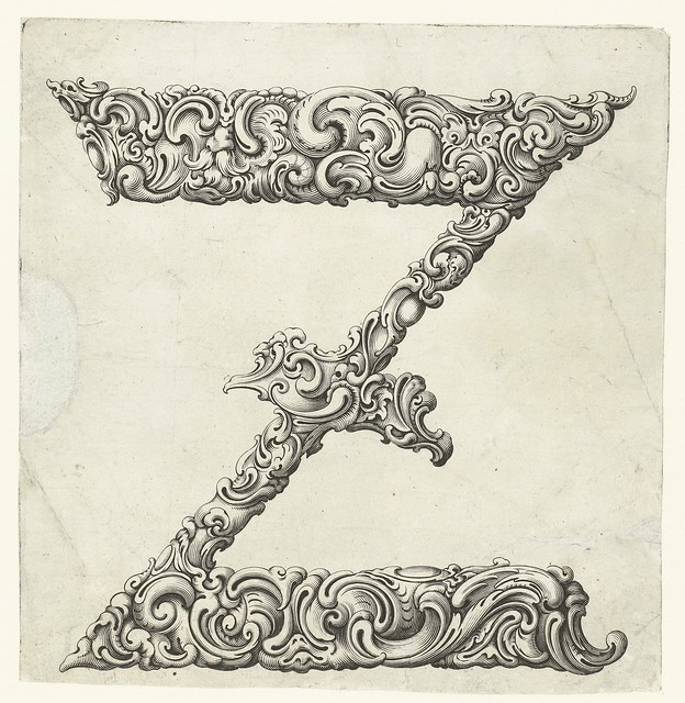
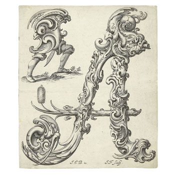
This 17th-century alphabet seems to show grotesque vegetation, animals and even humans in its forms, reminiscent of DeepDream imaging.
An Alphabet of Organic Type (ca.1650)
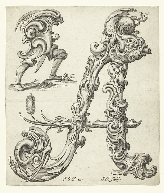
A series of stunning prints – titled Libellus Novus Elementorum Latinorum – designed by the Polish goldsmith Jan Christian Bierpfaff (1600-ca.1690) and engraved by fellow-countryman Jeremias Falck (1610–1677). According to BibliOdyssey blog, where we first learnt of the images, Bierpfaff worked as an apprentice at the Mackensen family of metalworkers in Cracow, a group “who introduced the Dutch auricular (‘shell or ear-like’) style of ornament into the Polish gold and silver workshops”. We see the influence of this auricular style in Bierpfaff’s letterforms but also the unmistakable baroque stylings of the grotesque. The result is wonderfully surreal, the writhing forms hovering somewhere between the monstrous and floral.