From Wikipedia:
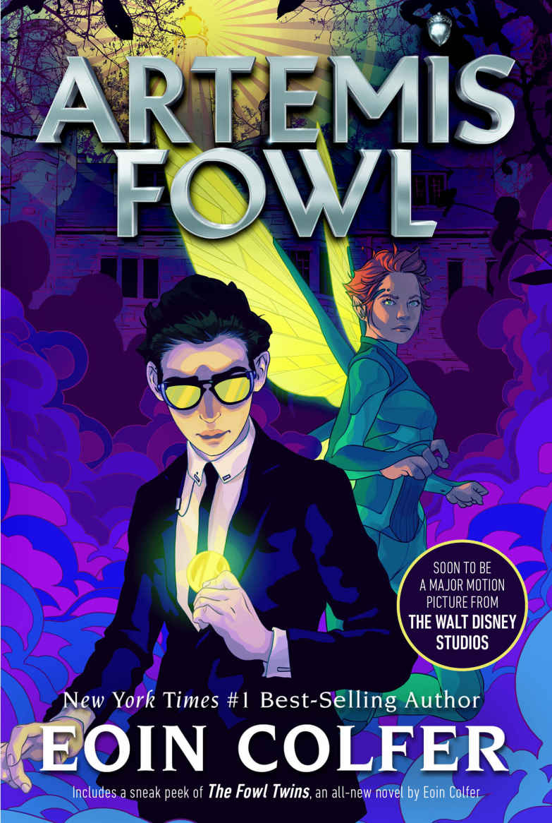
Artemis Fowl is a series of eight children’s fantasy novels written by Irish author Eoin Colfer, featuring the criminal mastermind Artemis Fowl II. The series has received positive critical reception and generated huge sales. It has also originated graphic novel adaptations.
And it has fonts!
The Artemis Fowl FanGathering fan site has extensive information about the series, the author and his other work. It also has numerous resources, from a forum to fan art to fanfic. And, of course, downloadable fonts. From the site:
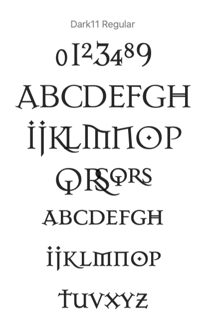
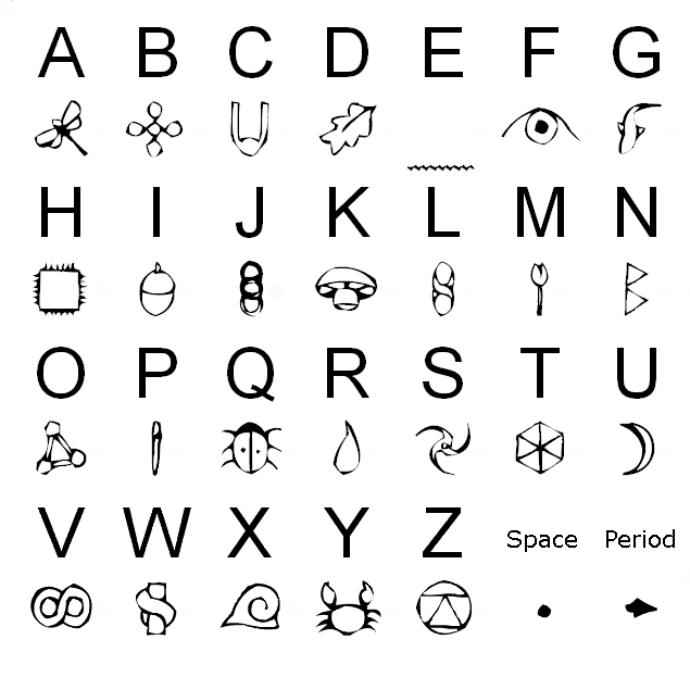
Gnommish Fonts
We have four fonts available for download here…The first is a font for the “Gnommish” language, and the second is the font used for the chapter headings in the Artemis Fowl books [named Dark11 as above]. [We also present] two which cannot be found anywhere else. [Ed.: This is not true; blogger BabelStone features another version of Centaurean/Centaurian.]
 Gnommish Font created by The Phlegm Plot.
Download here
 Chapter Headings Font
Download here
 Centaurean Font
Download here
NB – The Centaurean Font was created by and is exclusive to FanGathering. The characters, “J,”, “T,”, “Z,” and “!,” do not exist in the book’s usage of the language, but have been created here, to make the font fully usable. This font was only used in the UK version of The Arctic Incident.
 Eternity Code Font
Download here
NB – The Eternity Font was created by and is exclusive to FanGathering. The characters, “J,”, “Q,”, “.,” and “!,” do not exist in the book’s usage of the language, but have been created here, to make the font fully usable. This font was only used in the UK version of The Eternity Code.
The author of BabelStone Blog creates cyphers for their children in their spare time. They have some snarky but seemingly well-deserved comments about the FanGathering’s design of the Centaurean/Centaurian typeface (each creator uses a different spelling, although the latter is dictionary-correct):
BabelStone Centaurian is based on the Centaurian alphabet used in the UK edition of Artemis Fowl : The Arctic Incident by Eoin Colfer. A version of the Centaurian font is also available from Artemis Fowl FanGathering, but not only are some of the glyphs rather poorly designed (“O” and “R” are particularly bad), but the font’s creator has mistakenly created a glyph for the letter “T” (which should be blank) and has a blank glyph for the space characters (which should not be blank), so it cannot be used to replicate the actual Centaurian text used in the book.
More about the programming involved in creating the actual typeface is here (scroll down).
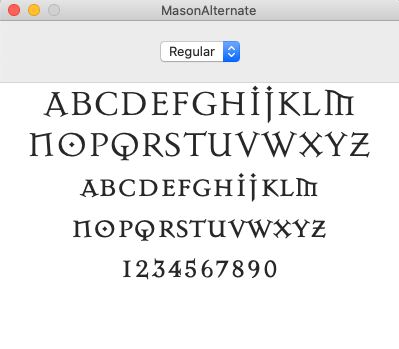
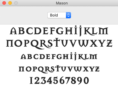
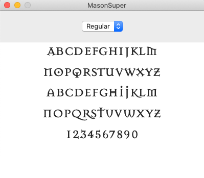
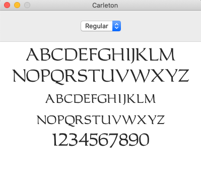
The “Artemis Fowl Confidential” fan site (artemis-fowl.com) has two additional typefaces based on the chapter headings style: Mason, in three versions, each with two weights; and Carleton. These are plainer versions of the chapter headings style and an uppercase, uncial-inspired set of letterforms, respectively. All the fonts are here.
An entertaining pastime is perusing the image results of a Google search on “fowl” and “font”: Artemis, Artemis, book, film, book, series, Artemis, CHICKENS.


