Faith-Free Font Friday

Study: Top Reason Millennials Leave The Church Is Terrible Font Choices
Führer Font Friday
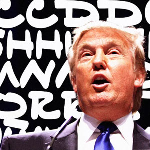
The below is an article from October 2016, but worth a rerun in light of Trump’s recent (impeachment hearings 2019) adventures in writing speech notes for himself. Here’s a link to Trump’s latest scrawlings set to music made by various talented musicians: a) Ramones-style b) Emo-style c) Morrissey-style BY JOHN BROWNLEE Although he’s known for […]
1482 Font Friday
Mnemonic Alphabet of Jacobus Publicius (1482) Jacobus Publicius was a fifteenth-century rhetorician and physician who is remembered today for being the author of the first ars memoriae (or ars memorativa), a work dedicated to techniques concerning the organisation and improving of memory. Publicius’ ideas were gathered in a book called Ars Oratoria. Ars Epistolandi. Ars Memorativa published in 1482, which […]
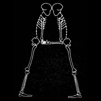
Fear Font Friday 2 (OK, OK, it’s Thursday)
For Halloween, what’s skarier than a skeleton? What about the kind of person who makes a skeleton out of designer-y type? Def skarier. Not to be confused with my post Fear Font Friday 1. Skeleton Typogram, A Human Skeleton Illustration Made Using The Words For Each Bone “Skeleton Typogram” by designer Aaron Kuehn is a gorgeous typographic artwork […]
Feline Font Friday 2
Cats As Fonts Courtesy Jolyon Hawley from https://www.sadanduseless.com. Not to be confused with my post Feline Font Friday 1 (in memory of Lucy).
Father Friday 2, No Fonts (CN: loss of father)

CN: Loss of father, stroke Sunday, January 19th, 2020, is the 48th anniversary of my father’s death. He died at just 59, when I was nine. He’d had a bad stroke two years before, and, in the days before early intervention in stroke patients prevented or ameliorated effects, was paralyzed on his left side and […]
Father Friday 1, No Fonts (CN: death)
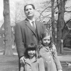
CN: Death of parent Today is my father’s birthday: Maurice Ginzler. He was born (one of seven children) in 1912 (ten-eleven-twelve) so he’d be 107 today. Right now there’s a family reunion going on in Florida and there was a slideshow this morning of photos various relatives had amassed. I video conferenced and saw photos […]
Feline Font Friday 1 (in memory of Lucy)
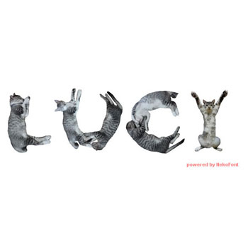
Eleven years ago tomorrow, on September 28, I lost my beautiful sweet Lucy Cat. She was skittish and terrified when I first got her, hiding under the bed and only emerging at night to eat. I decided to take on gentling her as a project, but that soon turned into just loving her up. She […]
Philatelic Font Friday
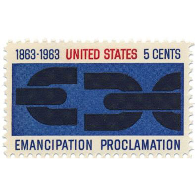
Aaaaghhh! Michael Russem at Kat Ran Press beat me to this idea. His extensive collection of stamps designed by type designers, and musings thereupon, was started in 1999. Here are some highlights.
F’n Huge Font Friday (Helvetica in Space)
From kottke.org: Ben Terrett wrote a post about how many instances of the word “helvetica” set in unkerned 100 pt Helvetica it would take to go from the Earth to the Moon: The distance to the moon is 385,000,000,000 mm. The size of an unkerned piece of normal cut Helvetica at 100pt is 136.23 mm. […]
Fourth-Dimension Font Friday
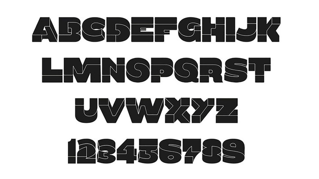
This font will make your brain hurt Oxymora is a typeface that evokes the twisting, non-Euclidian geometry of MC Escher’s artwork By Carl Franzen (Birgit Palma/Cargo Collective/Inspiration Hut) Impossible, twisting geometric artwork abounds across the internet (see The Verge‘s logo for one prominent example). So it seems high time that someone made a similarly reality-defying font. […]
Found Font Friday 2
Not to be confused with my post Found Font Friday 1, the tale of a bitter turn-of-the-20th-century rivalry which led to economically valuable—and artistically priceless—metal type being flung into London’s River Thames, to be recovered only after a lapse of a hundred years. This post deals with matters cheerier, cheekier, and altogether less grim. From […]
Fake Font Friday 4
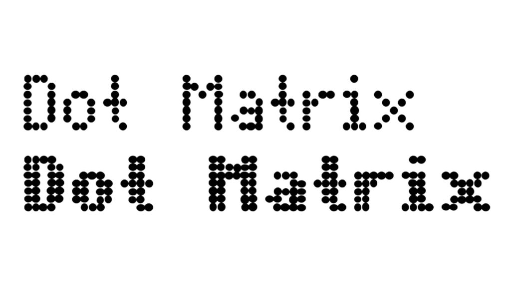
Another kind of fake font, these type styles replicate printing found starting in the 20th century—dot matrix, LCD, “computer” and 8-bit. Not to be confused with my posts Fake Font Friday 1, Fake Font Friday 2 or Fake Font Friday 3. Dot Matrix by Moonbase Press in Techno > LCDDownload
Forensics Fonts Friday
Forensics professionals pay a great deal of attention about what fonts to use in courtroom exhibits concerning or reproducing digital evidence. To quote a paper by Fred Cohen & Associates of the California Sciences Institute [abstract below] “fonts for forensics are less about the beauty of the presentation and more about the tradeoff between readability […]
Fake Font Friday 3
Today we salute fonts that fake text itself. Microdot replaces every character with the placeholder rectangle from regular fonts, and Blokk replaces characters with horizontal lines. Type in either font gives the effect of a block of copy (or headline) without distracting the viewer with content. Both are great for making wireframes or mockups. Not […]
Fingerprint Font Friday
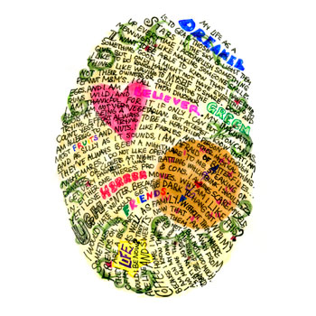
Typeface? Drawing? These typographic works of art, described by Christian Goldemann at typostrate.com, are by design as unique as their creators. Not to be confused with my post Fingerprinting Font Metrics Font Friday. Fingerprints Daniel Eatock had this great idea on his first day as a graphic design student. He wanted to create a real typography […]
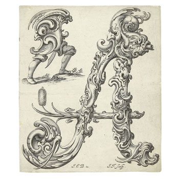
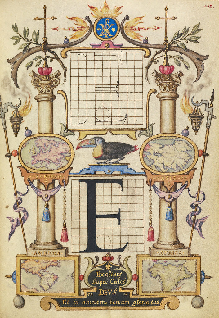
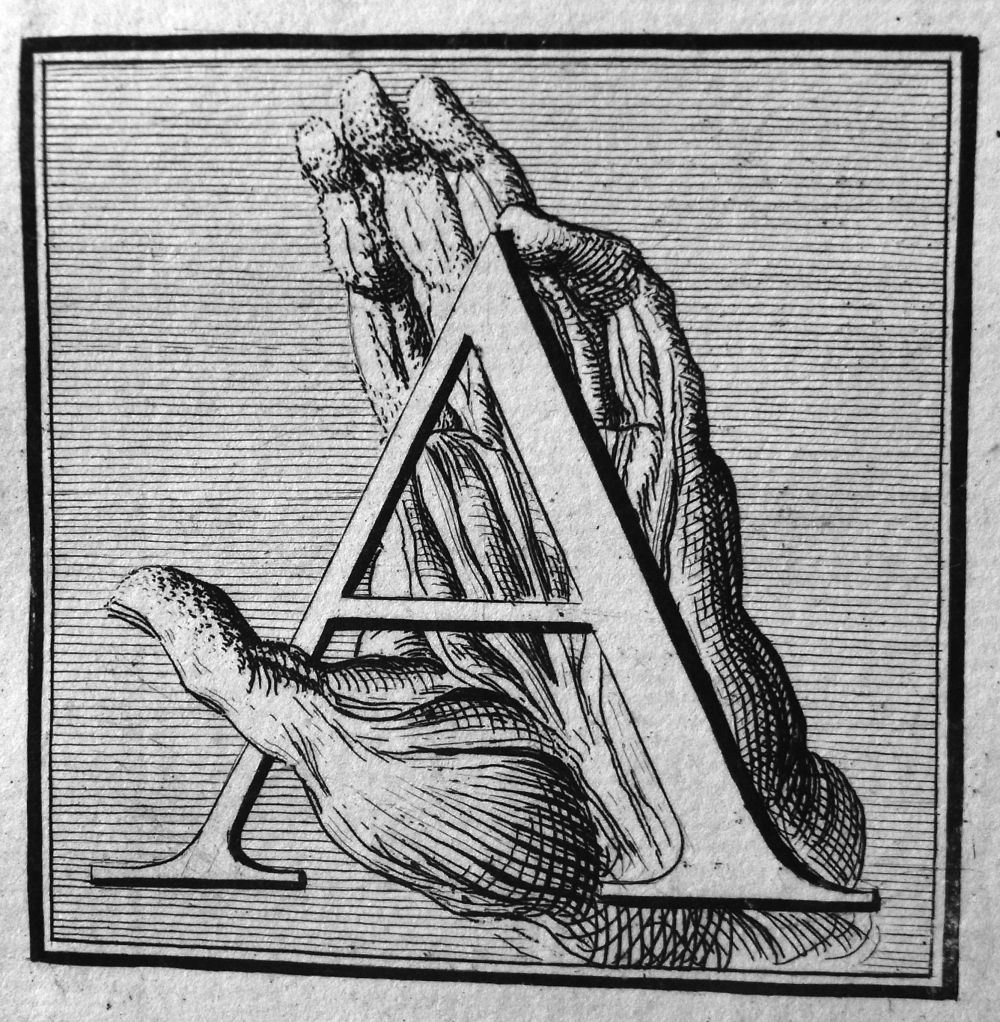
1493 Font Friday
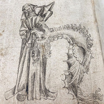
Newberry Library Dragon dentistry isn’t a job. It’s a calling. This hand-drawn calligraphic letter appears in the back pages of one of our copies of the Nuremberg Chronicle—a late 15th-century history of the world and one of the best-known incunables, or early printed books. It’s based on an image belonging to a series of engravings […]
Funny Font Friday 2
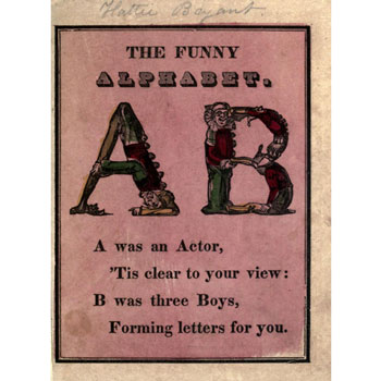
From the Public Domain Review. See also my post Funny Font Friday 1, some silly movies and their fonts. The Funny Alphabet (ca.1850) Funny alphabet; ca.1850; McLoughlin Bro’s publishers, New York. A delightful little alphabet book in which the letters are made up from acrobatically contorted bodies, and the accompanying text from often equally contorted […]
Flora Fauna Faces Font Friday
From the Public Domain Review This 17th-century alphabet seems to show grotesque vegetation, animals and even humans in its forms, reminiscent of DeepDream imaging. An Alphabet of Organic Type (ca.1650) A series of stunning prints – titled Libellus Novus Elementorum Latinorum – designed by the Polish goldsmith Jan Christian Bierpfaff (1600-ca.1690) and engraved by […]
‘Fringe’ Font Friday
The TV show ‘Fringe’ aired between 2008 and 2013 on the Fox Network. The series follows members of the fictional Fringe Division of the Federal Bureau of Investigation, based in Boston, Massachusetts, under the supervision of Homeland Security. The team uses fringe science and FBI investigative techniques to investigate a series of unexplained, often ghastly […]
Famous Font Friday
Ever wondered what all the world’s most famous companies’ fonts are? Yes? Congratulations! You are a type nerd who will probably enjoy this fascinating info! No? Give it a look anyway, you might get hooked on letterforms in spite of yourself. Famous Logo Fonts A look at most popular fonts used in the logos of […]
Flight Font Friday
Ever wonder what fonts airlines use in their logos? A sampling of airline fonts, from fontmeme.com, is below. (See also Fightin’ Font Friday, about typefaces used on airplane models.) About United Express Font United Express is the brand name for the regional branch of United Airlines, under which nine individually owned regional airlines operate short […]
Half-erased blackboards from quantum physics labs
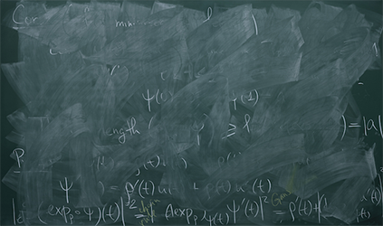
From The Atlantic. The article is from 2012, so a London exhibition of full-size photos is no longer there. But still way cool. The Beautiful Blackboards at Quantum Physics Labs MEGAN GARBER An artist visits the world’s premier quantum mechanics labs. Beauty ensues. “Momentum,” displayed at the Wilmotte Gallery in London (Alejandro Guijarro) Blackboards, the legend […]
Ferdinand I Font Friday
A fascinating article about calligraphy for the Holy Roman Emperor Ferdinand I, in the waning days of hand-lettered books, from Noor Al-Samarrai at Atlas Obscura. See a Dazzling, Exuberant Renaissance Calligraphy Guide A masterclass in script, illuminated with an array of curiosities.
Future Font Friday 1
A handy how-to to make any word look like it’s from [cue theremin music] THE FUTURE! Via Dave Addey at Typeset in the Future. I’ll be watching his blog for more posts on sci-fi type. How To Make Your Text Look Futuristic We’ve already seen how Eurostile Bold Extended is spectacularly effective at establishing a movie’s timeframe. But if […]
Future Font Friday 2
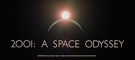
A gloriously obsessive examination of the typography in 2001: A Space Odyssey. This post stars Albertus, City Medium, Eurostile Bold and Bold Extended, Futura, Gill Sans, Microgramma, Spartan and Univers. Please also see my post Future Font Friday 1. Now, over to Mr. Addey: 2001: A Space Odyssey – Stanley Kubrick’s 1968 sci-fi masterpiece – seems an […]
‘F is for Fox’ Font Friday
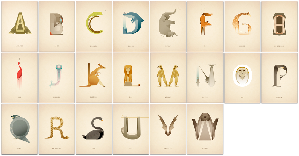
This lovely animal alphabet was created by Marcus Reed, a UK-based illustrator and designer. You can buy prints of the alphabet here. Each letter is represented by a drawing of an animal whose name begins with that letter, in the shape of the letter.
‘Phics Font Friday
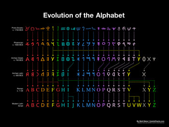
Hierogly-PHICS, that is. I know, I know, it’s a reach, but this is cool and it was hard to think of an applicable real word starting with an “f” sound. From My Modern Met. Colorful Chart Reveals Evolution of English Alphabet From Egyptian Hieroglyphics By Emma Taggart on January 25, 2019
Food Font Friday 3
Fontmeme.com provides font sources and information for typography in many fields, from airlines (see my post, Flight Font Friday) to movies to sports. See also my previous posts Food Font Friday 1: a typographic map of American foods, and Food Font Friday 2: Typografische Schokolade (Typographic Chocolate). Food and Drinks Fonts Page 1 / Page […]
Phony Font Friday
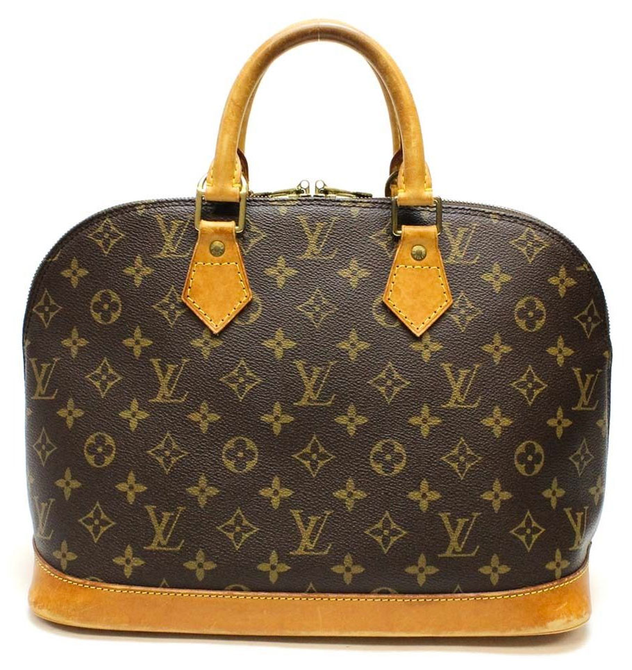
Part three of five articles concerned with spotting fake Louis Vuitton merchandise. This cool font-related piece is about the font and spacing of the characters in the signature heat-stamped label. Mostly the signals of an authentic label are subtleties of spacing, alignment, and character shape. Font geeks, pull up a chair! Spotting Fake Louis Vuitton […]
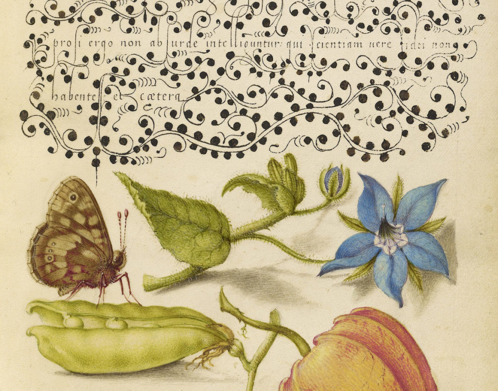
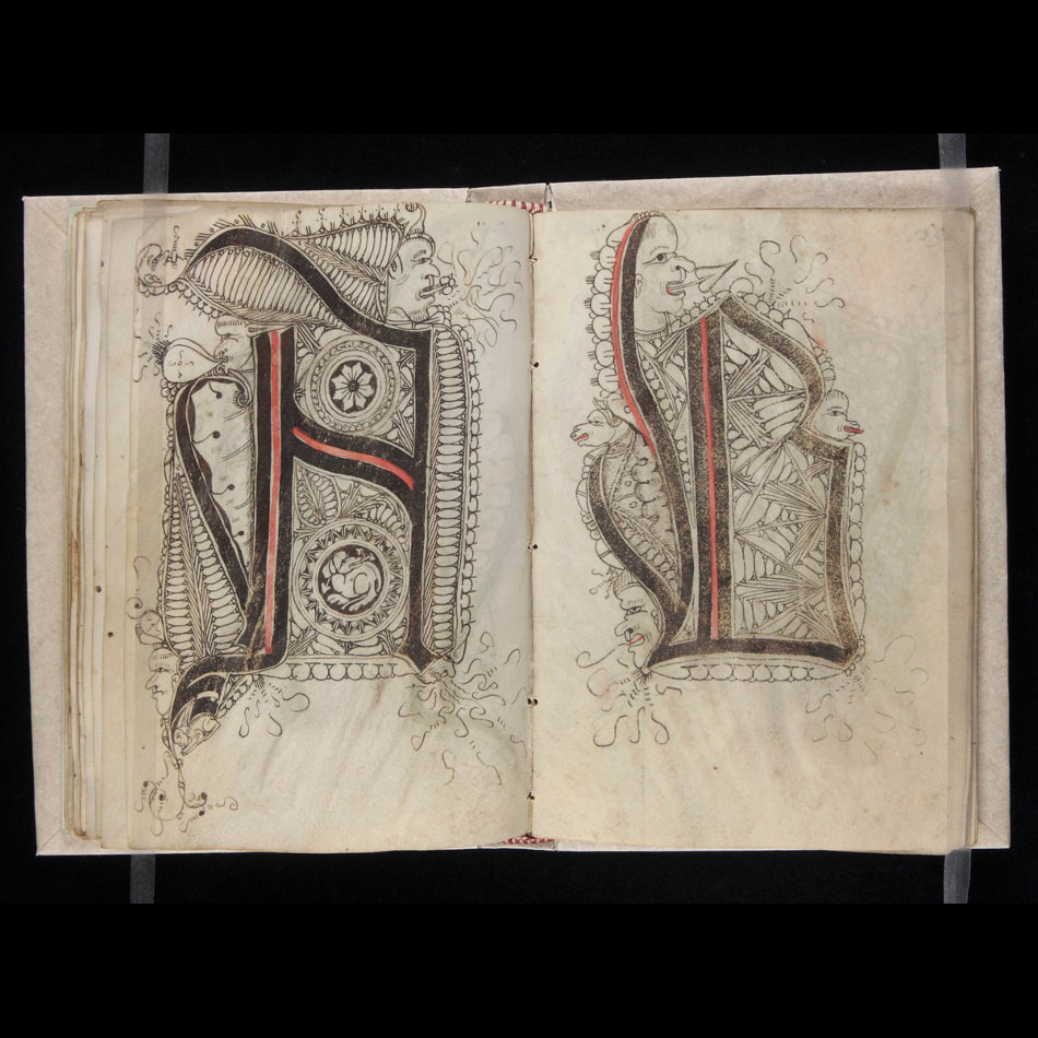
1595 Font Friday
From the Public Domain Review. See also my post 1510 Font Friday. Hoefnagel’s Guide to Constructing the Letters (ca. 1595) Joris Hoefnagel (1542 – 1600) was a pivotal figure in the history of Dutch art, playing an important role both in the latter stages of the Flemish illumination tradition and the birth of the new […]
Phonic Font Friday
A great site, http://typophonic.com/, exploring the typographic art of the phonograph record. c. 60s. Thanks to my pal Vil Arias for sending me this pic.
1510 Font Friday
From the Public Domain Review. See also my post 1595 Font Friday. 16th-Century Pattern Book for Scribes (ca. 1510) This scribal pattern book—dated to around 1510 from Swabia, Germany—was made by Gregorius Bock and is addressed to his cousin Heinrich Lercher Wyss, who was the official scribe of the duchy of Württemberg, most likely put […]
F-in’ Hilarious Font Friday
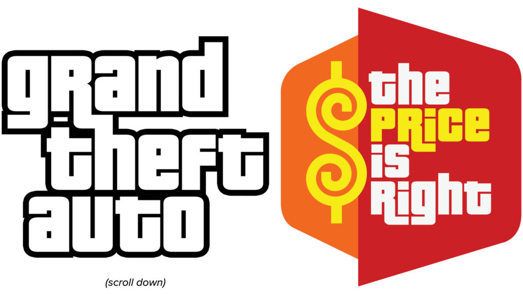
Did you know that Grand Theft Auto and The Price is Right use the same typeface? Totally awesome. It’s Pricedown Black (see below) from font house Typodermic. I discovered this using WhatTheFont, a great online tool that helps you find out what typeface a particular type sample uses. You upload an image, ascertain which characters […]
Flesh Font Friday 2
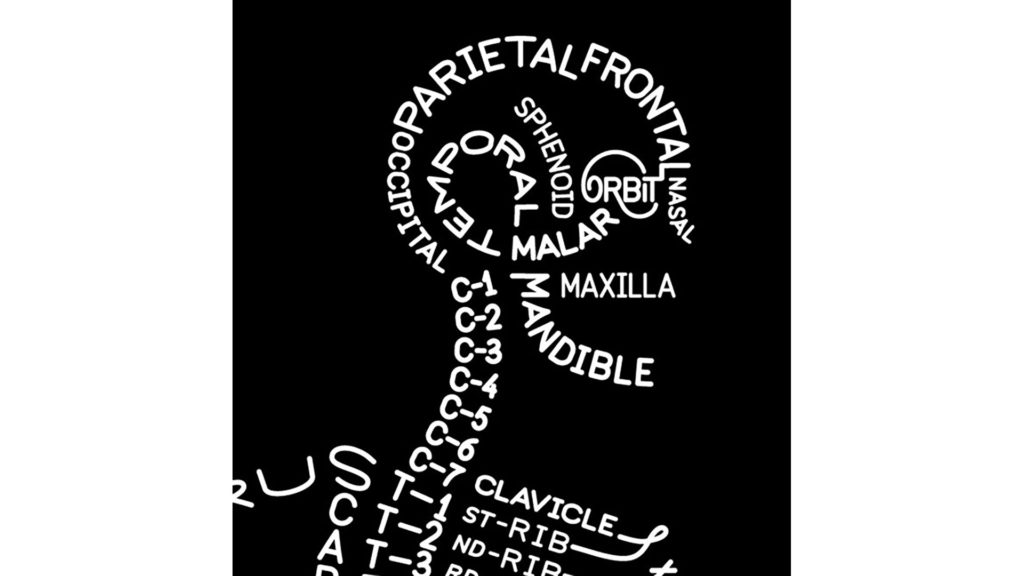
From A Beautiful Book: On Books, Streets & Migrant Footprints: A beautiful alphabet, from Anus to Tarsals. An anatomical alphabet, made for William Cowpers Myotomia reformata. London 1724
Fake Font Friday 2
From Christian Naths at GitHub: More fun dummy text to download and use! Not to be confused with my posts Fake Font Friday 1, Fake Font Friday 3 and Fake Font Friday 4. Redacted: A Font for Web and Desktop Redacted Regular
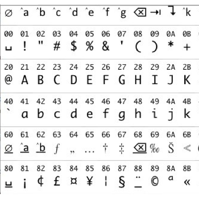
Fingerprinting Font Metrics Font Friday
These University of California, Berkeley researchers studied a method of compromising web user privacy, “fingerprinting” of online text: using font glyph* measuring techniques in various browsers to decipher text. (More pages, or buy the ebook or paperback, at books.google.com. Not to be confused with my post Fingerprint Font Friday.) *Loosely, a typographic unit
Fortean Font Friday
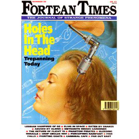
Fortean Times is a British monthly magazine devoted to the anomalous phenomena popularized by Charles Fort. Previously published by John Brown Publishing (from 1991 to 2001) and then I Feel Good Publishing (2001 to 2005), it is now published by Dennis Publishing Ltd. As of December 2014, its circulation was just under 14,300 copies per […]
Fabric Font Friday
I saw this framed fabric at Britex Fabrics in San Francisco. Britex is an amazing emporium of all things fabric, from single buttons to $200-a-yard sequinned loveliness. Yes, I know, I should get a bunch of the font fabric and upholster my house in it!
Flesh-Free Font Friday
Skeletons! A classic Halloween visual. Here’s a skeleton font from a new-to-me source: home machine embroidery. How the embroidery works: you install software from a website or disk and it tells your home embroidery machine—your enhanced sewing machine or dedicated device—how to make the letterforms or designs. This alphabet was developed by trishsthreads.com and is […]
Flesh Font Friday (NSFW)
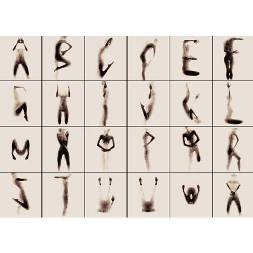
From designboom: a series of ethereal photographs by greek artist anastasia mastrakouli utilizes the nude human form to highlight the dialectical relationship between anatomy and visual art. each image is the product of an experimental performance, rendered as a composition of a silhouette and surface while conforming to the shape of the english alphabet. cut […]
Fontaine Fluorescent Font Friday
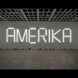
Claire Fontaine is an art collective based in Paris, making, among other things, large-scale words and phrases out of fluorescent light tubes. The font used is called “K”, a typeface in turn taking its name from the Czech author Franz Kafka, as a tribute to him and to his unfinished work Amerika. From the artists’ […]
Foot Font Friday
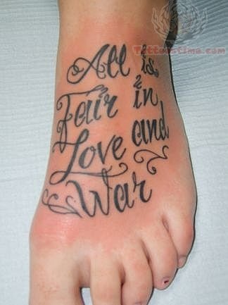
A lot of people seem to get type tattoos on their feet. Judging by images online, most of the tattoos are on women, and are inspirational (“Live Laugh Love,” or a serotonin molecule labeled “Stay Positive”). Some are foot-specific (“These feet are made for dancing”) and a few are names (“Amanda”). Many of them use the […]
‘F is for The Flash’ Font Friday
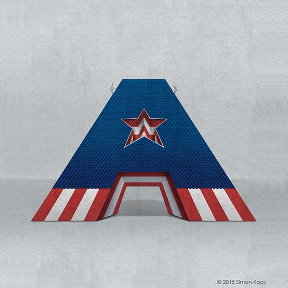
Alphabet created by Simon Koay, from SimonKoay.com: Superbet ‘Superbet’ is a typographic exploration of alphabet design by reimagining each letter of the alphabet as everyone’s favourite superheroes and supervillains. Each letter has been created with inspiration from characters who share that same initial in their name.These would be great for kids, or as CNet put it, “perfect for any bedroom wall or […]
Fake Font Friday 1
Just a quick visual so you know why their handwriting looks like that: Not to be confused with my posts Fake Font 2, Fake Font 3 or Fake Font 4. Link to larger size. Created by Orion Champadiyil (web, Twitter).
‘fonts dot info’ Font Friday
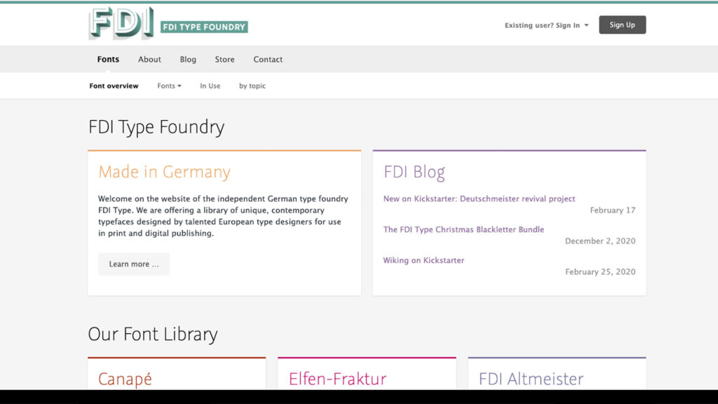
In my LinkedIn profile, I put ‘Typography Evangelist’; this type stuff is awesome! FDI is an independent German type foundry. To quote FDI’s website: We [offer] a library of unique, contemporary typefaces designed by talented European type designers for use in print and digital publishing. FDI Type was founded in 2004. The name comes from the […]
Fleuron Font Friday
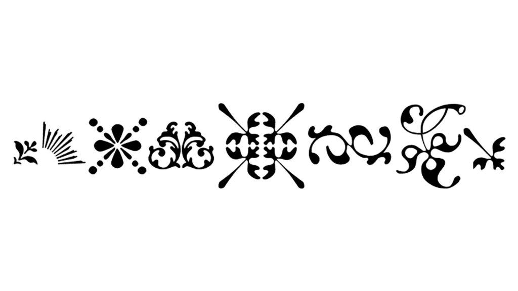
A fleuron, or flower, is a decorative typographic character. The category of fleuron includes some characters that are not floral in design. Also known as a printer’s flower or floret. Flowers are in a category of characters known as ornaments or type ornaments. Scroll down or jump to here for a short essay on fleurons. […]
Faëry Font Friday
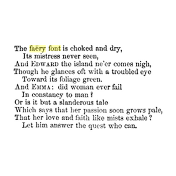
Ok, so this is a total cheat. Today’s Font Friday is “font” as in “fountain”: in this case, a font created and guarded by faeries. I came across the poem when I was looking for font-related words that start with “f,” and I thought it was interesting.