Future Font Friday 1
A handy how-to to make any word look like it’s from [cue theremin music] THE FUTURE! Via Dave Addey at Typeset in the Future. I’ll be watching his blog for more posts on sci-fi type. How To Make Your Text Look Futuristic We’ve already seen how Eurostile Bold Extended is spectacularly effective at establishing a movie’s timeframe. But if […]
Future Font Friday 2
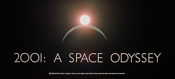
A gloriously obsessive examination of the typography in 2001: A Space Odyssey. This post stars Albertus, City Medium, Eurostile Bold and Bold Extended, Futura, Gill Sans, Microgramma, Spartan and Univers. Please also see my post Future Font Friday 1. Now, over to Mr. Addey: 2001: A Space Odyssey – Stanley Kubrick’s 1968 sci-fi masterpiece – seems an […]
Far, Far Away Font Friday
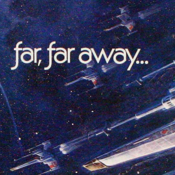
From Yves Peters at fontshop.com on December 14, 2015 (revised December 20, 2015): An exhaustive article on the various versions of the fonts for the “iconic opening [text] crawl” and posters for each Star Wars movie! To say a whole lot of people are getting a whole lot of excited about Star Wars: The Force […]