Flying Font Friday 1
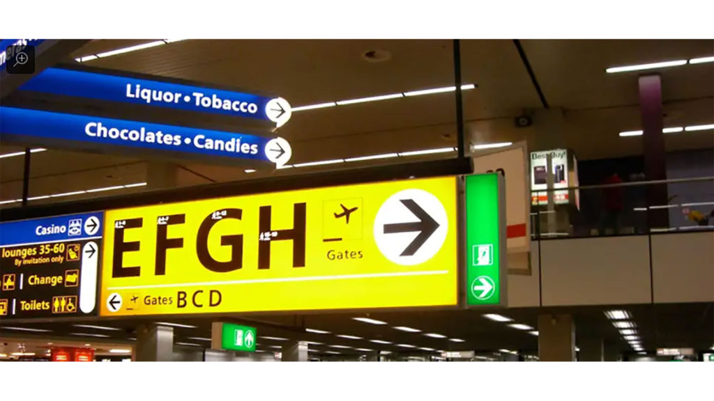
Also see my post Flying Font Friday 2, about typeforms found in butterfly wings. Why the Same Three Typefaces Are Used In Almost Every Airport From Gizmodo by Alissa Walker Wayfinding signage is an invisible network draped upon our public places. And that network has to work especially hard in airports when we’re lost, hungry, […]
Type-o-philes Scour NYC for Urban Signage Project
By Jakob Schiller from Wired.com: [Ed. Entertainingly, this article was originally titled “Type-o-PATHS Scour NYC for Urban Signage Project.”] New York City is such a sensory overload, it’s easy to miss the details — like the graphical symphony of typography that’s playing under your visual field. Nyctype.com aims to bring that symphony to the surface […]
Uncovering the First, Fascinating Rulebook for [New York City] Subway Sign Design
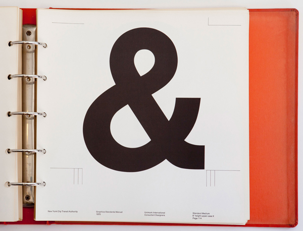
From TheAtlanticCities.com: Late one night last August, three Pentagram designers rummaging through the design firm’s basement archives found the Rosetta Stone of New York subway graphics: the original Standards Manual, designed by Bob Noorda and Massimo Vignelli in the late 1960s. The 180-page binder, the key to the system’s iconic design choices, outlines a meticulous […]