The Client
ACCESS: Women’s Health Justice (now ACCESS: Reproductive Justice) helps make it possible for lower-income people to receive reproductive care, including abortion. ACCESS provides help through the lens of reproductive justice: the concept that reproductive care, and access to care, exists within the framework of the inequalities of the society at large, and must be addressed as such. From their website:
Most people believe that reproductive health care is easy to get in California because we enjoy some of the strongest reproductive rights in the nation. Medi-Cal covers prenatal care and abortion, and low-cost family planning services are widely available. Legally, there are few restrictions on abortion. Yet, thousands of people in California still find it nearly impossible to act on these rights or obtain reproductive health care without a struggle. Reproductive rights are meaningless when you don’t know where to get birth control, no abortion provider accepts your insurance, you are afraid to seek prenatal care because of your immigration status, or the closest clinic is hours from your home.
The clientele is largely people who have exhausted other means of assistance. The organization facilitates rides to healthcare providers, overnight lodging, and counseling.
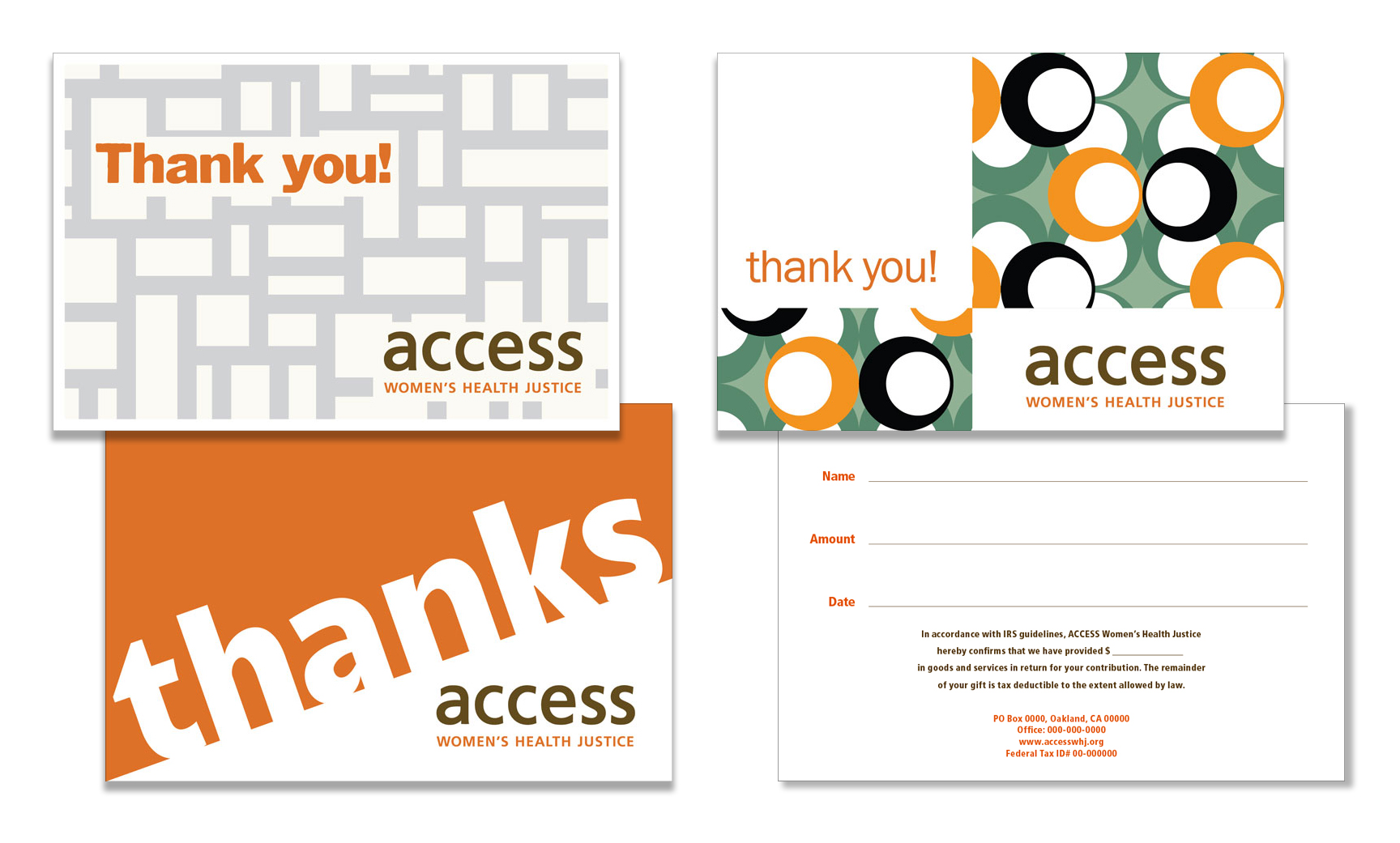
The Challenge — Thank-you cards
ACCESS needed thank-you cards to send to the healthcare providers who are part of the program, as well as donors who support it. The cards needed to be cheerful but professional, and more homey than elegant. The budget for artwork was minimal.
The Solution
Working with the existing ACCESS logo and colors of burnt orange and sepia, I created a set of three cards (see above) using low-cost royalty-free artwork from an online supplier. The back, with small text, is filled out by hand for each donor. I’ve removed contact and other identifying information.
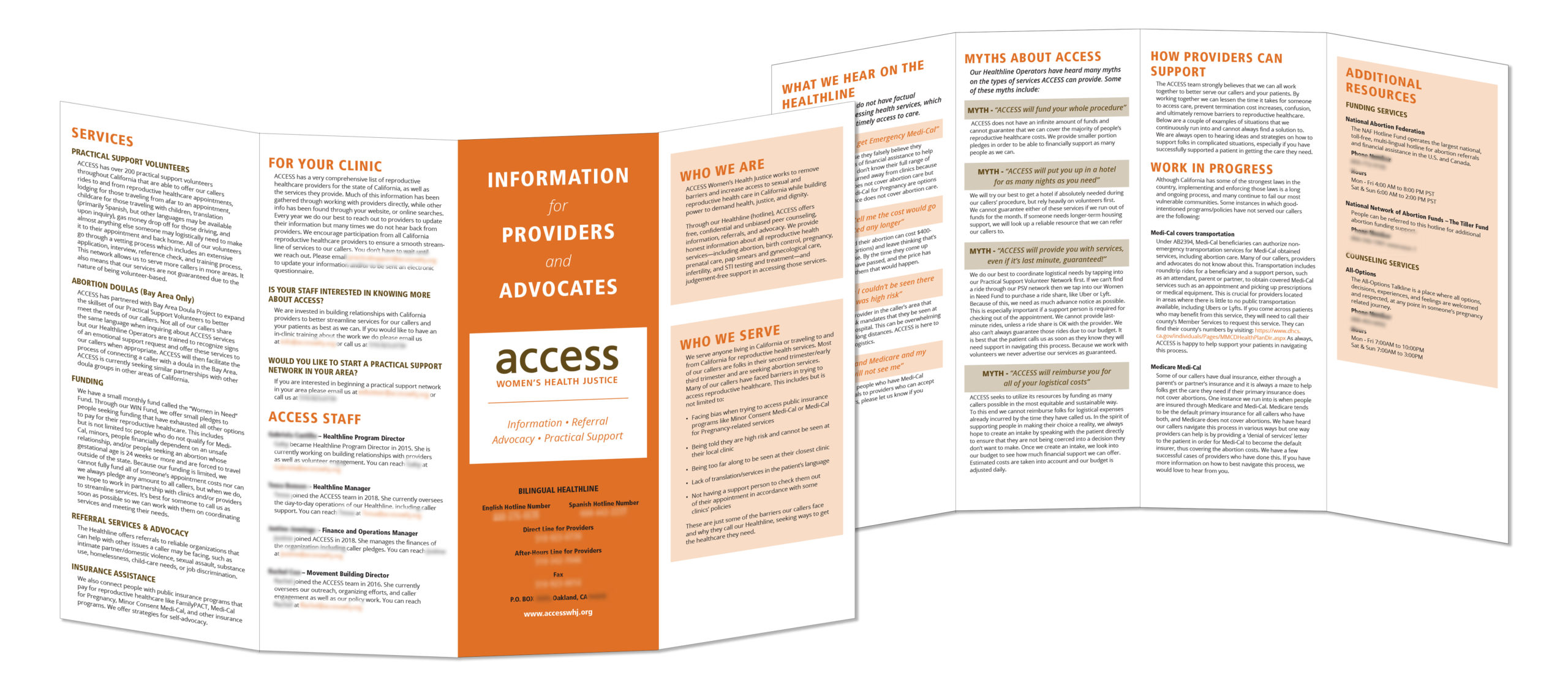
The Challenge — Provider and advocate brochure
ACCESS also needed a brochure to give to the healthcare providers and advocates they work with. The brochure contained information about ACCESS as an organization, as well as important topics such as what services they do and do not provide.
The Solution
To present a lot of information at a relatively low cost, we decided on a gatefold brochure on 11″ x 17″ paper, in black and ACCESS’ signature colors. I love working with type, and this all-text project was a good challenge:
- I used the all-caps, letter-spaced style of the logo tagline for the primary and secondary heads, in different colors and sizes.
- I created further hierarchy and provided additional white space on the page by indenting the text.
- Email addresses and URLs were called out in burnt orange.
- Quotes were rendered in italics in orange or sepia, with a matching box background.
I’ve removed contact and other identifying information.