NICOLA GINZLER

Senior Graphic Designer
Search
Close this search box.

The Transgender District—Entrepreneur Accelerator Program 2022

Type of Work: ,
Type of Client: ,

In 2021, San Francisco’s Transgender Cultural District created an Entrepreneur Accelerator Program which gave a select group of transgender first-time entrepreneurs access to business help: business development information, a seed money grant, a website and branding.

(Here are three logos I created for 2021 participants.) I also created logos and style guides for 2022 participants; here are three.


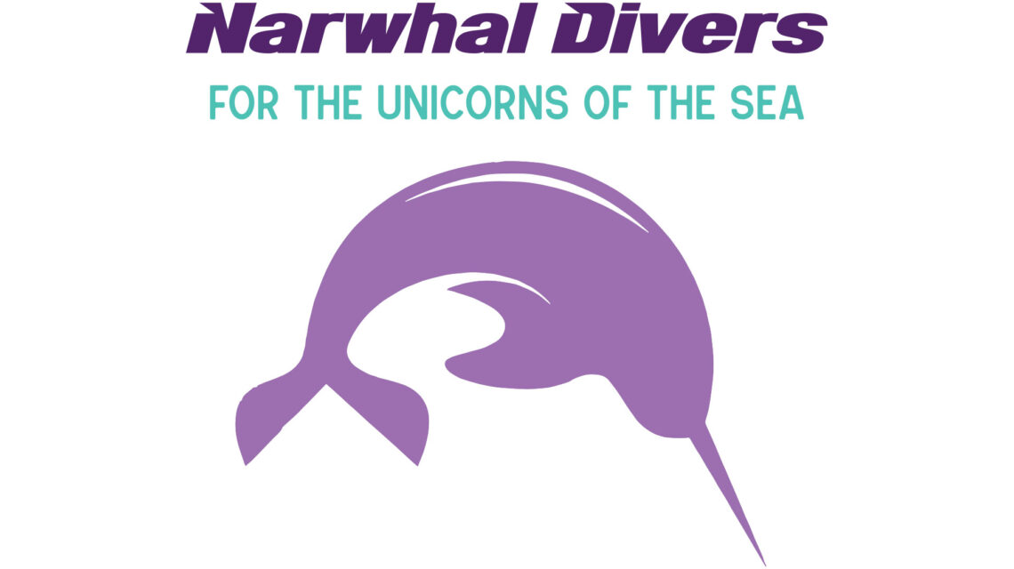
Narwhal Divers by Niko Kowell

Niko Kowell is a veteran scuba diver and scuba diving teacher. He runs an informal “queer and trans dive club” to give access to the expensive, exclusive sport to people traditionally barred from it financially. He’s now throwing his full energy into formalizing the club, which will operate in the San Francisco Bay Area, with trips to other parts of the world.

Narwhals are marine mammals with a single long tusk, earning them their nickname of “unicorns of the sea.” Niko wanted to call out the uniqueness of trans folk by using the reference in the Narwhal Divers’ club name and tagline.

We used a color palette of vibrant pastels drawn from tropical marine life, with the addition of the dark purple for the club name. For the three additional logos shown here, Niko spiced up the taglines with naughty wording and we changed the club name and image to black.

Here’s an update of Narwhal Divers’ success!

"Narwhal Divers" in a dark purple bold italic sans serif font; centered underneath is subhead FOR THE UNICORNS OF THE SEA" in teal sans serif all caps; underneath that is a light purple stylized illustration of a narwhal curved downwards in a dive.
“Narwhal Divers” in a dark purple bold italic sans serif font; centered underneath is subhead “FOR THE UNICORNS OF THE SEA” in teal sans serif all caps; underneath that is a light purple stylized illustration of a narwhal curved downwards in a dive.
Secondary logos with black headlines and narwhal illustrations: left-hand logo has subhead "GET WET WITH US" in light purple type; center logo has subhead "THINGS LOOK BIGGER UNDERWATER" in teal; right-hand logo has subhead 'EXPLORE SOME NEW GEAR WITH US" in magenta.
Secondary logos with black headlines and narwhal illustrations: left-hand logo has subhead “GET WET WITH US” in light purple type; center logo has subhead “THINGS LOOK BIGGER UNDERWATER” in teal; right-hand logo has subhead ‘EXPLORE SOME NEW GEAR WITH US” in magenta.

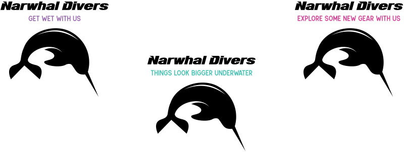
Narwhal Divers style guide shows logo typefaces, colors, approved placements and clear space.


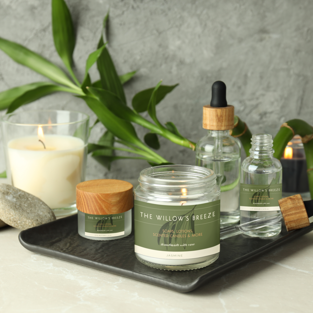
The Willow’s Breeze by Salome El

Salome El is already making her “home spa” products in her studio and selling them online, and is looking to reach a wider audience; her long-range plans include a storefront. She wanted a logo that reflected her product line: sophisticated yet natural, luxurious but not out of reach for ordinary people.

We decided on a palette of cream, greens and butterscotch. Salome had originally wanted a realistic illustration of an entire willow tree, but ended up loving the stylized, leafy branch I presented among more literal options. I chose the header/subhead typeface especially because of its unique and graceful “W,” the openness of the “O” and the unusual ampersand, “Handmade with care,” of course, is in a handwritten-looking script.

Packaging follows next! I’ll keep you updated.

Olive green horizontal rectangular background with "THE WILLOW'S BREEZE" in cream-colored sans serif all-caps font, with horizontal rules above and below; black stylized line drawing of a willow branch with dark and medium green leaves behind type and in front of rules; "SOAPS, LOTIONS, SCENTED CANDLES & MORE" in butterscotch-colored sans serif all-caps font below bottom rule; below that, "Handmade with care" in cream-colored script sentence-cap font.
Olive green horizontal rectangular background with “THE WILLOW’S BREEZE” in cream-colored sans serif all-caps font, with horizontal rules above and below; black stylized line drawing of a willow branch with dark and medium green leaves behind type and in front of rules; “SOAPS, LOTIONS, SCENTED CANDLES & MORE” in butterscotch-colored sans serif all-caps font below bottom rule; below that, “Handmade with care” in cream-colored script sentence-cap font.

Logo and product mockup. Logo: Olive green horizontal rectangular background with "THE WILLOW'S BREEZE" in cream-colored sans serif all-caps font, with horizontal rules above and below; black stylized line drawing of a willow branch with dark and medium green leaves behind type and in front of rules; "SOAPS, LOTIONS, SCENTED CANDLES & MORE" in butterscotch-colored sans serif all-caps font below bottom rule; below that, "Handmade with care" in cream-colored script sentence-cap font.
Product mockup: labels have narrow cream-colored border at bottom with green all caps text. Small frosted glass jar has label reading "EYE BUTTER / 2 oz."; clear glass jar holding lit white candle has label reading "JASMINE"; small clear bottle has label reading "LIP SERUM 2 FL. OZ."

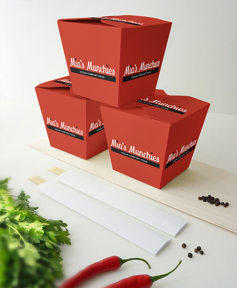
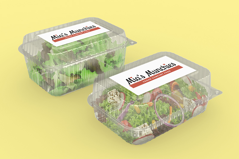
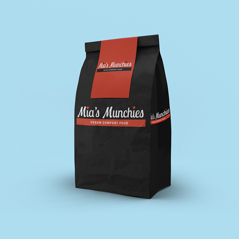
Mia’s Munchies: Vegan Comfort Food by Mia Satya

Mia Satya is an experienced “plant-based” chef with a Tex-Mex flair, who’s already had exposure at popups around the San Francisco Bay Area. Now she’s looking to run her own popups, move into “Byte Fridge” locations (high-end vending machines in businesses and break rooms) and eventually operate a full, delivery-only restaurant. Some of her current “vegan comfort food”: Veggie Frittatas, Avocado Toast on Sourdough, Texan Chili, Jalapeño Poppers, French Fries and Deep-Fried Oreos*, as well as many offerings with meat, cheese and eggs made with plant protein.

Keep a lookout for Mia’s Munchies in your break room—even if you’re not vegan, there’s sure to be something you’ll find yummy.

*Yes, Oreos are vegan! They have no animal ingredients (but the machinery they’re made on may have trace amounts of milk from other products).

Mia's Munchies logo for use on white backgrounds: "Mia's Munchies" in black script type with red hearts for dots on the "i"s; red bar underneath type with "VEGAN COMFORT FOOD" in white sans serif all caps type, centered in bar. I created two other color versions for use on red and black backgrounds.
Mia’s Munchies logo for use on white backgrounds: “Mia’s Munchies” in black script type with red hearts for dots on the “i”s; red bar underneath type with “VEGAN COMFORT FOOD” in white sans serif all caps type, centered in bar. I created two other color versions for use on red and black backgrounds.


Photograph of three stacked takeout containers with black and white logos on red boxes; light gray background with cilantro, two red hot peppers, black peppercorns, two sets of chopsticks.
Photograph of two clear food containers filled with green salad; red and black logos on white labels; yellow background.
Photograph of black lunch bag with red and white and logos on front and side; black and white logo on red sticker closing bag; light blue background.
The owner of this website has made a commitment to accessibility and inclusion, please report any problems that you encounter using the contact form on this website. This site uses the WP ADA Compliance Check plugin to enhance accessibility.