San Francisco’s Transgender Cultural District created an Entrepreneur Accelerator Program which gave eight transgender people of color access to business help: business development information, a small seed money grant, a website and branding.
I created logos, style guides and social media graphics for the participants; here are three.
Fluid Coffee & Events logo
Fluid Coffee & Events will be launched as a café, hangout space and event venue in San Francisco’s Tenderloin neighborhood, home to many transgender people. Fluid will be especially but not exclusively for transgender youth, for whom there are few welcoming, safe spaces in the city.
For the type, I used a looping cursive typeface reflecting the name, and strong caps for the tag; purple to represent queer issues; blue and pink from the transgender flag; and bright yellow accents to bring a feeling of youth and dynamism.
The style guide shows brand fonts, colors and usage.
Adsit Media
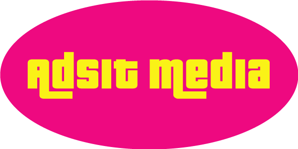
Adsit Media’s founder says: “Adsit Media produces books, videos, documentaries, and digital media that humanize marginalized people and grow people’s critical thinking.” The client asked for eye-catching type and colors to match her energetic vision of and plans for Adsit. I used a stylized, blocky sans serif typeface with interlocking letterforms in bright yellow to convey strength and vitality, with the curves of the surrounding oval in saturated pink as counterpoint.
The style guide shows brand fonts, colors and usage.
Ishtar Consulting
Ishtar Consulting builds apps for LGBTQ+- and Black-run businesses, particularly those with transgender leaders—this includes community organizations, corporations and academic institutions. The client wanted a palette of blues and a strong typeface. He also wanted to reference the ancient Mesopotamian goddess Ishtar, deity of wayfinding, intersection and direction, by incorporating a “Star of Ishtar” or compass-like eight-pointed star. We chose this image; I rounded the edges to give it a more accessible and organic feel.
The style guide shows brand fonts, colors and usage.