By Margaret Rhodes from Wired magazine:
Self-Censoring Font Redacts Words the Feds Are Watching For
Seen, a font from designer Emil Kozole, recognizes National Security Agency spook words and blacks them out.
Image credit: Emil Kozole
To create it, Kozole programmed an Adobe OpenType font to recognize suspicious terms, then smear them with bold, black lines.
Image credit: Emil Kozole
“The idea isn’t to make a terrorist tool but a conversation starter,” Kozole says, “so people will see and ask themselves why some of the words are on the list and why some aren’t.”
Image credit: Emil Kozole
If Edward Snowden taught us anything, it’s that the government is always watching, always listening. Nothing escapes its notice, even that seemingly innocuous Facebook post you made about your trip to Mexico or your tweet about the amazing pork belly you had last night.
The Department of Homeland Security has a list of 370 words it tracks on social media to identify possible terroristic or public health treats and follow unfolding natural disasters. That list, included in the 2011 Analysts Desktop Binder, includes obvious red flags like Al-Qaeda, North Korea, and suicide bomber. But seemingly banal words like help, pork, and snow are on there, too.
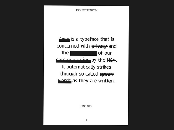
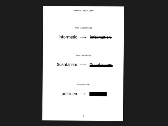
Seen, a downloadable font from designer Emil Kozole, brilliantly illustrates these linguistic triggers by redacting these so-called spook words. Type something as innocent as “facility” or “San Diego” and before your cursor even jumps a space ahead, the word is hidden behind a black strike-through. It’s disturbing, frustrating, and alarming, and that’s the point.

Image credit: Emil Kozole
Kozole began working on Seen in 2013 after Snowden released a trove of documents outlining the scale of US surveillance. He’d just moved to London from Slovenia to begin a master’s design program at Central Saint Martins. The designer was fascinated by digital surveillance, and the spook words identified by the Department of Homeland Security and Britain’s spy agency, the Government Communications Headquarters.
The designer programmed a custom-made Adobe OpenType font to recognize and redact these words, taken from a list the government released three years ago in response to a Freedom of Information Act request. When a hot word from the DHS or GCH database forms, the code in the typeface automatically strikes it out, leaving your document smeared with bold, black lines.
Seen isn’t meant to help you evade the government’s snooping eyes, but make you think more about why the government might be snooping at all.
“The idea isn’t to make a terrorist tool but a conversation starter,” Kozole says, “so people will see and ask themselves why some of the words are on the list and why some aren’t.”


