Helvetica’s evil twin, Hellvetica, will haunt your nightmares
“We wanted people to see this in the wild and be like, ‘What the HELL is wrong with my computer?’” says the typeface’s creator, Matthew Woodward.
Hold your favorite graphic design tome close. We now know what the classic typeface Helvetica would look like if it came from the underworld. Yes, it will keep type enthusiasts up at night.
(Devastatingly, the typeface is no longer available.)
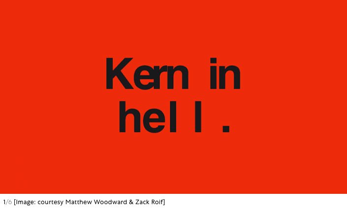
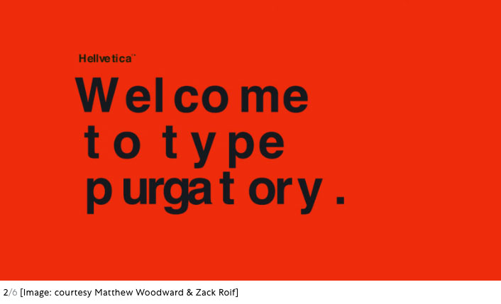
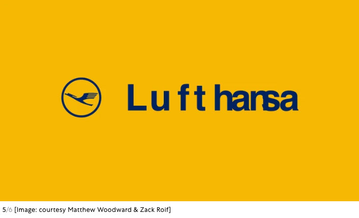
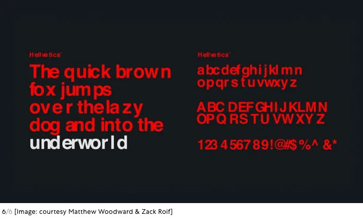
Zack Roif and Matthew Woodward, associate creative directors at the international advertising agency R/GA, along with art director Emily Stetzer, and copywriters Namwan Leavell and Chloe Saintilan, have released a new typeface available free to download called Hellvetica, and it will make all your worst kerning nightmares come true. While each character has the same form as the classic typeface it’s riffing on, Hellvetica utilizes inconsistent, variable spacing between each letterform to give an overall effect that something has gone terribly astray. Nope, that wasn’t a mistake. You might just say it was intentionally erroneous.
I asked the Roif and Woodward why they played with Helvetica in particular. Was it simply because it’s punny? According to Roif, who developed the concept, their initial reaction to the pun (“we definitely all shamelessly laughed”) was part of it, but it was also a sign they could be on to something bigger. As a design classic, Helvetica was ripe for a shake-up. “Flipping what is widely considered to be the most iconic ‘good design’ font of all time on its head is about as evil as it gets in the design world,” Roif says.
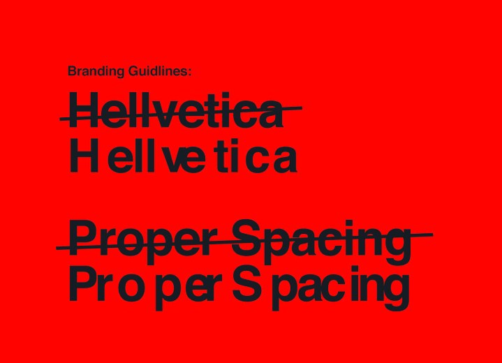
You might think that developing brand guidelines for a typeface that runs counter to best practice would be difficult. After all, how can you be consistently incorrect in a purposeful way? It happens with small changes that add up. “The smallest of adjustments to the margin of each character makes such a big difference,” says Woodward, who developed the typeface itself. “Your brain automatically wants to fix it, and that’s why we love it. I wouldn’t say it was difficult, but it was definitely cringe-worthy.”Beyond the sheer fun of the concept, the project is a study in playfulness and rule-breaking, “an exercise in going against the ‘designer instincts’ to fix up that awful kerning.” If Helvetica can be messed with, then nothing is precious. “Hundred percent break the rules,” says Woodward. “Don’t listen to your gut. Forget your training . . . and make that logo kern in hell!” May it inspire a bit more devil’s play in design, all year long.
(Devastatingly, the typeface is no longer available.)


