NICOLA GINZLER

Senior Graphic Designer
Search
Close this search box.

Type descriptions and filters like the below find their way into my most fervid dreams.

The talented and hardworking presentation designer Mimi Heft (https://www.mimiheftdesign.com/) told me about Ilovetypography.com. Hire her for all your presentation needs! Original post is at https://fonts.ilovetypography.com/cedars?mc_cid=b9d99d1a93&mc_eid=b2ec9d6f4f.

CEDARS+ is a new and revolutionary way to describe type via formal characteristics resulting from the movement of the writing tool that created the letterforms and the path it traces. Here you are able to filter your selection based on the following:

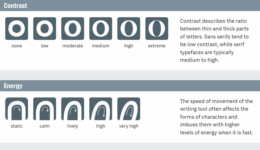
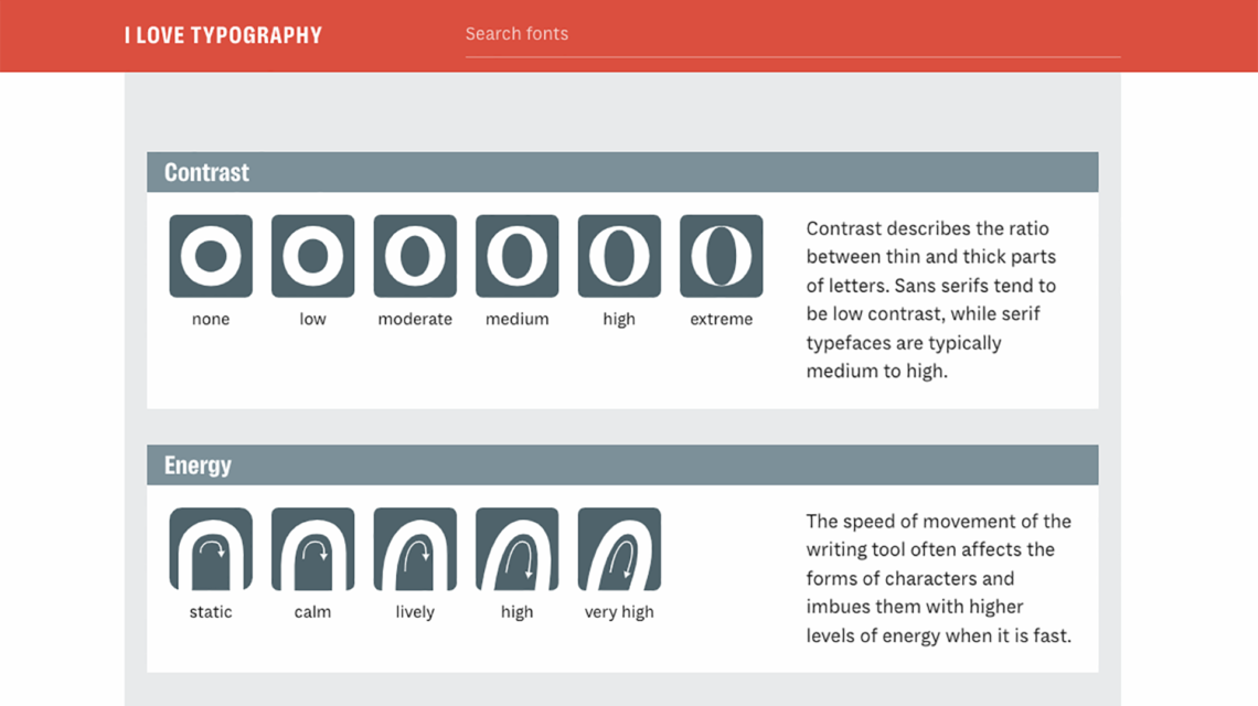
Contrast: how much difference between thin and thick parts of the letter

Energy: the energy level based on speed of movement of the tool drawing the letter

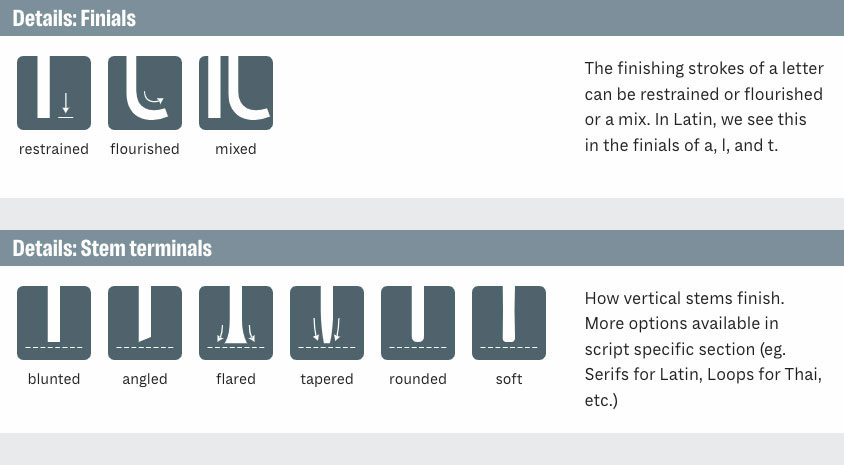
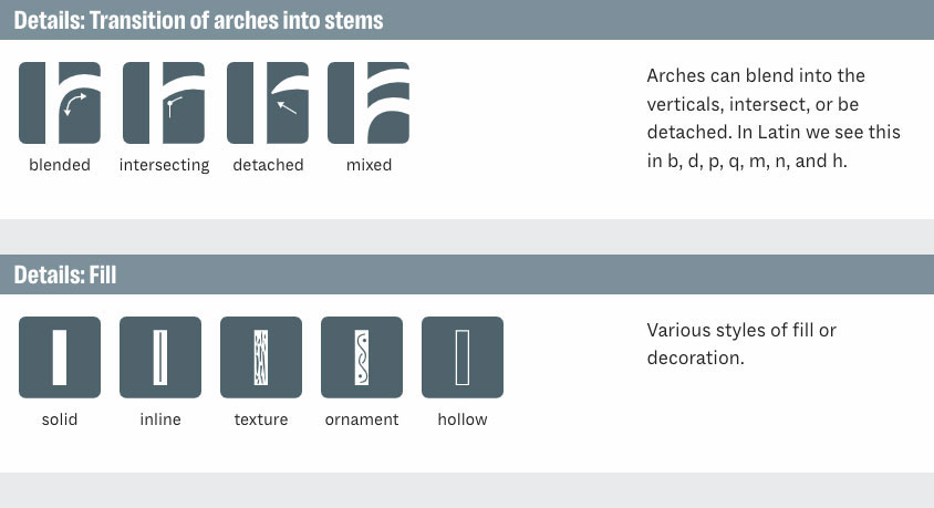
Details: how the finials look; how the stems finish; how arches transition into vertical strokes; and how the outlines of letters are filled

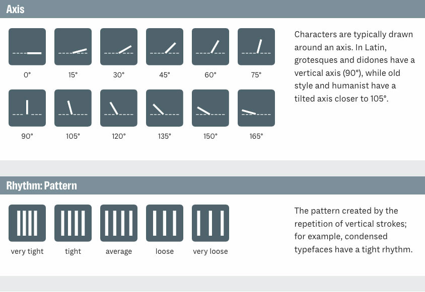
Axis: this relates to the angle at which the writing tool is cut and held

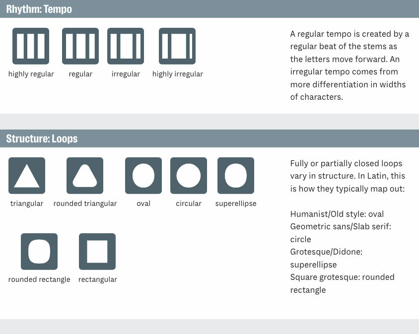
Rhythm: if it is tight or loose; and the difference in width between narrow and wide letters

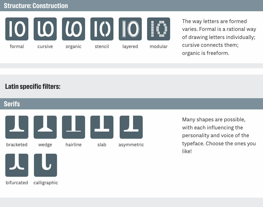
Structure: the forms of closed loops and how letters are constructed

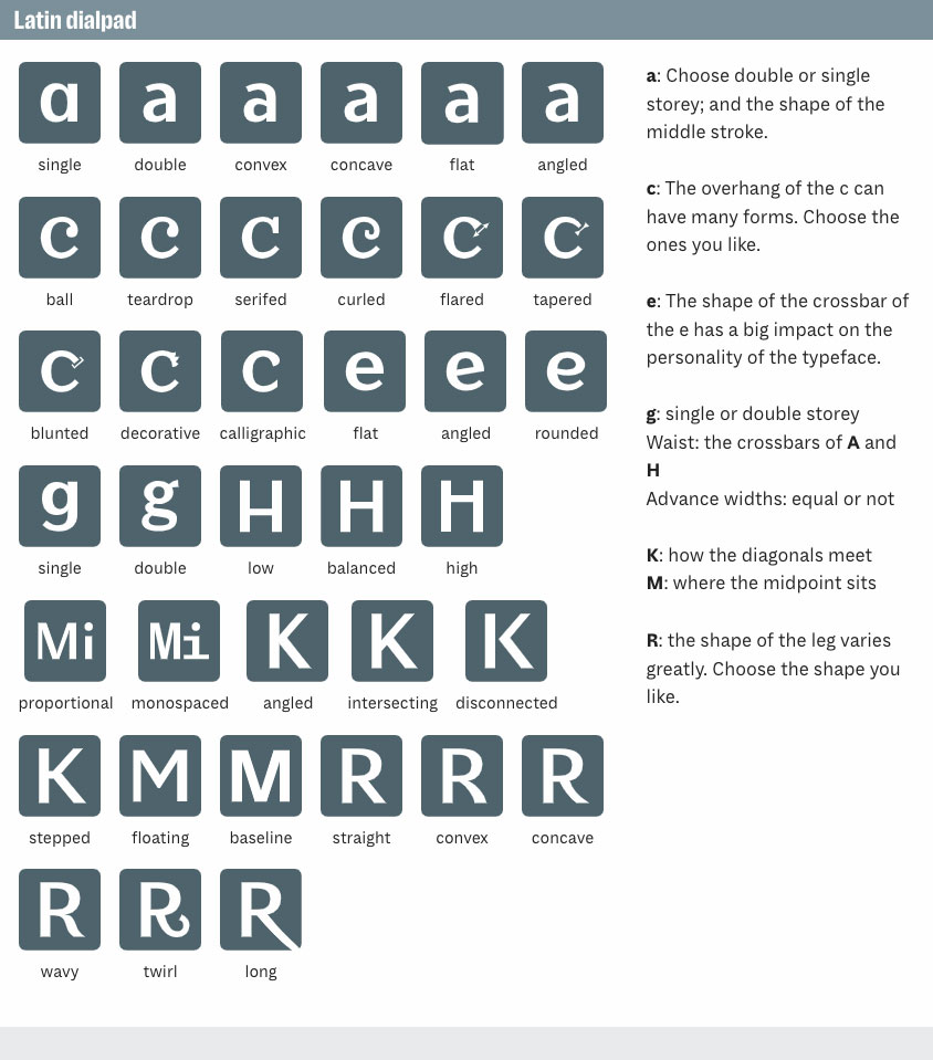
Latin specific descriptors!

Hx: proportion of x-height to cap height

Serifs: pick the shape you like!

Waist: height of the crossbars of A and/or H

Advanced widths: if the typeface is proportional or monospaced

a: single or double storey; and the shape of the middle stroke

c: shape of the overhanging terminal

e: shape of the crossbar

g: single or double storey

K: how the diagonal strokes meet

M: where the midpoint sits

R: shape of the leg

C = Contrast: Contrast describes the ratio between thin and thick parts of letters. Sans serifs tend to be low contrast, while serif typefaces are typically medium to high. Range: none, low, moderate, medium, high, extreme
E = Energy: The speed of movement of the writing tool often affects the forms of characters and imbues them with higher levels of energy when it is fast. Range: static, calm, lively, high, very high
D = Details: Finials - The finishing strokes of a letter can be restrained or flourished or a mix. In Latin, we see this in the finials of a, l, and t. Range: restrained, flourished, mixed
D = Details: Stem terminals - How vertical stems finish. More options available in script specific section (eg. Serifs for Latin, Loops for Thai, etc.). Range: blunted, angled, flared, tapered, rounded, soft
D = Details: Transitions of arches into stems - Arches can blend into the verticals, intersect, or be detached. In Latin we see this in b, d, p, q, m, n, and h. Range: blended, intersecting, detached, mixed 
D= Details: Fill - various styles of fill or decoration. Range: solid, inline, texture, ornament, hollow
A = Axis: Characters are typically drawn around an axis. In Latin, grotesques and didones have a vertical axis (90°), while old style and humanist have a tilted axis closer to 105°. Range: 0º-90º.
R = Rhythm:  The pattern created by the repetition of vertical strokes; for example, condensed typefaces have a tight rhythm. Range: very tight - very loose
R = Rhythm: Tempo - A regular tempo is created by a regular beat of the stems as the letters move forward. An irregular tempo comes from more differentiation in widths of characters. Range: highly regular - highly irregular.
S = Structure: Loops - Fully or partially closed loops vary in structure. In Latin, this is how they typically map out:
Humanist/Old style: oval
Geometric sans/Slab serif: circle
Grotesque/Didone: superellipse
Square grotesque: rounded rectangle
S = Structure: Construction - The way letters are formed varies. Formal is a rational way of drawing letters individually; cursive connects them; organic is freeform. Range: formal, cursive, organic, stencil, layered, modular.
Latin specific filters: Serifs - Many shapes are possible, with each influencing the personality and voice of the typeface. Choose the ones you like! Range: bracketed, wedge, hairline, slab, asymmetric, bifurcated, calligraphic
a: Choose double or single storey; and the shape of the middle stroke. Range: single, double, convex, concave, flat, angled.

c: The overhang of the c can have many forms. Choose the ones you like. Range: ball, teardrop, serifed, curled, flared, tapered, blunted, decorative, calligraphic.

e: The shape of the crossbar of the e has a big impact on the personality of the typeface. Range: flat, angled, rounded.

g: single or double storey. Range: single, double.

Waist: the crossbars of A and H Range: low, balanced, high.

Advance widths: equal or not. Range: proportional, monospaced.

K: how the diagonals meet. Range: angled, intersecting, disconnected, stepped.

M: where the midpoint sits. Range: floating, baseline.

R: the shape of the leg varies greatly. Choose the shape you like. Range: straight, convex, concave, wavy, twirl, long.
The owner of this website has made a commitment to accessibility and inclusion, please report any problems that you encounter using the contact form on this website. This site uses the WP ADA Compliance Check plugin to enhance accessibility.