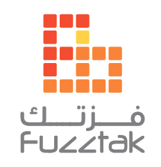
The evolution of the Fuzztak logotype by Lebanese designer and calligrapher Joumana Medlej:
The logo for Fuzztak, the game distribution platform operated by Quirkat of which I am part. Both companies underwent a rebranding in late 2010 and I needed to design a logo that would be game-related, iconic, convenient for use in print and online, on light and dark backgrounds, and that would somehow express our Middle-Eastern, bilingual identity as that was the way in which we most stand out.
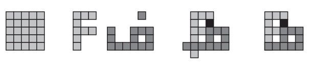
I dearly wanted to avoid attempting to express the Middle-East pictorially, as that would be unavoidably cliché. I thought instead of a typographic treatment using the letter F in both languages, which look like this:

At the same time, an appropriate way to refer to digital gaming was to evoke pixels, by using a grid of squares. This fit perfectly for two reasons: working with grids was one of the ways in which Kufic script is created, and it would complement the grid of circles in the Quirkat logo:

Treated as grids, the two letters merged beautifully in a symmetrical design that had a square ratio and was even heart-shaped.
The “pixels” were spaced out, given rounded corners, and the two logos were further tied together by keeping the same color scheme and font. And voilà:


