NICOLA GINZLER

Senior Graphic Designer
Search
Close this search box.
Cheverísimo label mockup and logo. Mockup: clear bottle is filled with opaque orange-yellow liquid. Label has the Cheverisimo logo on a white background; below that, "Orange Passion"; "orange - apple - berries"; 375 ml / 12.6 oz." Logo: Flat fruit and vegetable shapes arranged partially overlapping horizontally, with Cheverísimo in black all caps below. From left to right: yellow-orange pepper, green celery, purple beet/ red apple, yellow pineapple, green grapes.

The Transgender District—Entrepreneur Accelerator Program 2023

Type of Work: ,
Type of Client: ,

2023 is the third year of San Francisco’s Transgender Cultural District Entrepreneur Accelerator Program (EAP). The program gives a select group of transgender first-time entrepreneurs access to business help: business development information, a seed money grant, a website and branding.

Below are three logos and style guides I created for 2023 participants. (Here are three 2021 logos and three from 2022.)


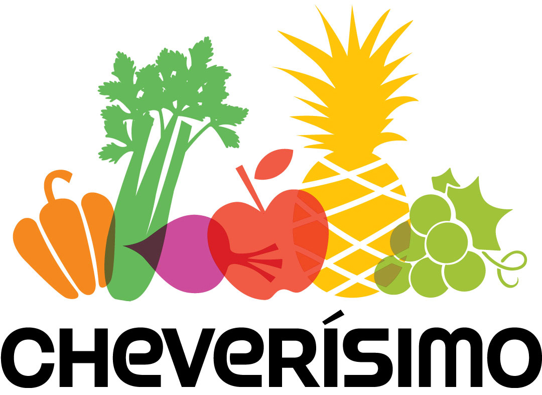
Cheverísimo by Papo Rebolledo

Papo Rebolledo is an experienced chef with plans to open a storefront for fresh juices and plates. From the Transgender District’s EAP graduation announcement:

Cheverísimo centers health and wellness for the community by using organic locally sourced ingredients. We offer organic cold-pressed elixirs and a variety of nutrient-rich plant-based foods.

Cheverísimo’s mission is to inspire people to build a better relationship with food by providing holistic alternatives that can nourish their life.

The business name comes from Colombian Spanish slang: “chévere” means “cool”; “cheverísimo” means “the coolest.”

For the logo I used a color palette of vibrant natural fruit and vegetable colors; the overlapping of the images hints at the blended “elixirs” the brand offers. The solid black all-caps type anchors the composition, while the lowercase “e”s provide a touch of whimsy.

Cheverísimo logo. Flat fruit and vegetable shapes arranged partially overlapping horizontally, with Cheverísimo in black all caps below. From left to right: yellow-orange pepper, green celery, purple beet/ red apple, yellow pineapple, green grapes.
Cheverísimo logo


Cheverísimo style guide shows logo typefaces, colors, approved placements and clear space.


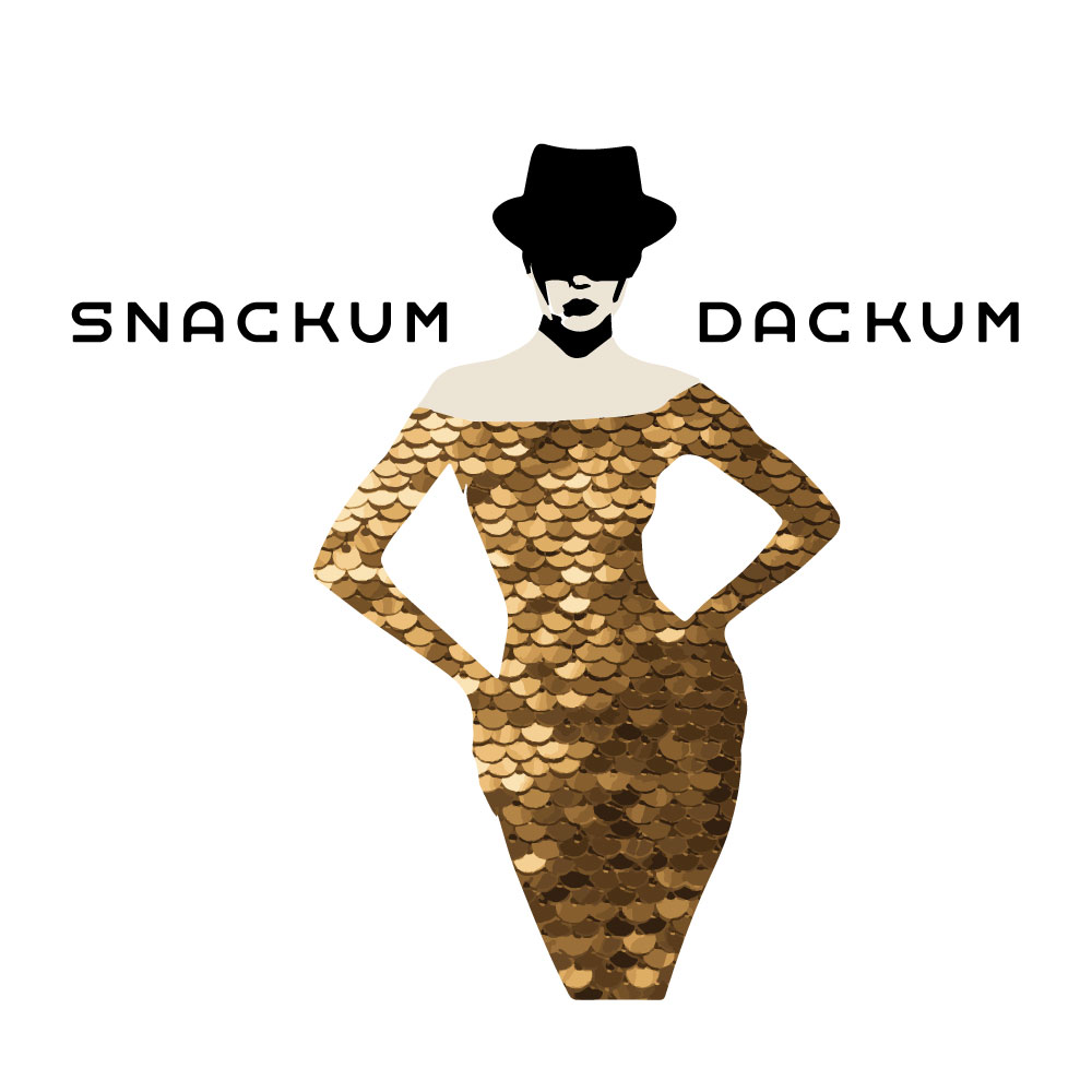
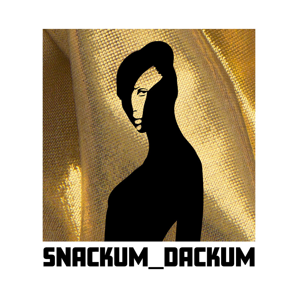
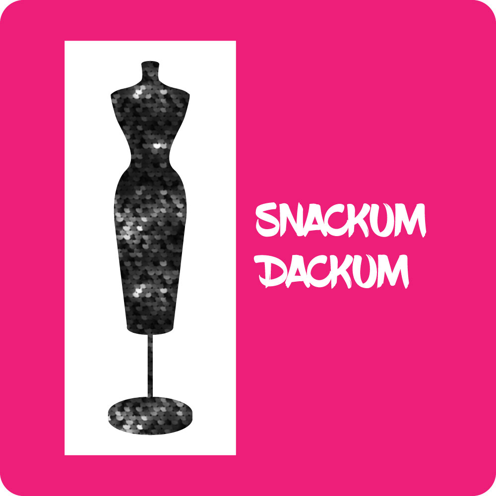
Snackum Dackum by Kipper Yanaga aka “Kipper Snacks”

From the Transgender District’s EAP graduation announcement:

Kipper Snacks is a trans entertainer, mother of the Haus of Snacks, and clothing and costume designer under the label Snackum Dackum. Specializing in drag, burlesque, and theater, all pieces are custom, one of a kind, and hand made locally in the Tenderloin district of San Francisco.

I used images of sequins and luxury fabrics to give a feeling of theatricality and opulence, and feminine silhouettes to honor Kipper’s drag clientele. Strong, distinctive type indicates that the brand is not to be trifled with! Logo versions A to C below are preliminary designs for the Snackum Dackum brand (click to enlarge).

Snackum Dackum preliminary logo design 1a. Illustration of an elegant woman from head to knees. She wears a black hat that shades her face and an off the shoulder sequin dress, Her hands are on her hips. The words "SNACKUM" and "DACKUM" appear on either side of her face in distinctive all-caps type.
Logo version A
Snackum Dackum preliminary logo design 1c. The background is a square of flowing metallic gold fabric. Against it is the black silhouette of a woman's head, neck and torso in an elegant pose. The face has cutouts showing the features of a beautiful woman, looking directly at the viewer. "SNACKUM_DACKUM" appears in all caps in black below the gold square in a strong distinctive typeface.
Logo version C
Snackum Dackum preliminary logo design 1b. A hot pink square has a long white inset rectangle on the left side. In the rectangle is the shape of an elegant full-length dressmaker's dummy. The dummy shape is filled with a sequin background. "SNACKUM DACKUM" appears in white on two lines on the right-hand side of the pink square, centered vertically. The letters have a graffiti-style brushstroke.
Logo version B

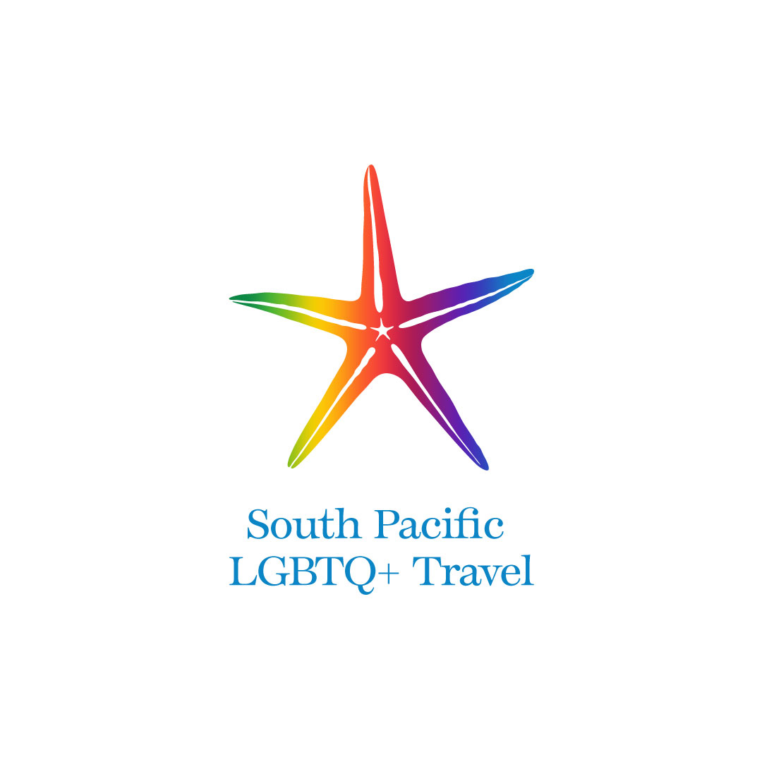
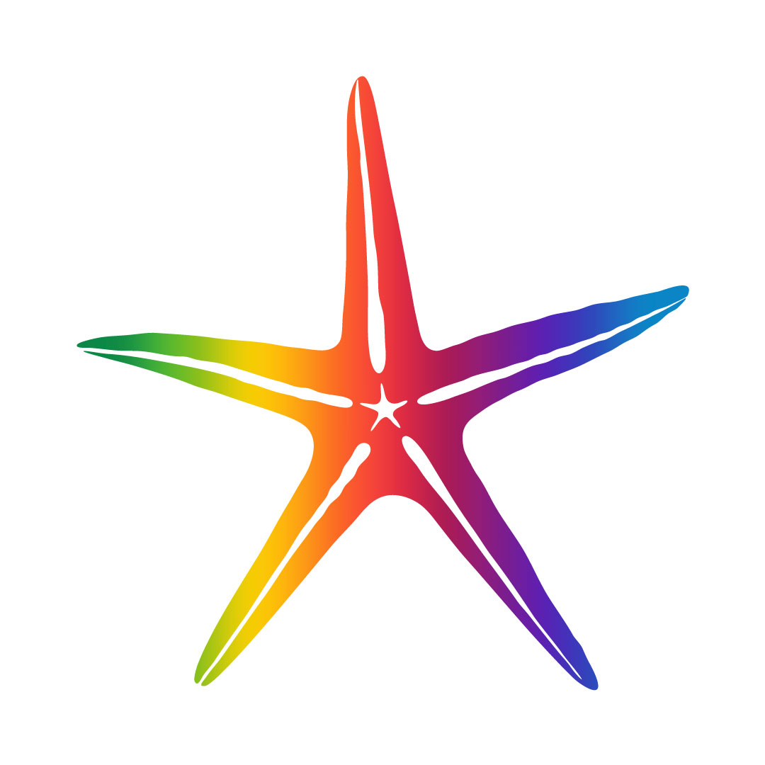
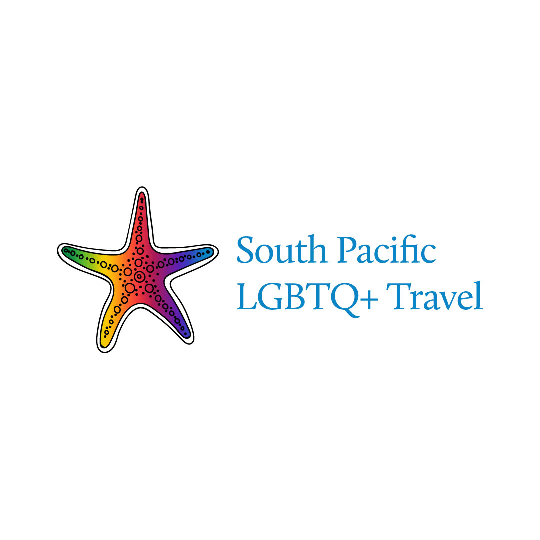
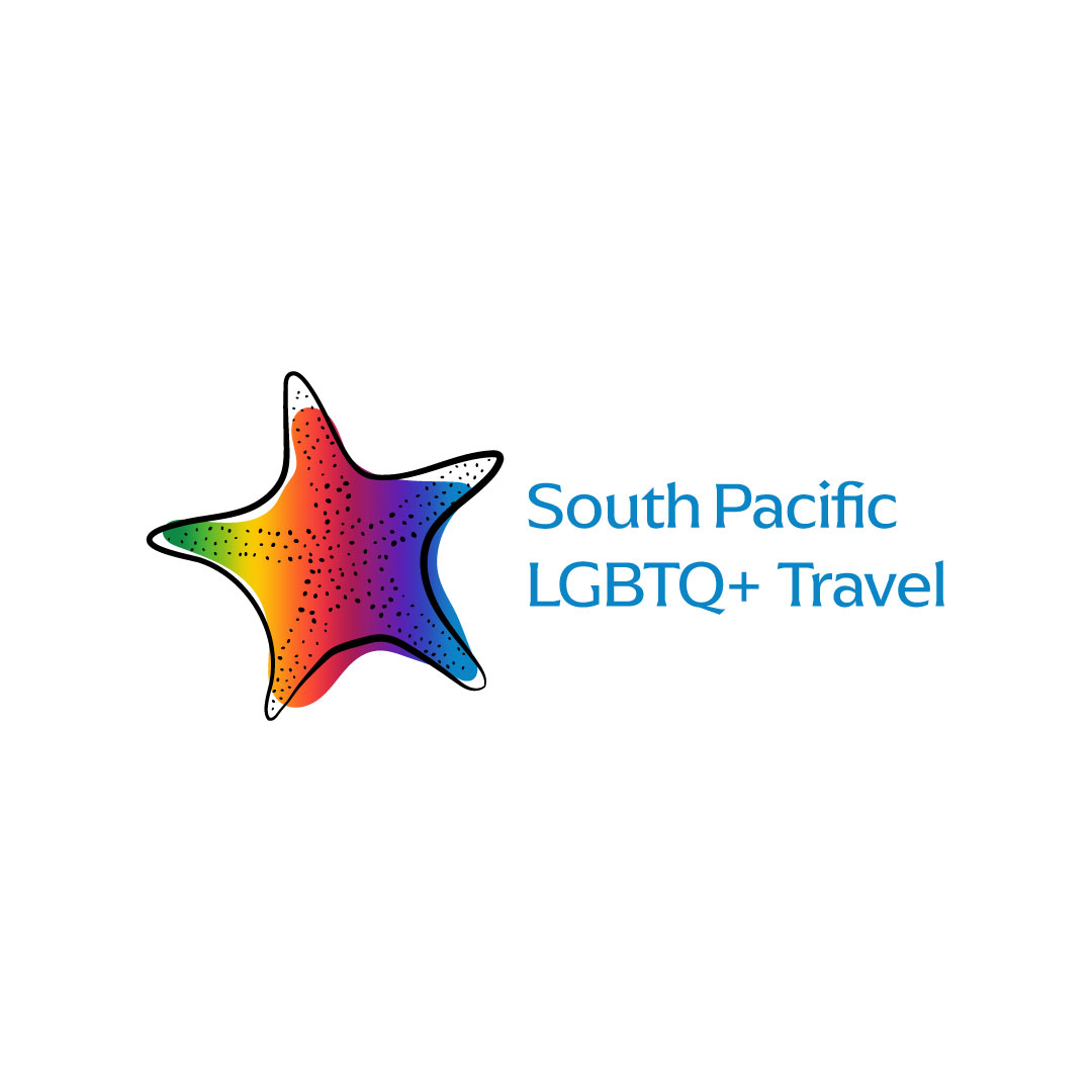
South Pacific LGBTQ+ Travel by Sulique Venus Waqa

From the Transgender District’s EAP graduation announcement:

My name is Sulique Waqa and my business is South Pacific LGBTQ+ Travel LLC. Our mission is to provide LGBTQ+ travelers and allies with the ultimate travel experience within the South Pacific.

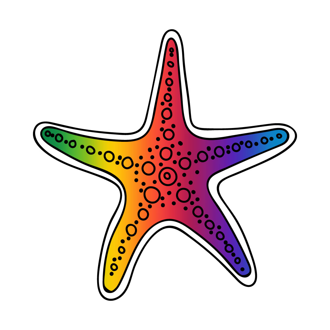
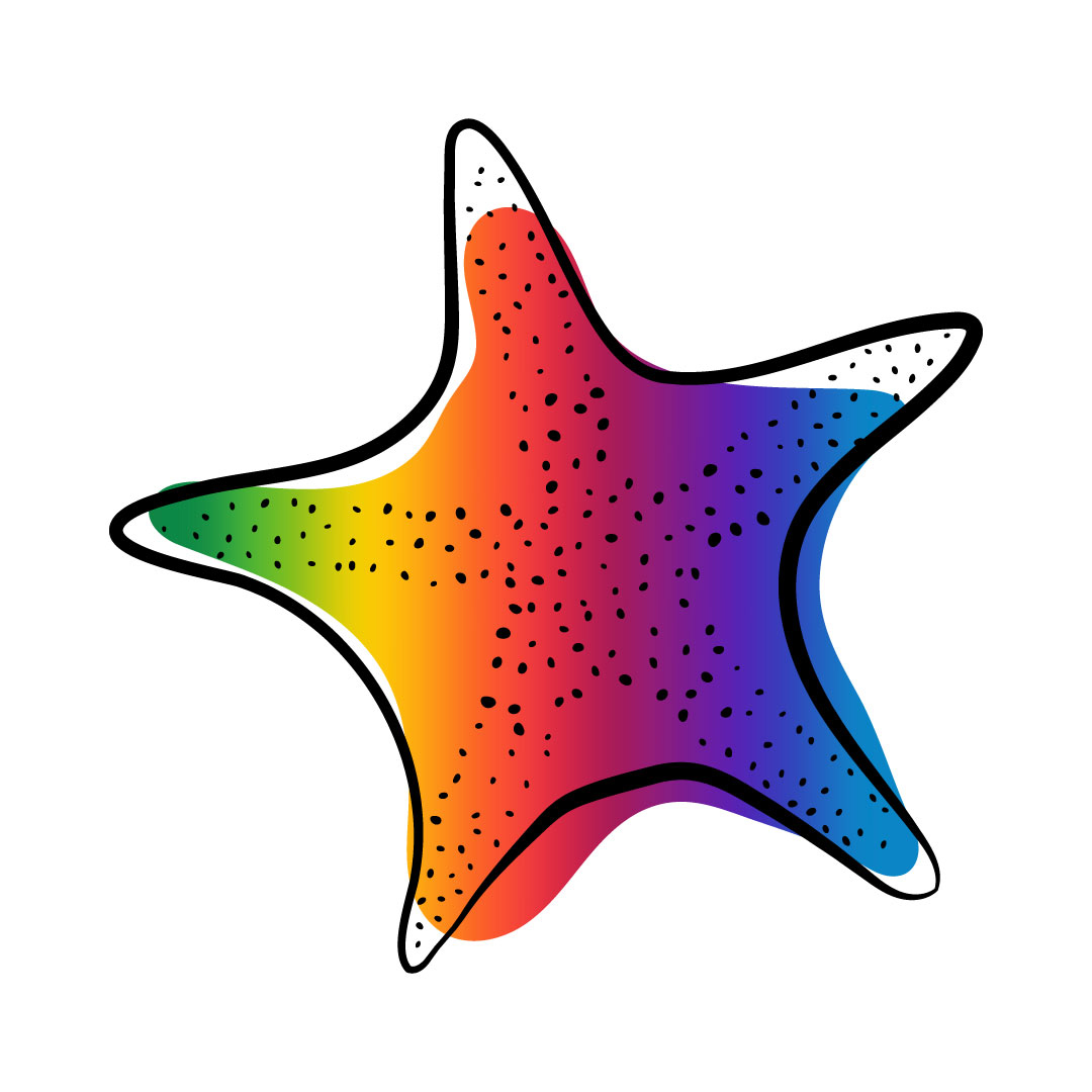
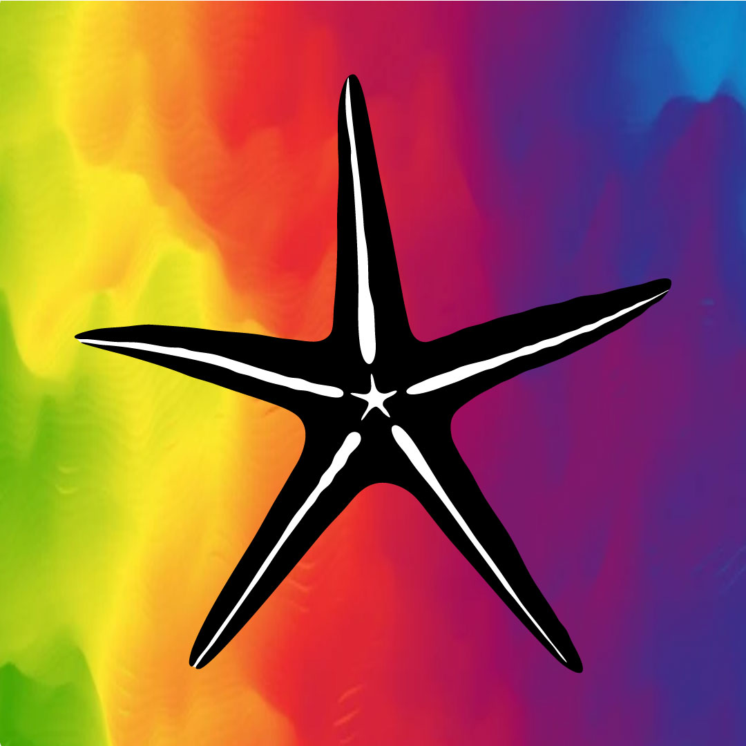
Sulique came in with a strong idea of what she wanted: a starfish and a rainbow, together if possible. The starfish represented her native island of Fiji and the rainbow, of course, her desired LGBTQ+ travelers. She wanted logos that worked in full-color rainbows, two-color purple and black, and with type in a turquoise blue representing tropical seas. Below are my first-round designs (click to enlarge).

Logo version A-rainbow. Simple vector starfish shape in black, filled in with a rainbow gradient.
Logo version A-rainbow
Logo version B-rainbow. Stylized vector starfish shape in black, filled in with a rainbow gradient.
Logo version B-rainbow
Logo version C-rainbow special. A square filled with a vibrant rainbow gradient, with a slender vector starfish shape in black and white centered in it.
Logo version C-rainbow special
Logo version C-with type. Centered, a slender vector starfish shape filled in with a rainbow gradient. Below it, "South Pacific / LBGTQ+ Travel" in a classic serif typeface in turquoise blue.
Logo version C-with type
Logo version A-purple. Simple vector starfish shape in black, filled in with purple.
Logo version A-purple
Logo version B-purple. Stylized vector starfish shape in black, filled in with purple.
Logo version B-purple
Logo version C-rainbow regular. Slender vector starfish shape filled in with a rainbow gradient.
Logo version C-rainbow regular
Logo version A-with type. On the left, a simple vector starfish shape in black, filled in with a rainbow gradient. To the right "South Pacific / LBGTQ+ Travel" in a classic serif typeface in turquoise blue.
Logo version A-with type
Logo version B-with type. On the left, a stylized vector starfish shape in black, filled in with a rainbow gradient. To the right "South Pacific / LBGTQ+ Travel" in a classic serif typeface in turquoise blue.
Logo version B-with type
Logo version C-purple. Slender vector starfish shape filled in with purple.
Logo version C-purple
The owner of this website has made a commitment to accessibility and inclusion, please report any problems that you encounter using the contact form on this website. This site uses the WP ADA Compliance Check plugin to enhance accessibility.