How Font Technologies Will Improve the Web
PARAMETRIC FONTS (original article)
Words are the primary component of content for the web. However, until a short while ago, all we had at our disposal were but a few system fonts. Adding to that, those system typefaces weren’t necessarily coherent from operating system to operating system (OS). Fortunately, Windows, macOS and Linux made up font-wise, and since then, all modern fonts have been compatible across those OS’. There’s no question, the future of web typography looks promising.
And it’s looking more and more promising, too. At the 2016 ATypI conference, the world’s biggest type design conference, Microsoft, Google, Apple and Adobe announced that they have been working on a new iteration of the OpenType standard, called variable fonts. Because it gives a lot more control to the user to modify the typeface depending on the context and device, this new version opens new opportunities for web typography and will close the gap in quality between web and print.
Variable fonts and parametric fonts are tools that will undeniably revolutionize responsive web type. They will allow graphic and web designers to explore shapes and sizes on their own and to tailor typefaces to their needs. Let’s learn the ins and outs of these new tools and how to take control of our typography.
CREATING SCALABLE, FLUID TYPOGRAPHY
Fluid layouts have been a normal part of front-end development for years. The idea of fluid typography, however, is relatively new and has yet to be fully explored. Read a related article →
Web Is Not Print With Pixels
When a paradigm shift comes forth, such as a new medium for typography, the first thing it encounters is resistance. We feel like we need to push the status quo to its limit before it can break free and make room for a new way of thinking. Typography is no exception, and for a long time designers have considered screen as paper made of pixels instead of trees. Typefaces used on computers were, and still are for the most part, just a static embodiment of physical fonts. Sure, the screen medium brought with it a number of necessary and extra elements, such as hinting, but the legacy of physical fonts still resonate strongly in type design.
Still, it feels like digital typography is behind physical typography on a range of issues, not so much in the diversity or quality of design, but in the huge fragmentation of screen media. For print design, a cast of physical fonts could be optimized depending on the sizes and shapes of the letters to increase readability. Once the fonts were produced, the result was the same every time; you got exactly what you paid for.
On a screen, it’s a lot more complicated. Once you’re lost in a forest of DPI values and different renderers, what the user gets is all up in the air. And because type designers have little incentive to produce different optical sizes, a lot of digital typefaces include only a couple of them, which hinders the readability of web typography.

When a graphic designer works on a poster, they already know how it will be displayed or distributed. They know the size of the poster, the size of the font, the colors they will use, etc. All of these are known variables that will contribute to their design choices. Also, the designer knows that, once it’s done and printed, the design will not change, and all viewers will experience the same poster.
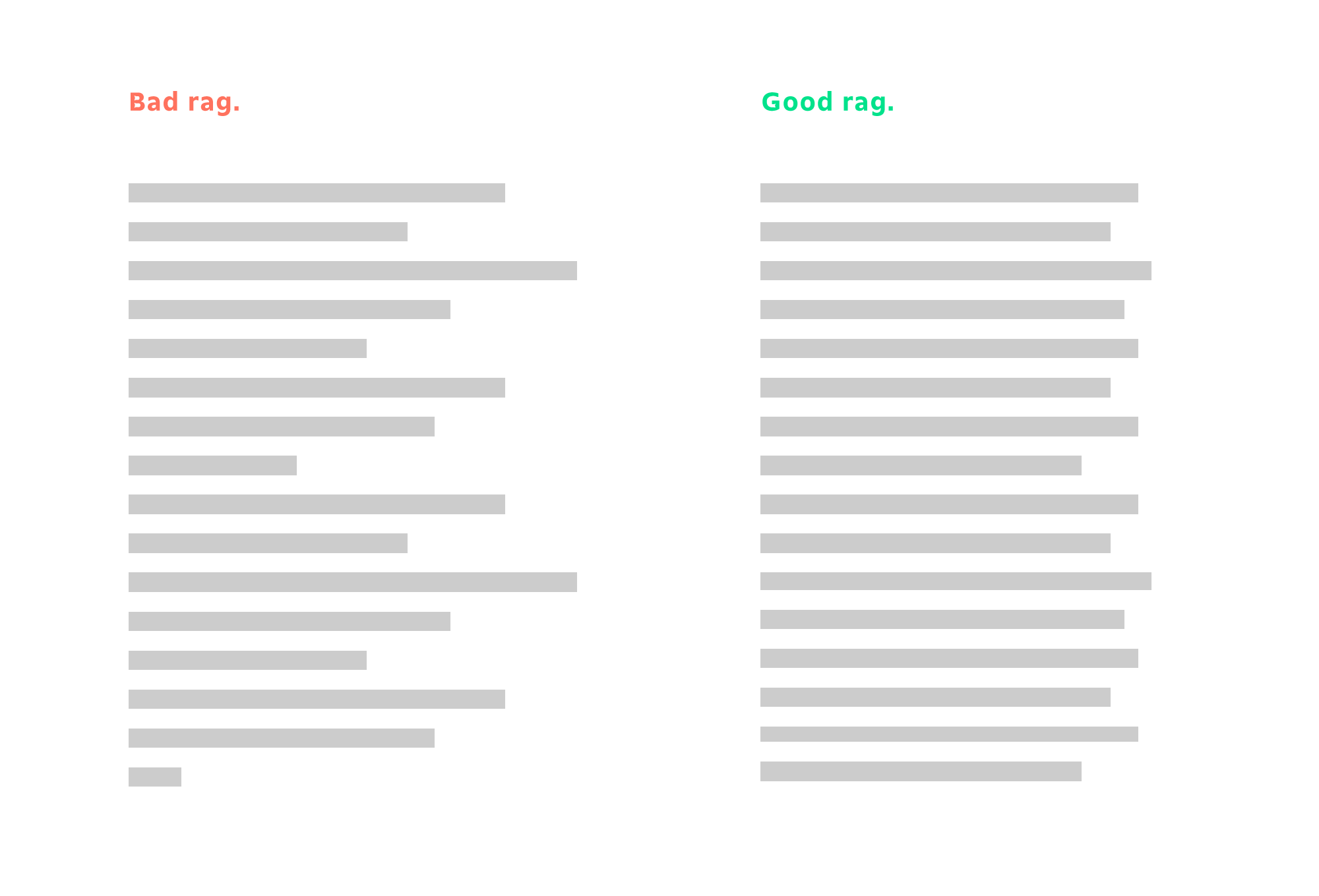
Let’s look at another aspect that is difficult to fix in web typography: rags. Rags are easy to deal with in print: You can adjust the tracking a bit, insert line breaks or hyphenate to clean up the rags. Unfortunately, achieving this degree of detail in web typography is more complicated. The width changes, and the font size can be changed by the user. The dynamism of web pages makes it difficult to make the right choice of size, letter-spacing, etc.
Fortunately, it is possible to gather some data about the context in which your website will be browsed. Thanks to CSS and JavaScript, you can adapt the typography of a web page. However, as easy as it is to change the size of a typeface gradually, it is still impossible to easily change from one variant to another progressively. The only option left is to set up breakpoints, with one variant on one side and another on the other side.
Loading more variants has a price. Adding 150 KB of fonts might not seem like a bad trade-off, but it compounds every time you add a new font to the website. Because loading time is a major factor in the bounce rate of a page, you wouldn’t want users to bail just because your web page has too much to load.
Responsive Web Type Technologies
Having described the challenges of web typography, let’s dive into the heart of the matter. We’ll go deep into the two main technologies that help us make great typography for the web: variable fonts and parametric fonts.
VARIABLE FONTS
With the ATypI 2016 conference on variable fonts, variable fonts have made a big entrance on the web. They’re pushed by the biggest names in web browsing (Google, Adobe, Apple and Microsoft), and they are here to stay.
If you want to see what people do with and say about variable fonts, we’ve gathered resources from around the web. You’ll have to use a browser that supports variable fonts, either Chrome from version 59.0 or Firefox from version 53.0:
The best source of news on variable fonts is, without question, the Twitter feed led by Nick Sherman, who collects everything on the web about variable fonts (and for which we should be grateful).
Thanks to the new variable fonts format, it will be possible to precisely adapt typography to its context. Variable fonts are based on a pretty simple idea: They contain several variants of a single typeface or, more precisely, a master variant and deltas from other ones, and the user is free to choose an interpolation of these different versions using only CSS. For example, the typeface could contain a light variant and a bold variant, and you would be able to choose a weight between these light and bold weights using CSS, like so:
 h2 {
    font-variation-settings: "wght" 200;
}
Variable fonts are picky. For them to work, all masters of the font’s base variants must have exactly the same number of points. Morphing between two shapes will be smooth and unique only if the shape you start from and the shape you end up with are similar. Nevertheless, some type creators are used to designing for masters for variable fonts. A similar concept was used for Adobe’s “multiple master” format, and type designers use interpolation to create extended families with tools such as Superpolator. Yet font-variation-settings is still not prevalent in web browsers, and as of the time of writing, only Firefox has implemented the feature. But others should soon follow suit.
There are still a lot of hurdles to jump before variable fonts become an integral part of responsive web typography. Making them is a long endeavor, and type designers now have to think about variations from the get go in order to create typefaces that take full advantage of these new features. Even though converting old typefaces to variable fonts is possible, the old ways are not necessarily suited to the new and more relevant uses that we’ve discussed:
- generating grades on the spot for screens with different DPI.
- changing the width of a typeface depending on the way the user wants to fill lines,
- modifying the optical size depending on the font’s size.
Unfortunately, variable fonts don’t solve every problem with responsive web typography. For example, how do we reduce the number of media queries? How do we handle outliers? How do we make the typeface a part of the web page?
Parametric fonts are intended to fix these issues. They differ from variable fonts in concept and production. They put customization logic at the heart of the font, instead of letting a software do the transformation. All typographic rules are inherently a part of the font, but the font is still easily customizable on the user’s side.
PARAMETRIC FONTS
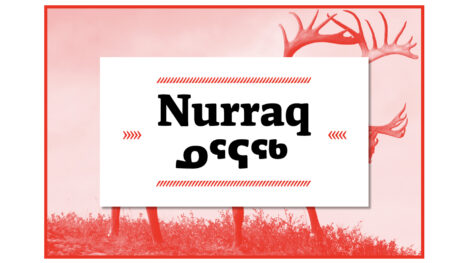
Parametric fonts are an old idea that seems to be revisited regularly by people from different backgrounds. It looks to solve the same issues that variable fonts solve but coming from a more automated way of thinking. So, it has usually been a subject tackled by computer scientists who take an interest in type design.
As with variable fonts, we’ve gathered links from around the web that deal with parametric fonts and their history:
- “Metafont,” Wikipedia
The father of all modern parametric typeface frameworks - Metaflop
A Metafont graphics interface - Metapolator
A parametric typeface creation tool based on Metaflop - “Parametric TrueType Fonts,” TrueType Typography
Information about the now discontinued FontChameleon, which is font software that let you merge fonts from a wide library - Elementar, Typotheque
A bitmap parametric font
It’s been almost 40 years since Donald Knuth pioneered the concept of parametric fonts. By creating Metafont and Tex, Knuth opened up a new era of typography, in which typefaces were created using a series of steps and equations to describe each character.
That’s the big difference between variable fonts and parametric fonts. Variable fonts are interpolated, meaning that they are confined in a design space. The designer is not able to escape this space; moreover, adding dimensions to it requires the type designer to create a new master (i.e. a completely new font). Parametric fonts are extrapolated, meaning that they emerge from a single definition. The space in which they live is not limited because they behave like a mathematical object.

Take the simple example of a circle. In a variable font world, the type designer would produce two circles and tell you, “Choose either of these circles.” In a parametric font world, the type designer would tell you, “Give the font a radius, and it will produce a circle of that radius.”

Adding a new dimension to your design space is easy with parametric fonts. For variable fonts, it would mean creating a new master. For a parametric font, you just have to bake the new dimension into the existing equations.
It is also easy to add constraints or to alter the rate of change of some points using parametric fonts. As well, you can add logic directly into the font.
How To Start Working With Parametric Fonts?
Parametric fonts are pretty easy to use, and the result can look gorgeous. As we’ll see in the examples, parametric fonts can mitigate optical differences between different colors of text. You can also create text that responds to its context or to any interface you can imagine.

François Poizat François is the hidden twin brother of Wikipedia: he knows everything about everything, or at least he knows just enough to convince his teammates that he does. A question about Schrödinger’s cat? He has the answer. But at Prototypo he is in charge of shipping a lot of very cool features. Since he got his software engineering degree at INSA, he has been involved in many research projects in France and Japan. Ohayō François!