Fortean Times is a British monthly magazine devoted to the anomalous phenomena popularized by Charles Fort. Previously published by John Brown Publishing (from 1991 to 2001) and then I Feel Good Publishing (2001 to 2005), it is now published by Dennis Publishing Ltd. As of December 2014, its circulation was just under 14,300 copies per month. The magazine’s tagline is “The World of Strange Phenomena.” (Wikipedia)
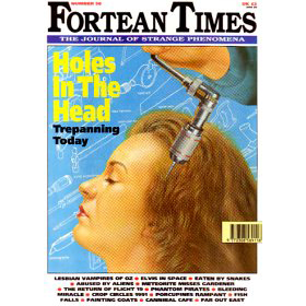
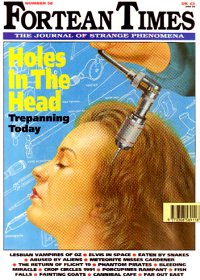
The magazine covers, particularly the more recent ones, are a glorious riot of photographs and illustrations overlaid with type announcing everything from modern-day trepanation to live burial. For the complete cover experience, go to the Fortean Times cover gallery, 1972-present.
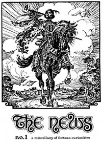
The magazine started as The News, said to be taken from Samuel Butler’s The News From Nowhere. The issues were produced on a typewriter, with headings created with Letraset (rub-down type). I haven’t been able to track down who designed the masthead name, but its sophistication makes it unlikely to be Letraset. If so, bravo.
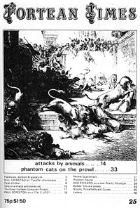
Now Fortean Times, the magazine’s masthead definitely has the Letraset look. The interior was still produced on a typewriter.
Fully typeset in A4 size!
That horrible small-caps craze of the 1990s. At least they didn’t have the final “S” in the larger size.

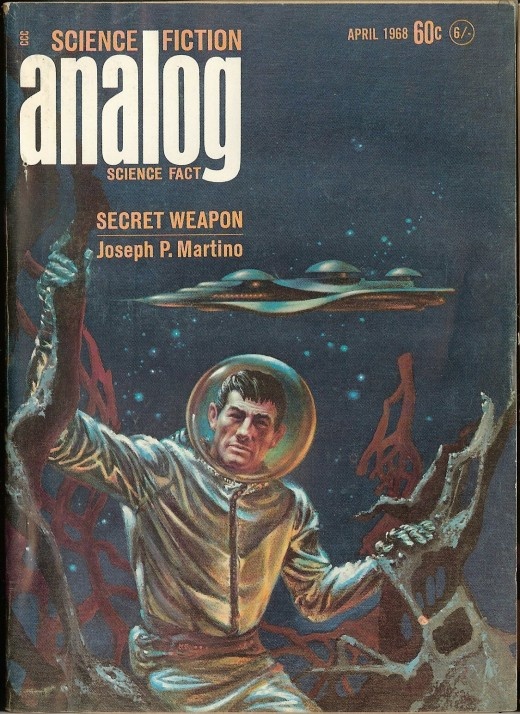
Looks like the masthead of Analog magazine in the 1960s. Coincidence… OR NOT?

Another ugly 1990s type treatment on the masthead: “Fortean” stands out, but “times” in all lowercase (even though it’s outlined) does not.

A significant improvement.
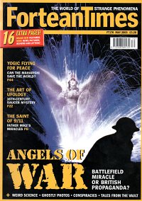
The current masthead has been in service since 2003, and really could do with a refresh. To start with, some kerning: the “T,” “i” and “m” in “Times” are too tight, as are the “a” and “n” in “Fortean.” As is, the eye moves in a leisurely manner over “Fortea,” comes to a screeching stop for “nTim,” and then proceeds at a reasonable pace once more over “es.” Also the subhead on either side of the “T” makes the top of the “T” disappear, rendering the masthead unreadable. I am disappoint.


