A lovely type-related article from Atlas Obscura, chroniclers of the strange and wonderful.
The Lost Typefaces of W.A. Dwiggins
The pioneering designer created dozens of fonts, only a few of which are still around today.

Fighting words—especially considering that words can’t fight back. A few months later, Dwiggins got a letter from Harry Gage, the assistant director of typography at the Mergenthaler Linotype Company, asking him to put his pen where his mouth was. Gage was hoping to broaden the number of new fonts his company offered to its clients. He’d read Dwiggins’ Gothic takedown, and found himself agreeing. Could Dwiggins make a typeface for Linotype—one like Gothic, but better?
He could. “Tell me how fast you have to move,” Dwiggins responded. “I shall be busy as a bootlegger all Summer, but a type face is a job that you have to dream over anyhow.”
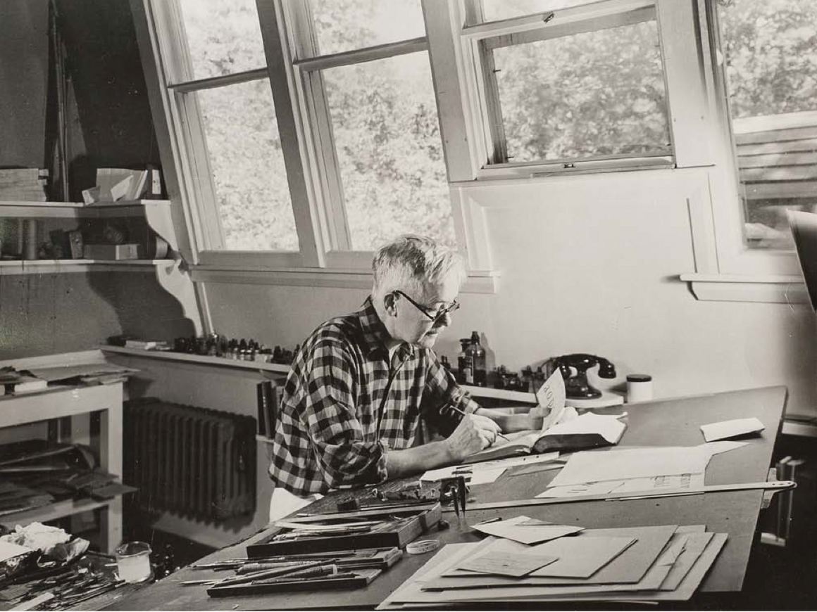
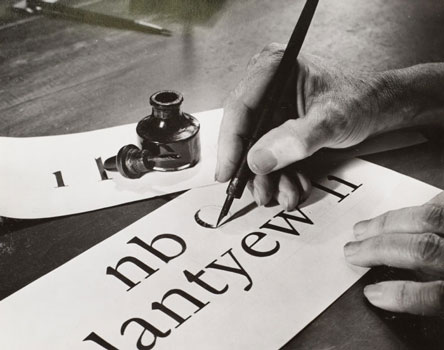
For the next 28 years—up until his death, in 1956—Dwiggins dreamed over typefaces. He did more than that, though: he designed dozens of them. He made typefaces for books, magazines, newspaper articles, newspaper headlines, and typewriters, including an early IBM creation. (“Letter forms just naturally came to flow from his fingers,” his peer, Rudolph Ruzicka, once wrote.) All but a few have since lapsed into obscurity, left behind by bad luck or circumstance.
This is all despite Dwiggins’s robust legacy in other areas. By the time he started designing typefaces, the forward-thinking book designer, calligrapher and illustrator had already made several indelible stamps on the American visual landscape. He may have been the first person to use the word “graphic designer,” in 1922, and the way he worked within and across disciplines is now a defining aspect of that field.
“There was kind of a clarity of vision that he had in all these different things that he worked on that I think is really inspiring and unusual,” says Bruce Kennett, a book designer himself, and the author of an upcoming biography of the artist, W.A. Dwiggins: A Life in Design. “He was always thinking about the end user.” Today’s end users, able to view the whole of Dwiggins’ career, may find it worth taking another look at these lost typefaces, to see what we can learn.
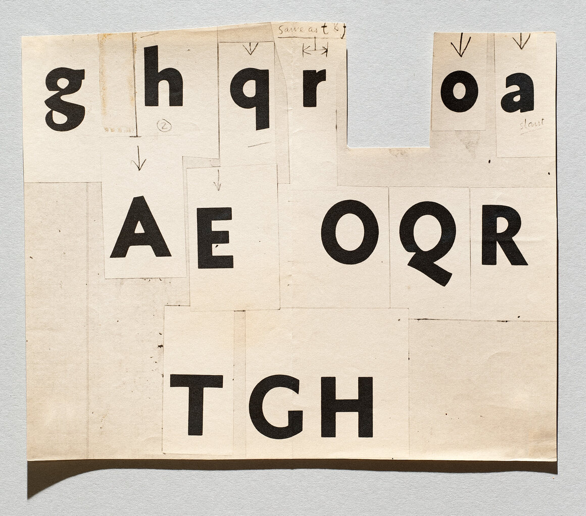
After he received Gage’s letter, Dwiggins threw himself into one-upping Gothic. He drew patterns ten times the size of a 12-point font, and cut them into stencils so that he could rearrange letters at will. By the end of 1929, he had come up with Metroblack, a robust sans serif that combined Gothic’s simplicity with a sense of warmth and hints of flair: curly loops for the g’s, jaunty tails for the Q’s. Linotype made some spin-offs in other weights—Metrolite, Metrothin, and Metromedium—and began to sell it.
Sadly, there are a number of things that can kill a typeface. One is public opinion: While Linotype was a fan of the Metro family, advertising it as suggestive of “inscriptions on old Greek and Roman coins,” audiences were skeptical. “The public was hungry for all things modern,” writes Kennett, and they preferred their designs to look ahead, not backwards. Sleek, efficient types like Futura were all the rage.
When customers complained about several of Metro’s lowercase characters, calling them awkward, Dwiggins and Linotype redesigned them, and released them as Metro 2. Although the company kept it on the docket, by the 1940s, the type was effectively retired, eclipsed by sleeker, more efficient faces such as Futura, and Linotype’s similar Spartan, designed in-house.
More of Dwiggins’ type designs suffered similar fates, some before they were even baptized. Experimental No. 63, an unabashedly humanist typeface with thick stems and asymmetric bars that Dwiggins worked on for several years, was ultimately dismissed by Linotype as a “stunt font,” and shelved.
Bad timing can also take down a typeface. In the early 1930s, Dwiggins worked with the Underwood typewriter company to develop a bubbly cursive, which he wrote was meant to be “aimed at social letters—home use—Junior League correspondence and such-like.” It was never produced, “the result of the poor business climate of the Great Depression,” writes Kennett.
During that same period, Dwiggins wrote to his boss at Linotype detailing some ideas for remaking a Scotch Roman face. “This is for the years to come, after the war,” he added, at the end. He then he realized his mistake, crossed out “war,” and wrote “depression.”
He might have written the same letter a decade later, without the correction. “During [World War II], metal was scarce,” says Kennett. Many companies, including print shops, dedicated some or all of their facilities to the war effort—Linotype made bombsights, among other equipment—which left much less floorspace for experimentation.
The war happened to coincide with Dwiggins’ most productive years. He dreamed up a whole suite of forms for the company, which he wrote were meant to “expand the Lino equipment in days to come, when we stop slaughtering and go back to reasonable human activities.”
Linotype had Dwiggins on a retainer, which meant both great creative freedom and no guarantees. “He could blue-sky to his heart’s content, and then they would pick which ones to carry into real metal,” says Kennett. “Several of those types were developed to the point that entire books were typeset in them, but Linotype never brought them to a full commercial release.”
Some of these were designed with a specific purpose in mind. One was Charter, a completely upright script face. “For reasons known only to Dwiggins, he was convinced that Charter would have a long career in the setting of legal documents,” writes Kennett. Instead, it had no career at all: it never made it past the pilot stage.
Others were born from Dwiggins’ vast and multidisciplinary knowledge of design history. “Often, he would see something from the history of printing design and want to improve it,” says Kennett. “He sees a typeface from the early 1600s in Spain and he says ‘Oh, I want to do something with that.’”
Thus was born Eldorado, which Dwiggins described as “something brisk and colorful to set a tale like Treasure Island in.” (While Eldorado was eventually set in metal and used in book production, it perished at another dangerous crossroads—it was not popular enough to make the transition to film typesetting.)
A 1942 effort, Tippecanoe, was meant to provide a decent tribute to the 19th-century Italian designer Giambattista Bodoni, whom other contemporary designers had attempted to imitate, in Dwiggins’s words, with “all the fawn-like grace of a galloping cow.” Linotype brought Tippecanoe all the way through the pilot stage, but no further. And the paintings of Frans Hals, a 17th century Dutch portrait painter, inspired Stuyvesant, to which Dwiggins gave “a certain well-fed robustness”—and which was also never made.
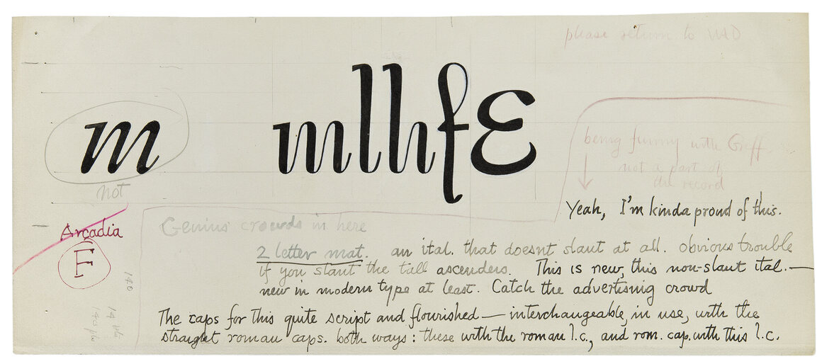
There was Arcadia, which Dwiggins described as “round and crisp—like the new moon one day out—a trimming of Diana’s toe-nail.” There was Winchester, designed for easy reading. Neither of these made it past the pilot stage. By the time the war was over, Dwiggins’ health was beginning to fail. He never revisited many of these ideas.
On a few, bright occasions, though, everything did work out. Dwiggins created several fonts that have stood the test of time, and successfully made the transition from metal typesetting to film, and then to digital. One, Caledonia, was the result of those years of working to remake Scotch Roman—it was snuck into production in between the Depression and the war, and has stuck around since, usually in books. Another book typeface, Electra, was released in 1935. Dwiggins meant for it to combine precision with “a warm, human, personal quality—full of warm animal blood.”
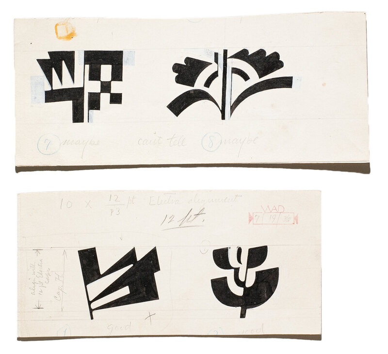
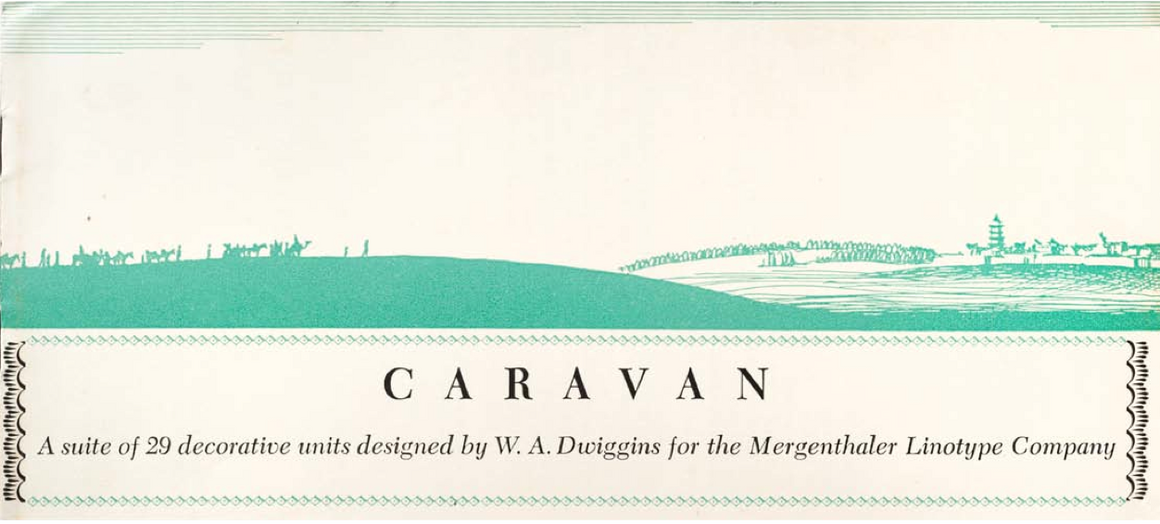
Perhaps the most interesting survivor of all is a set of what Kennett calls “modular decorative units,” the Caravan Ornaments. These don’t form words at all; instead, they are strictly decorative, meant to be used for individual flourishes or, taken together, as a wide field of pattern. Although they can’t be read, they are recognizably related to letters, like cousins that majored in theater and dance. “He saw these as a very magical extension of the alphabet,” says Kennett.
Electra, Caledonia, and the Caravan Ornaments have consistently been available to any printer who wants to use them. Metro also stuck around. This isn’t a bad batting average—all artists end up with hits and misses. Considering the length and density of Dwiggins’ typeface-making career, though, his legacy could have been much larger. “By my count, there are over 30 ideas for types,” says Kennett. “In the end, six of them were commercially released. All the others are just hidden under the radar.”
A still greater cost, Kennett says, is uncountable: “I think he was ready [to design typefaces] 20 years before he was given the chance,” he says. “I think he was champing at the bit to start earlier.”
This sense of loss is borne out by the fact that in the decades since his death, Dwiggins’ influence has regularly reappeared, sometimes in disguise. In 1952, Hermann Zapf, another famous typeface designer, released his own masterwork, Optima. (You may recognize it from the Vietnam Veterans Memorial, or the end credits of The Exorcist.) Over a decade later, he was shocked to find during an archival trip that he had basically remade Dwiggins’ Experimental No. 63—the so-called “stunt font.” Other designs, including Eldorado and Winchester, have been resuscitated for the digital age by modern type designers.
There is hope yet for more such revivals. Although Dwiggins is no longer the central figure he once was, “he is still revered by many,” Kennett writes. Ultimately, Kennett’s aim is that, with his book’s help, that number will grow.
It’s a big book—480 pages—but anyone who so much as flips through it will glimpse a tiny part of Dwiggins’ legacy: the whole thing is printed in typefaces that he designed. Excerpts of Dwiggins’ writing are set in Metro, Eldorado, Caledonia, and others, while the rest of the text appears in a new revival of Electra that Kennett commissioned for this project from the designer Jim Parkinson.
“All the [digital] versions of Electra before this have been scrawny and emaciated and tiring to read,” Kennett says. “This one has all the warmth and robustness it always had in the letterpress version.” The kind of robustness, perhaps, that comes from being one of the last types standing—containing a man’s dreams, legacy, and “warm animal blood” in a set of precise lines.


