From wired.com:

[Nicola’s Note: Clicking on the images below will take you away from my site. Please click your Back button twice and come see me again!]


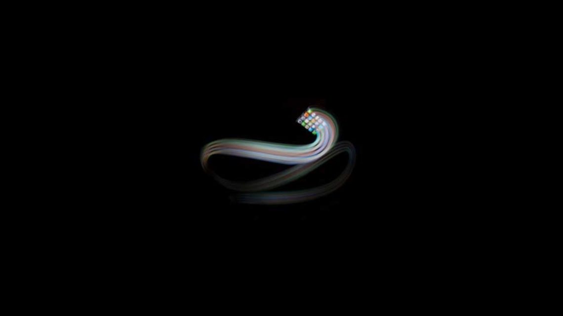
Phone Streak, a font made with long-exposure photography and a hyperactive iPhone owner, proves that smartphones are content-creation devices after all. Photo: Marcus Byrne
By day, Marcus Byrne works as a motion graphics designer for clients like Honda. But one night the Melbourne-based designer and self-proclaimed Apple geek decided to create a new font using the colorful icons on his iPhone and came up with a lively collection of letterforms and a typeface called Phone Streak.
He was able to manipulate the phone the way a calligrapher controls a brush.
Byrne created each character by waving his iPhone like a magic wand in front of a Canon 5D DSLR and conjured the magical results in three- and four-second exposures. The resulting typeface is dynamic, what you’d expect from a font made by flailing an iPhone around in the dark, but also displays a strong sense of craft. Through a process of trial and error he was able to manipulate the phone the way a calligrapher controls a brush. “Holding the iPhone in the same position for a little longer before making the strokes gave the camera enough time to capture the detail in the App icons.” says Byrne. The frozen images of app icons act like serifs, grounding the letters while also revealing their unusual origin.
Byrne was fastidious about the font’s details during the design process. He recreated the stock set of icons that come with the phone so that they would be more immediately recognizable. The screenshot of the icons was reversed in Photoshop so he could draw left to right without obscuring the screen with colorful contrails and then flipped back when the image was completed. Each character required testing and Byrne created four or five candidates for each character before choosing a stroke he found suitable. He explains: “I really wanted the icons to be visible when viewed in full color and be part of the character of each individual letterform.”

Long-exposure photographs turned colorful contrails into a cool collection of characters. Photo: Marcus Byrne
Some of the letters posed challenges. The “C” was made with a simple sweeping gesture, but the hash (#) and percentage (%) symbols proved to be more difficult. “When vertical and horizontal strokes cross each other, that’s when it got tricky,” says Byrne. “I played around with some techniques to hide the iPhone for a split second after a stroke and then move it into position before making the next stroke.”
In addition to being a forward-thinking photographer, Byrne has also taken an interest in 3-D printing and commissioned plastic versions of some of his characters. “I love when technology and art meet to have a party,” says Byrne. “This project started as a simple idea to make one character into a 3-D object by using gestures.” That simple creative brief has now birthed a typeface, plastic sculptures, and even some 3-D printed jewelry based on the animated alphabet.
The font is freely available on Dafont.com and can be used without restrictions. “As designers in the digital world, we have a huge number of resources for free assets,” says Byrne. “It’s always good to give back to the community.”


