By Steven Heller from TheAtlantic.com:
Monotype U.K.
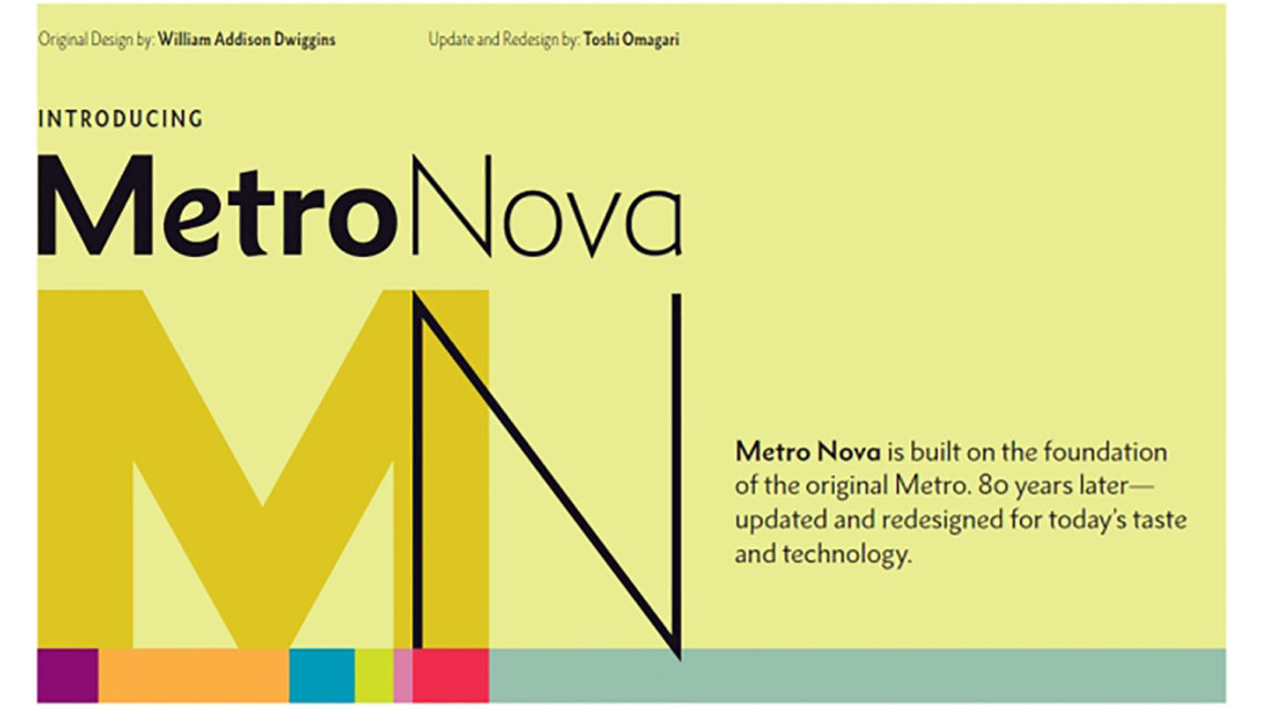
Tens of thousands of more-or-less similar typefaces are currently available, yet designers continue to create new ones and revive old ones every day. The soon-to-be released Monotype Metro Nova, however, stands out as a notable resurrection of what was arguably a lost masterpiece by William Addison Dwiggins (a.k.a WAD or Dwig [1880-1956]).
Dwiggins was a significant American designer who, among other things, coined the term “graphic design” in 1922 to explain all his graphic trades: calligrapher, book and book jacket designer, typographer, type designer, advertising designer, and illustrator. In the early 1920s, he designed Metro, the first modern sans-serif typeface done for the leading American type supplier’s most famous type machine, Linotype. There were other popular sans serifs–“gothics”–but not from Linotype. Metro was so named because it was intended for newspaper use in large and small sizes. A stylish, art-deco typeface, it was linked to but distinct from Modernist European sans.
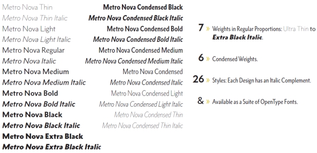
Metro might have been revived sooner, but the original drawings disappeared into the archives of the Printing Museum in North Andover, Massachusetts for 80 years, until filmmaker Doug Wilson stumbled upon them during research. Wilson, the director and producer of the critically acclaimed documentary Linotype: The Film—In Search of the Eighth Wonder of the World (2012), persuaded the famous type company Monotype U.K. to turn Dwiggins’s pencil sketches into a digital font to use for his film. Type designer Toshi Omagari was assigned to make the new Metro Nova, which Monotype will officially introduce later this year.
The decision to produce a new or revived face isn’t made lightly, given the high cost of making, distributing, and promoting a font in today’s competitive font marketplace. For Wilson, legacy was a major factor: “Metro will always have a special place in Linotype history,” he explained in an email. “I chose to make it the ‘signature’ face of Linotype: The Film because I felt it was a great typeface that didn’t get the respect it deserved in the digital age.” But it was only when he pulled a drawing out of one of the many black boxes and saw a capital “A” that had a graceful, slanted apex did he realize this typeface “had much more life and character” than he realized.
It may seem arcane, but typeface nuances govern our reading habits. As Wilson researched through old type specimen books, he discovered that there were two Linotype releases: Metro and, soon after, Metro No. 2, which was more “modern” and “sterile” than Dwiggins’s original glyphs. “I believe this [change] was from customer feedback, but I greatly preferred the original Metro,” he says.
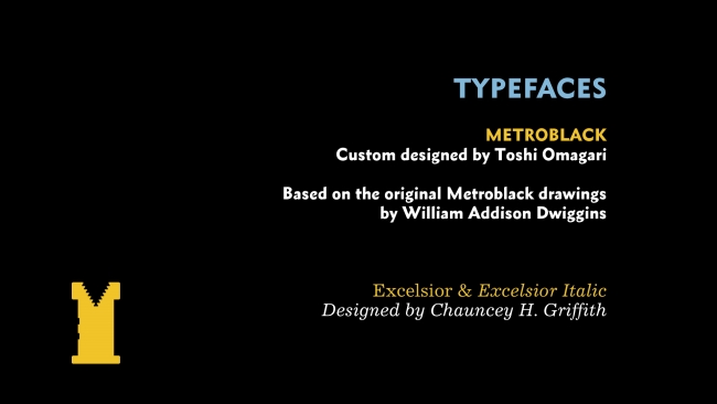
Wanting the “great old quirks and lively characters,” Wilson contacted Dan Rhatigan, Monotype U.K. type director, “about having someone draw up just an all-caps version” that could be used exclusively for his film credits, since he wanted to use only typefaces that were originally designed for the Linotype to help the film’s authenticity. Omagari designed an all-caps version in the bolder Metro Black, then he completed a lowercase to match. From there, the idea for a full typeface with additional weights began to materialize as Metro Nova.
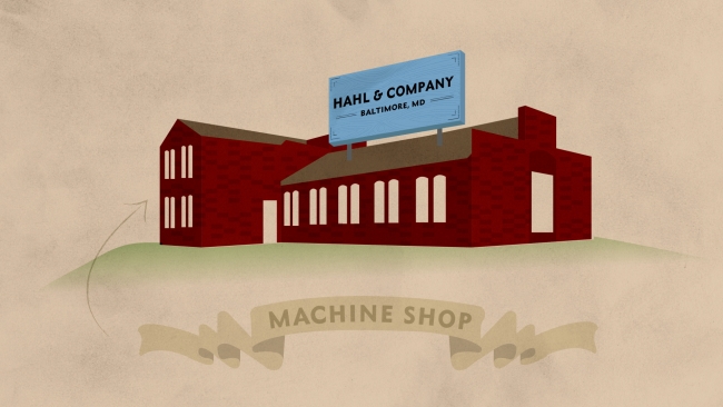
Images from Linotype: The Film, which used Metro Nova.


