A blog post from the Extensis group. It’s not quite clear what the people at Extensis actually do (see below) but it’s a good article.
“At Extensis, we believe chaos is a barrier that stifles creatives’ efforts to solve problems through thoughtful design. So our job is to build a route around chaos, one that leads creatives to their best work—the kind of design that connects to the heart of what people care about.”
Yes, but what do you do? This is not clear. Better mission statement needed.
ANYWAY. Happy Pride Month and, in San Francisco, Pride Weekend! Here’s the article.
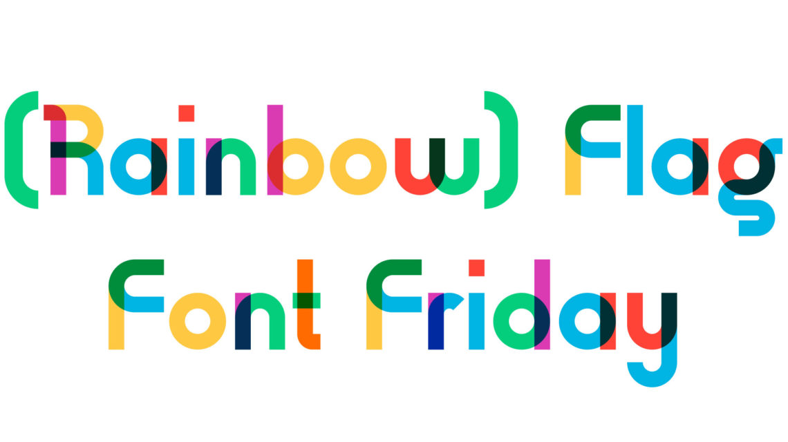
Type With Pride: An Interview With Fontself’s Franz Hoffman About How The Gilbert Font Will Inspire A New Generation Of Designers
Written by Andrew Rhodes – Senior Content Producer
Fonts & Typography | Creativity & Design
Updated with an interview from Franz Hoffman on July 14th, 2021
Great design can inspire us, unite us, and give us hope.
Great design can ignite conversations and provoke change, wresting us out of ignorance.
In 1978 gay rights activist and artist Gilbert Baker set out to create a new symbol for the gay and lesbian movement to replace the pink triangle — a Nazi relic from World War II. Gilbert’s experience as an openly gay man in San Francisco and his work as a vexillographer [Ed.: flag designer] gave him a unique opportunity to highlight the movement at a critical moment when LGBTQIA+ people were fighting for equal rights. Gilbert conceived of the Rainbow Flag, which he displayed at United Nations Plaza on June 25, 1978 to commemorate the San Francisco Gay Freedom Day Parade.
Gilbert channeled everything he knew and everything he loved into the design of the Rainbow Flag. He poured all his passion, skill, and hope into a flag which is now one of the most powerful symbols on earth. Since the Rainbow Flag’s first public unveiling in San Francisco in 1978, it has been raised countless times all over the world as a sign of empowerment and solidarity with the LGBTQIA+ community.
Ed.: It’s not that simple. The Rainbow Flag has gone through a number of incarnations since 1978, and is still evolving (see below). Also, Gilbert Baker wasn’t solely responsible for the flag’s design. For the flag’s range of incarnations up to 2021 and additional information, please see this Wikipedia page.
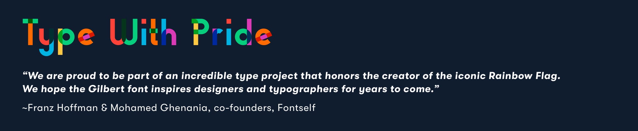
Gilbert passed away on March 31, 2017. Great designers are immortalized through their work, yet Gilbert’s contribution to the LGBTQIA+ movement earned him a distinctive form of recognition. To honor his legacy, Ogilvy New York, NewFest, and NYC Pride partnered with Fontself to create a free font inspired by the timeless design of the Rainbow Flag. Befitting the origins of the Rainbow Flag, this font was specifically designed for headlines and protest banners.
The name of this font? Gilbert. And this is its story:
Type With Pride Web from chrisrowson on Vimeo.
I wanted to learn more about this exciting typeface from the man who made it possible — Franz Hoffman, one of Fontself’s co-founders.
Andrew Rhodes: The story of how Fontself was invited to collaborate on the Gilbert font family almost defies belief. Have you ever experienced anything like that before?
Franz Hoffman: It was really a lifetime opportunity to collaborate on such a tribute font as Gilbert. It’s not every day that you get contacted to work on a project that has a universal meaning & impact; so while we had never considered publishing a font ourselves, we made this one exception to ensure this typeface would come to life.
The colorful design that Ogilvy’s team had come up with really resonated with what the Rainbow Flag creator, Gilbert Baker had conveyed in his memorable flag. It was obvious we needed to jump in and work full steam to turn these gorgeous letters into one of the very first color vector fonts ever created.
Today, we are really proud of this collective effort with Ogilvy New York, NewFest, and NYC Pride. Not only for the values it carries, but also because we are thrilled to see how this font is used all around the world..png?width=267&name=Franz-Hoffman-Headshot%20(1).png)
FH: In this case and in many other creative endeavors, an arbitrary deadline helped to set the pace and ensured that something tangible and valuable was delivered. But we’re always happily surprised when a subsequent delay is allowed 😉
AR: The Gilbert font project had a lot of moving parts with a tight deadline. In your experience, what factors make it easier for complex creative projects to succeed?
It’s better to stick to a plan and deliver in due time, should you scale down the scope of the initial release to ensure improvements can be added gradually afterwards. The pressure will be lower on the team and an extra benefit is that this forces you to crystalize your value proposition.
The one drawback to this approach is that it will often result in compromises and frustration. To be honest, this might be a cost to bear for the long term, as some concessions are never recovered or forgiven.
So, whenever you’re hitting these issues, remember it’s better to have creative projects that are alive in the wild than perfect plans that never come to fruition.
AR: When Fontself collaborated with Ogilvy New York, NewFest, and NYC Pride on the Gilbert font, it helped highlight one of the key figures in the fight for LGBTQIA+ rights. What other Fontself projects have called attention to cultural shifts like this one?
FH: To date, the Gilbert font is the most iconic design that we have been privileged to contribute to, and while we have seen many social uses of DIY fonts made with Fontself Maker, our font creation software, we believe that we are still at the early days of a new era: when fonts created by a general audience of makers, creatives and thinkers will be more universally and easily crafted and distributed.
That’s why we really want to help many more folks get started with type-making, so that more communities can embrace type as an additional medium to share their values and enrich their communications.
AR: What role do you think typography will play in promoting social justice in the future?
FH: Type, handwriting, and lettering have always been at the front of modern social movements, from banners at demonstrations to flyers or posters. Whether the design is intentional or not, those words are carried by enthusiastic people looking for ways to express their opinion and their cause in written form.
So, if a growing number of activists learn about typography and even master its intricacies, this could further help to put type into the toolbox of anyone looking for social change.
AR: In many ways, Fontself has democratized typography. What are some of your favorite projects created by Fontself users?
FH: The most gratifying part of our job is when we hear from creatives who have joined the typographic bandwagon and come up with projects that may never have seen the light otherwise. Like when we learned about the journey of Tré Seals, a young graphic designer who has crafted entire alphabets based on banners from the civil rights movements in the sixties and launched Vocal Type Co.
Oftentimes, such stories come from various parts of the world, like some really classy designs for a cathedral in Moscow by Viktor Pushkarev or children’s fonts carefully crafted by their teachers in Australia.
It’s also humbling to see the artwork of designers who had joined our contest around the Gilbert font being featured on giant screens on Times Square in New York, and funny to see custom type on international campaign, like Nike’s England’s 2018 World Cup material by Craig Ward.
So, we are now focused on a new project that will hopefully further push this democratisation of type-making, and we can’t wait to tell you more about the cool new type projects that creatives will do with it 🙂
For every story an organization creates, for every message a designer wants to share, they need the right fonts to bring their vision to life. If you already know and love the Gilbert font, please share this article and spread the word. And if you’re just learning about Gilbert for the first time, this font is for you. This font is for all of us.
Design with pride, create with pride… and the next time you type, type with pride.
Gilbert is the first third-party color font available on Adobe Fonts, and can be easily installed through the Adobe Creative Cloud App.
Gilbert’s original 1978 rainbow flag has experienced a number of design changes over the years, driven by additional inclusions and recognitions in LGBTQ+ communities worldwide.
For instance, the original flag had eight stripes, each color symbolizing a different quality:
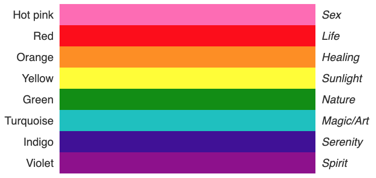
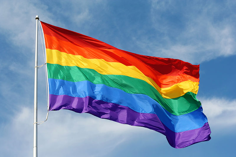
From Wikipedia: “As Baker ramped up production of his version of the flag, he…dropped the hot pink stripe because fabric in that color was not readily available…In 1979, the flag was modified again. Aiming to decorate the street lamps along the parade route with hundreds of rainbow banners, Baker decided to split the motif in two with an even number of stripes flanking each lamp pole. To achieve this effect, he dropped the turquoise stripe that had been used in the seven-stripe flag. The result was the six-stripe version of the flag that would become the standard for future production—red, orange, yellow, green, blue, and violet.[26]“
The “Philly Pride Flag,” 2017
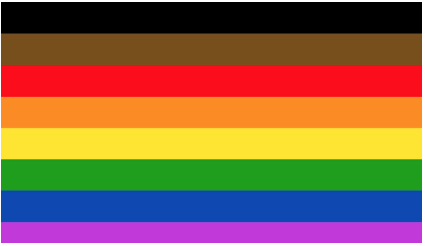
From Philadelphia magazine, June 8, 2017
“[Philadelphia’s] Pride flag will add black and brown stripes [above] the traditional six-color rainbow layout. The new permanent design will be, from top to bottom: black, brown, red, orange, yellow, green, blue, and purple.“
“The black and brown stripes are an inclusionary way to highlight black and brown LGBTQIA members within our community,” said one source involved with the flag-raising event who asked not to be named. With all of the black and brown activism that’s worked to address racism in the Gayborhood over the past year, I think the new flag is a great step for the city to show the world that they’re working toward fully supporting all members of our community.”
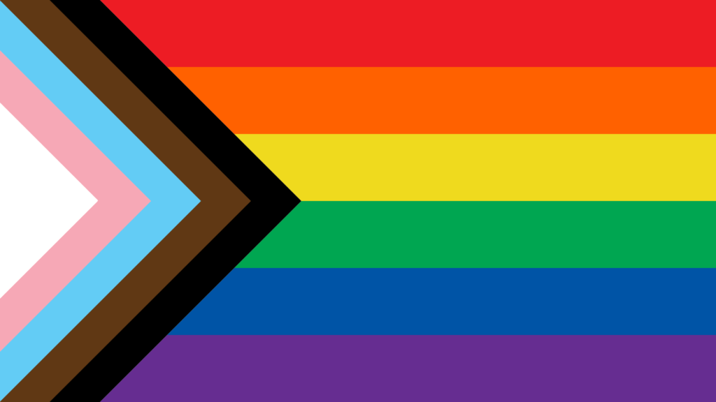
From Wikipedia: “In June 2018 designer Daniel Quasar released a redesign incorporating elements from both the Philadelphia flag and trans pride flag to bring focus on inclusion and progress within the community. The flag design spread quickly as the Progress Pride Flag on social media, prompting worldwide coverage in news outlets.[55][56][57] While retaining the common six-stripe rainbow design as a base, the “Progress” variation adds a chevron along the hoist that features black, brown, light blue, pink, and white stripes to bring those communities (marginalized people of color, trans people, and those living with HIV/AIDS and those who have been lost) to the forefront; ‘the arrow points to the right to show forward movement, while being along the left edge shows that progress still needs to be made.'”[58]


