
From edenspiekermann.com:
Finnish font wins Russian Award
FF Mister K, the font developed by the Finnish designer Julia Sysmäläinen, won the International Type Design Competition ‘Modern Cyrillic’. The latin version of the typography inspired by Franz Kafka had been introduced at the TYPO 2009 conference. Mы пoздравляем Mister K!
The competition was held by ParaType with support by the Federal Agency for Press and Mass Communications of Russia. It was dedicated to the Tercentenary of Russian Civil Type — Peter the Great’s historic reform of Russian typography (1708–1710). Cyrillic typeface projects and completed typefaces created and/or released after January 1, 2006 were eligible. There were 234 entries from 13 countries. The jury selected 23 type projects for the Honor diplomas for the excellence in typography. Besides 6 projects were selected for the special diplomas from ParaType.
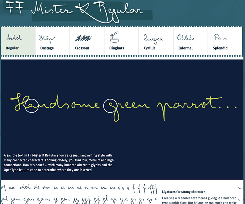
Creating a readable text means giving it a balanced typographic flow. But balancing too much can make it monotonous, boring. So, to give FF Mister K texts more character, a wide range of ligatures with ‘extraordinary’ forms were included, especially in the Regular. And OpenType feature code fixes the places where they appear.
Go to the site to learn more about the typeface’s Regular, Onstage, Crossout, Dingbats (images and pictograms), Cyrillic and Informal incarnations.
From the font’s website, ffmisterk.com:
Mister K’s genesis
A person called ‘K.’ can be found in different stories and novels of the Austro-Hungarian author Franz Kafka (1883–1924), who is considered to be one of the most influential writers of the 20th century.
He wrote short prose, long stories and novels, many of which were never completed. Instead, they were collected by Kafka’s friend Max Brod and published only after his death, contrary to the author’s request that they be destroyed.
The manuscripts of the two best known novels The Castle and The Trial were the source of inspiration for the design of the typeface ‘FF Mister K’ and their main characters (K., Josef K.) gave it its name.
While the starting point in designing FF Mister K was the study of letterforms in Kafka’s manuscripts, a digital font always has its own characteristics and a comparison with the original scripts shows that the result is not a simple imitation of Kafka’s handwriting.
One of the main tasks was the transformation of the writer’s eccentric letters with their strong form and size variations into a character set that enables a balanced typographic flow.
In a script font with predominantly connected characters, there are usually low, medium and high connections. All basic glyphs of FF Mister K have these alternates – which make written words look naturally connected. The OpenType feature code can determine the context in which the different alternates are inserted and place them in the right order.
To give the font more character, also several hundred ligatures with ‘extraordinary’ forms were made. Again, the OpenType feature code sees that they are inserted appropriately for different languages.
Finnish typography at its best!
You can buy FFMisterK here.


