The Oscars are on Sunday, February 9! Here’s a great breakdown of the design of posters of some leading films. See also Film Fonts Friday 1; (Bond) Film Font Friday; Film Font Friday, Wes Anderson Edition; and Font Film Font Friday.
Read the text below, or click the link for the full interactive experience.
Washington Post article about posters for some 2020 Oscar-nominated films.
With streaming services like Netflix and Amazon overpowering the box office, movie posters have had to adapt, with an emphasis on scalable design. Film studios are now tasked with the challenge of making sure that the actors are recognizable, that the type is readable and that, foremost, you’ll want to press play after a quick scan.
“Movie posters haven’t actually worked the way posters were originally intended to work in decades,” says DJ Stout of the design studio Pentagram. “The days when a man would see a poster on the street for the first time and then be convinced to see it in the theater has gone the way of the horse-drawn buggy.
“These days, the poster design establishes the look and feel of the film and provides the visual identity tools for the marketing and promotion of it.”
Movie posters also can be something you “buy and cherish after you’ve already fallen in love with the film,” says Marianne Seregi, design director at National Geographic magazine.
But a bad poster “can definitely make you not want to see a movie,” says Andrew Percival, director of Percival & Associates, an entertainment advertising agency. Typographer Craig Ward suggests that animation and augmented-reality technology could be next in movie-poster design.
For this award season, The Washington Post asked Stout, Seregi, Ward, Percival, along with illustrator Julia Rothman and creative director Allie Fisher to look at this year’s Oscar-nominated best-picture posters from a visual design perspective.

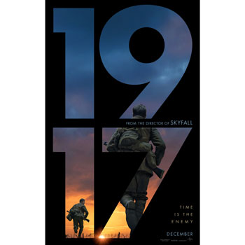
1917
Marianne Seregi, design director at National Geographic: To be honest, I was dreading being taken to “1917.” But after seeing this poster, I kind of want to watch it. The typography is clear and striking. The 9 and the 7 both point you in the direction of the action. The imagery shows the beginning of a moment, which makes me want to see where it ends. For me, this is the most compelling poster of the lot.
DJ Stout, art director and partner at Pentagram: I admire the attempt to do something unique here. The majority of movie posters these days are rigidly formulaic. This bold typographic approach, a huge number “1917” used as a window framing two unrecognizable soldiers running across a war-torn battlefield, is refreshingly different. It’s nice to see something other than the typical close-up beauty shots of famous actors. This graphic visual approach reflects the film’s emphasis on action, breathtaking scenery and cinematography, which has earned it an Oscar nomination in that category. This poster makes me want to see the movie.
Craig Ward, typographer: This is a really strong, confident poster. It gives you exactly the right amount information — a place, a time, a situation and the two protagonists — and nothing more. You’re either in or you’re not. As with “Parasite,” the type here is very coherent and entirely set in just two weights of Futura [font], which is very restrained for the medium. It flows well and leads your eye toward the soldiers and the landscape by virtue of you literally reading the poster. It tells a story.
Allie Fisher, creative director and partner at Godfrey Dadich: The designer effectively used the shapes of the letter forms to move your eye around an otherwise simple image. There are some nice bits of tension, too, like the odd crop at the neck of the main figure, which also pulls your eye to the mention of “Skyfall.” Even though the sun flare is a little cheesy, I like that there’s an element breaking through the plane of the type. The rag on “Time is the enemy” would generally drive me crazy, but against the 7 it’s oddly satisfying.
There’s a lot of Futura out there in poster designs, and though it’s not quite period correct, it does feel fresh for a World War I film. It also strikes me that this design would do well on streaming platforms — very scalable down to smaller screens, even when you lose some of the detail in the image.

Ford v Ferrari
Andrew Percival, founder at Percival & Associates: Even as a motor-sport enthusiast, I’m afraid this poster turned me off to the film — as did the title itself. It was the reviews that swung me around to go see it.
It’s solid, but a little basic in my opinion. The use of Ferrari’s signature red and gulf blue is a nice touch, and even though the use of Compacta [font] can be a little uninspired in film advertising, it feels right here. It’s period correct and I applaud the resistance to set it in italic.
Julia Rothman, illustrator: The poster says to me, “Here’s some dudes that are in every movie, but now they are racing cars.” Pass. The poster itself seems generic, which makes me think the movie must be, too. On the plus side, there’s lots of white space, which is pleasing, and the blue tones in the image age it nicely. And I would wear Christian Bale’s jacket.
Fisher: The poster is fairly quiet on the whole, which surprised me, but then I checked the original Steve McQueen “Le Mans” poster out of curiosity and discovered this is a direct tribute to that design. This was definitely made for an audience already familiar with the history and the people involved.

Stout: The poster artist has done a nice job colorizing the scene in a nostalgic, Kodachrome haze that perfectly captures the time period of the film.
Percival: There appears to be some heavy use of sharpening and blurring that don’t feel organic to me. I wish there wasn’t that massive blowout in the background, and it would have been nice if the image was more photoreal and we saw down the pit straight.

Jojo Rabbit
Fisher: I’m equal parts jealous and sympathetic to anyone who gets to design a poster for a Taika Waititi film. How do you capture his particular flavor of satire?
Seregi: I must be living under a rock because I don’t know anything about this movie. This poster is great and makes me want to see the film. I love the typography — it’s playful but dark.
Stout: Typographic scrawl can be an effective graphic device, but it is often done poorly. Not here. The lettering is perfectly crafted and does a good job of expressing the offbeat personality of this quirky “anti-hate satire.” The “peace-sign” rabbit with its hand-scrawled face, which doubles as the film’s title, makes me smile. The added touch of the wrinkled paper, like posters pasted up on construction fences and the walls of abandoned buildings, is the kind of detail that makes this poster rise above the rest of the best-picture nominees. If they gave Oscars for best movie poster, this would be the winner — hands down.
Seregi: The bunny ears with the drawn-on whiskers are fresh and creative. The poster takes a well-worn symbol for peace, mixes it with a silly child’s gesture and gives us something original.
Ward: Thank goodness, something fun. I really like the [color] palette here; it’s super loud and there’s a Saul Bass simplicity to it. This could have easily be made by him — “Bunny Lake Is Missing,” “The Shining,” etc., etc. So many of his posters have that strong graphic palette and hand-realized elements.
Rothman: The problem I have with this poster is that you have no idea what this movie is about. I did see this movie. But if I hadn’t seen it, I would not have guessed it’s about Hitler Youth.

Joker
Seregi: Do they want me to focus on his stance? Or the name of the movie? They’re about the same size and competing. The poster is almost cut in two with the vertical motion of the buildings and the sky on the top half and the horizontal motion of the steps on the bottom half. I want to like this, but I feel like I’m missing something.
Rothman: It’s a captivating photo from the most memorable scene from the movie. The position with his chest out is striking, like he’s being beamed up. It could have been a spectacular poster if they had integrated the type more into the design. Distressed type seems too easy. They must have turned down a lot of other better options in that boardroom. I would have loved to see some lettering done in the Joker’s handwriting instead.
Stout: The emotional power of this poster is delivered with a “POW! “BAM!” “OOF!” punch to the gut, primarily through the Joker’s body language. The position of Batman’s archenemy at the top of a stairway falling backwards (or guffawing?), arms flailing limply and face turned blankly up toward the colorless sky says everything about this clown’s state of mind — and it isn’t funny. I’m not sure if I want to see this movie. It kind of freaks me out.
Ward: The photograph, in the same manner as “Parasite,” is very well composed — you can see the straight lines running through it so everything draws you to [the Joker].
Fisher: They leaned hard into an iconic image for this one. It’s one of the more ecstatic scenes in an otherwise bleak film. A bit misleading, honestly, but I think it’s designed to play off our assumptions about the Joker character. There’s no discernible plot to the image, which in retrospect is a good tip-off that it’s not your typical action-hero origin story. I get that the woodblock type says “gritty,” but to me it doesn’t integrate well with the rest of the design. And what’s with that lens flare just off center?
Percival: I wish the actor was framed by the negative space of the sky more and didn’t overlap the building on the left. I also wish that more work was done to make the image symmetrical, with the only element breaking the symmetry being the light. The moment in the film feels like a deliberately inverted “Rocky” moment.

Little Women
Fisher: A few things I love about this poster: You’re in an intimate space with these four women, but you’re still on the outside looking at this tightknit unit of sisters in profile. And then, they’re all indoors in this incredibly floral, verdant domestic space, but they’re completely enthralled by something just beyond the frame, outside their window. I think it really invites empathy. And the color palette is fantastic. I’d see the film just for that. Okay, let’s be honest, I’d see it just for [director] Greta Gerwig.
Seregi: The first movie on this list that I’m actually excited to see! The type feels a bit raw and unfinished, which I suspect is the point. There is a lot of movement and tension in the title, with the varied letter heights and the different lengths of the crossbars in the E’s. Each letter feels like it’s breaking out of its own mold. But the image tells the opposite story. The women are rendered as observers, not dynamic actors. On the whole, the poster doesn’t feel as cohesive as it should.
Ward: A missed opportunity I think. The original poster for “Lady Bird” [also directed by Gerwig] ironically, worked for all the reasons this doesn’t, despite also featuring a young woman in profile. The ecclesiastical notes — stained-glass border and black letter type — of that poster all felt like they were coming from the same place.
Stout: I don’t know who these little women are. I’m pretty sure they’re famous actresses, but as a graphic artist this is the kind of formulaic poster that makes me thankful I’m not a movie poster designer. I get it. This is [at least] the sixth big-screen adaptation (not to mention the television versions) of a classic film based on a classic novel by a famous writer, but with that pedigree I’m disappointed this poster is not more inspired. I also don’t get the typographic choice for the film’s title — the shifty, up-and-down, all-caps letterforms — and I will probably never get it, because I’m not going to watch this movie.
Percival: It’s very open, airy and aspirational, but feels a bit “young adult” and is missing the gravitas of the film itself.
Rothman: Unfortunately because of the holly and the green tones, it feels like a sappy Christmas movie to me. I would never see this movie from this poster. But I do know that Greta Gerwig directed it, so I’m willing to take a shot. They should have made her name gigantic with nothing else, and then I would have rushed to the theater.

Marriage Story
Seregi: The larger scene within a silhouette is a visual trope but one that I’m a sucker for. The approach is effective for “Marriage Story.” She’s L.A.! He’s N.Y.! They’re at odds.
Rothman: These feel successful to me, even though the silhouette trick has been done so many times. Most notably, a friend pointed out to me, in the beautiful “True Detectives” opening credits where landscapes and portraits are double exposed. Adam Driver became such a huge star and his profile is so distinct. It’s a nice way of showing the actors without having their full-on faces. The warm and cool of the two cities feels right. I did see this movie because of the poster, but I wish I hadn’t. I found it insufferable.

Ward: As a diptych, these two posters work very hard to tell the viewer what’s going on, and I think they’re quite successful for it. The location photography is quiet and beautiful, and the silhouettes are a successful juxtaposition I think — Driver’s harder features set against New York vs. Johansson’s more feminine face as a frame for California’s coastline.
Percival: I would have liked to have seen a slightly more organic double exposure rather than the straightforward window technique. I do like the way the designer found a way to get the compositions of the two environments to echo each other. The pieces are quite understated in their coloration, which I like. However, there is something about the palettes mixed with the technique that gives me a slight sci-fi vibe.
Fisher: The isolation, the sense of distance between them, stretching from coast to coast, the window into their own inner worlds — it’s spot on. I love that Adam Driver’s silhouette is distinctive enough to work here and still telegraph the star power. It’s also just nice to see an unusual typeface choice in a movie poster. I can see this working really well on Netflix, scaling down to a tiny frame.

Once Upon A Time In Hollywood
Ward: Quentin Tarantino makes movies about movies, so it stands to reason that this would be a movie poster about movie posters. This kind of layered depiction of an ensemble cast is an obvious homage to countless other classic poster designs.
Fisher: This one makes perfect sense to me. The ultimate period tribute for Tarantino’s love letter to Hollywood. The composition absolutely works, with all the quirks and weirdness of this poster style. If I had to quibble, I can’t quite get on board with the use of Hobo [font] in the director credit along the top. I know it’s period correct, but it doesn’t seem to connect to anything else in the typographic system here. But I’m sure if I went digging it’d be a reference to, ah, yup, “Butch Cassidy and the Sundance Kid.” This thing is probably full of Easter eggs.
Rothman: Very fun homage to posters of the era, like “Star Wars,” “Goonies” and so many other classics. I think it’s perfect for the movie. Well done.
Stout: I loved this movie and I love the way this poster captures the raucous, nostalgic energy of the film and stays true to the cheesy look and feel of movie posters in the late ’60s and early ’70s setting of Tarantino’s picture. These kinds of graphic style riffs can fall flat if they aren’t handled with care, but this one is nicely executed.
Seregi: Like a lot of the movies nominated for best picture this year, “Once Upon a Time in Hollywood” seems by, about and for men. It’s all just a little boring. This is a classic kitchen-sink type of poster, that you really need to see at full size on your bedroom wall to take in all the details. This isn’t the kind of poster that makes you want to see a movie. It’s the one you buy and cherish after you’ve already fallen in love with the film. Which makes me wonder: What is the point of a movie poster? To make you want to see a movie? Or to remind you of a movie you love? Or both?

Parasite
Ward: Compare this with the poster for “Little Women” and you’ll see such a world of difference in terms of building intrigue. There are so many micro-stories happening in this image: Whose legs are those? Are they dead or sunbathing? Why is he carrying that rock? What’s with the redacted eyes? Whose kid is that?
Fisher: The type is fantastic and appropriately unsettling, with the strange half-serif, half-sans. The composition of the figures is eerily perfect, with everyone frozen like you just interrupted something you weren’t supposed to see. I particularly like the subtle white and black bars over every character’s eyes and the little pops of red punctuating the blues and greens. Oh, and the fact that you can see everything reflected in the glass windows, except for that body lying in the foreground.
Rothman: There’s so much happening. It’s creepy but also playful. The palette has a sort of green, cold tint, and without that beach ball, and those drinks, there would be no warm colors in the entire photo. I like the type — a mix-up of serif and sans serif — maybe a play on fancy vs. common, a theme in the movie. I loved this movie, and it should win all the awards.
Percival: I think [the typography] is fairly well done. Simple, clear, elegant. I’m not sure if the intention behind the serif/sans hybrid of the title is to speak to the haves vs. the have-nots, but either way, it’s unique and quite interesting.
Ward: The art direction here is great — everything I hate about “The Irishman” poster is resolved here. There’s a sense of place, the actors are (or were) all in one location and it’s an outdoor shoot vs. pretending to be an outdoor shoot. I also dig the single point perspective, which makes it feel very graphic and well composed. There’s also a lot of symbolism — you can read this image.

The Irishman
Seregi: This poster tells me there are three very famous actors in this movie and little else.
Fisher: This one leans hard into genre and star power. In other words, it reads like every gangster movie poster starring [insert three famous actors]. Very “Goodfellas” or “Casino” in its structure (and, ahem, cast!), but in this case on a blurry city block instead of the classic black-shadowed backdrop. As a poster design it doesn’t break any new ground, but perhaps that’s the point. The formula clearly telegraphs the genre and the big names, and for plenty of people that’s enough to queue it up. But purely from a design perspective, this poster leaves me asking why I should see this particular Scorsese gangster movie.
Percival: I don’t buy the overall piece, I don’t believe that the characters are in that environment and the heavy-handed blurring of the background makes the overall piece feel stripped and a little cheap. I imagine that contractually all three actors had to feature prominently on the poster, so given that, I think the composition is quite interesting, and I like the way that even though [Joe] Pesci is the biggest and closest, your eye immediately goes down to the bigger stars. But overall the poster is pretty uninspired.
Ward: I think I hate this poster? The type setting and irregular kerning in the names, the texture in the title, the studio photography in an exterior setting — it’s all off. There’s not much [typography], but it’s kind of all over the place. The actor names feel very weirdly kerned (the leading is also too tight here), whereas [Martin] Scorsese’s name is condensed and really overly tracked out in a completely different font, right next to the so-tight-it’s-touching title replete with a grungy texture that feels unnecessary. Overcooked.
Rothman: I’m a fan of these actors and Scorsese. I was waiting with anticipation for the movie to make it to Netflix. But I fell asleep after 20 minutes and I haven’t tried to watch it again. That’s kind of how I feel about the poster. I’m excited to see those actors together. Big yes to Joe Pesci in glasses! But then, they are just standing there, looking opposite ways, not even interacting. I might fall asleep again.


About this story
Illustration by Hanna Barczyk for The Washington Post; Poster credits: Ford v Ferrari: 20th Century Fox; The Irishman: Netflix; Jojo Rabbit: TSG Entertainment; Joker: Warner Bros. Pictures; Little Women: Sony Pictures; Once Upon a Time in Hollywood: Sony Pictures; Marriage Story: Netflix; Parasite: Neon; 1917: Universal Studios; The Shining: Warner Bros. Pictures/Everett Collection; Butch Cassidy: Century Fox/Everett Collection; Le Mans: Everett Collection; Little Women: Columbia Pictures/Everett Collection; Goodfellas: Warner Bros. Pictures/Everett Collection; Lady Bird: A24/Everett Collection; The Goonies: Warner Bros. Pictures/Everett Collection
Design and development by Irfan Uraizee and Matthew Callahan.


