See also (Bond) Film Font Friday; Film Font Friday, Wes Anderson Edition; Font Film Font Friday; and (Oscar) Film Font Friday.
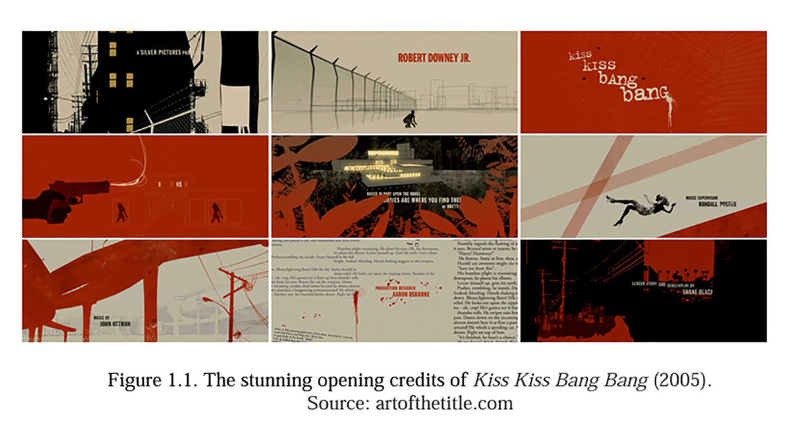
Here’s a link to a fascinating 2008 graduate thesis by Li Yu at Iowa State University: “Typography in Film Title Sequence Design.” The paper covers such topics as:
- A Historical Look at Film Title Sequences
- Typography Development
- Typography on Screen
- Methodology: Typography and Film Titles
Abstract
The present study sets off to examine the typography in film title sequence design. Particularly, two major aspects in film sequence design, the choice of typefaces and the choice of animation effects, are examined, and they are connected to the history of typography evolution, the development of computer technology, the theories in psychology, and different film genres. After drawing connections in historical reviews and theories, the present study provides tangible examples to illustrate how different designs are realized in film title sequences. With an emphasis on usages in film title sequences, a new classification system for typefaces and a classification system for animation effects are developed. Then, statistical evidence is gathered to identify certain typefaces and animation effects associated with particular film genres, adding quantitative measures in connecting the different aspects in film title sequence design. Finally, a case study is included to further explain the findings in a concrete context.


