A gloriously obsessive examination of the typography in 2001: A Space Odyssey. This post stars Albertus, City Medium, Eurostile Bold and Bold Extended, Futura, Gill Sans, Microgramma, Spartan and Univers. Please also see my post Future Font Friday 1. Now, over to Mr. Addey:
2001: A Space Odyssey – Stanley Kubrick’s 1968 sci-fi masterpiece – seems an appropriate place to start a blog about typography in sci-fi. Amongst other delights, it offers a zero-gravity toilet, emergency resuscitations, exploding bolts, and product placement aplenty. It’s also the Ur Example of Eurostile Bold Extended’s regular appearance in spacecraft user interfaces.
Right from the opening scene, we’re treated to Kubrick’s love of bold, clean, sans-serif typography:

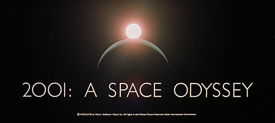
This title card is set in Gill Sans, one of the all-time classic sans-serif fonts. Perhaps surprisingly, the zeroes in ‘2001’ appear to be set with the Gill Sans capital letter O (shown below on the left), rather than its zero character (shown on the right):

The film’s opening act is set during The Dawn Of Man. The dawn of man is definitely not set in the future, as indicated by its use of Albertus for the act’s title card:
After introducing us to Albertus, the Dawn Of Man turns out to be typographically unremarkable. So, let’s skip forward a little, and join Dr. Heywood R. Floyd on his Pan Am flight to Space Station 5.
In the first of several subtle inclusions of real-world American companies, we discover that the Pan Am logo hasn’t changed much between 1968 and 2001. (We’ll gloss over the fact that Pan Am went bust in 1991.) The cabin crew have, however, adopted Velcro Grip Shoes to counter the weightlessness of space:

The Pan Am spacecraft’s flight deck gives us our first sighting of Eurostile Bold Extended, in an ominous foreshadowing of the HAL 9000 interface screens we’ll see later on. Presumably the Pan Am craft are also controlled by HAL-series computers. And why not? After all, the 9000 series has a perfect operational record.

In a subsequent close-up, we see that the craft also features the IBM logo in its pre-1972 version, set in City Medium, as designed by Paul Rand:
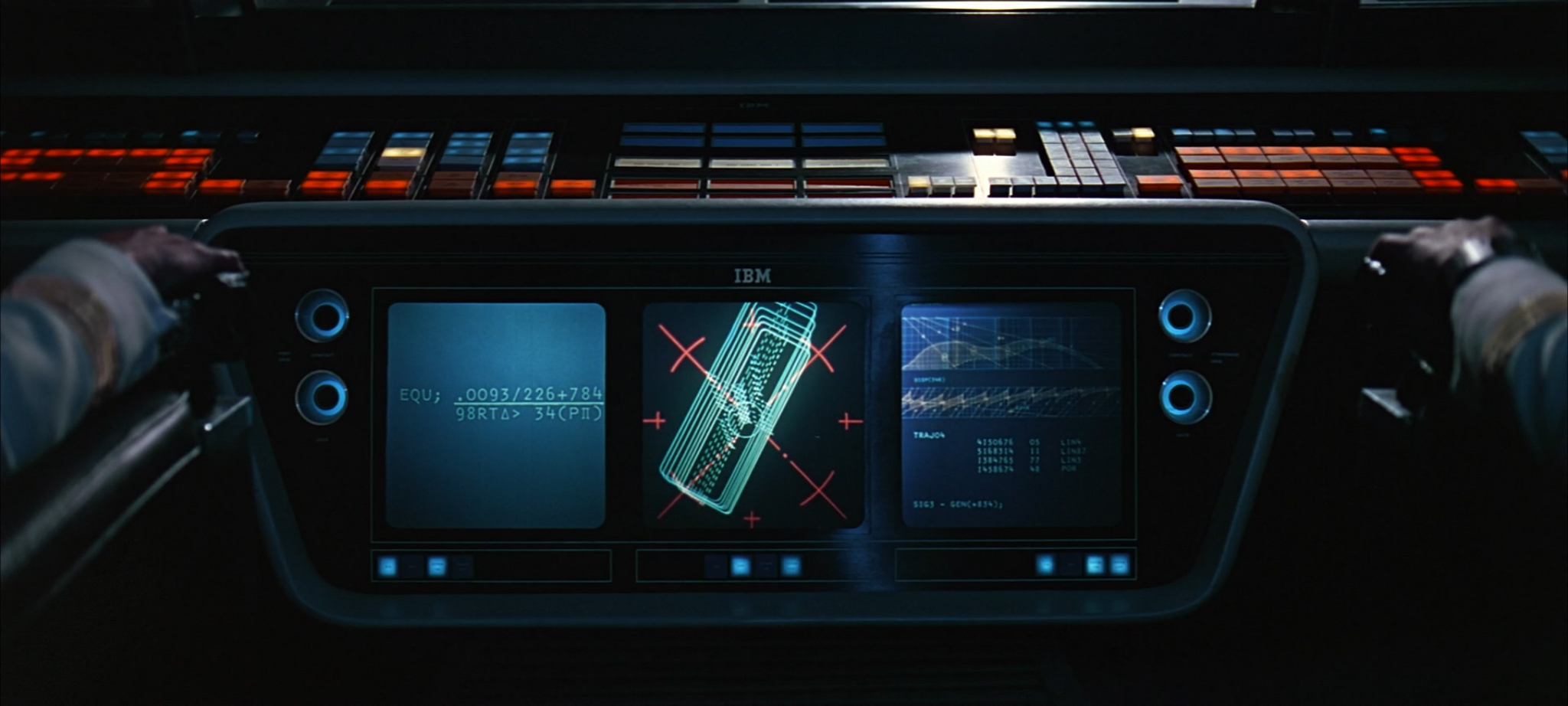
There’s no mistaking Eurostile Bold Extended on the receptionist’s language buttons when the Doctor arrives on the space station. Actually, there might be some mistaking it, because it could just as easily be Eurostile’s precursor, Microgramma. It’s nigh-impossible to tell them apart. Who knows, it could be Microgramma throughout the entire film. Let’s just call it Eurostile and get on with things.
UPDATE: In response to this article, Erik van Blokland has posted a comprehensive side-by-side comparison of Eurostile, Microgramma, and HAL interface artwork from the traveling Kubrick exhibition. His conclusion: inconclusive.
The Hilton chain of hotels has opened an outpost on Space Station 5. This logo doesn’t match any I can find from their history, but it is very reminiscent of the iconic signage for the Beverly Hilton in Los Angeles:

Just like Pan Am, the Howard Johnson’s chain of restaurants doesn’t seem to have changed its logo since the sixties. This is ironic, given that it updated its classic logo in 1998, a year or so before this scene takes place:
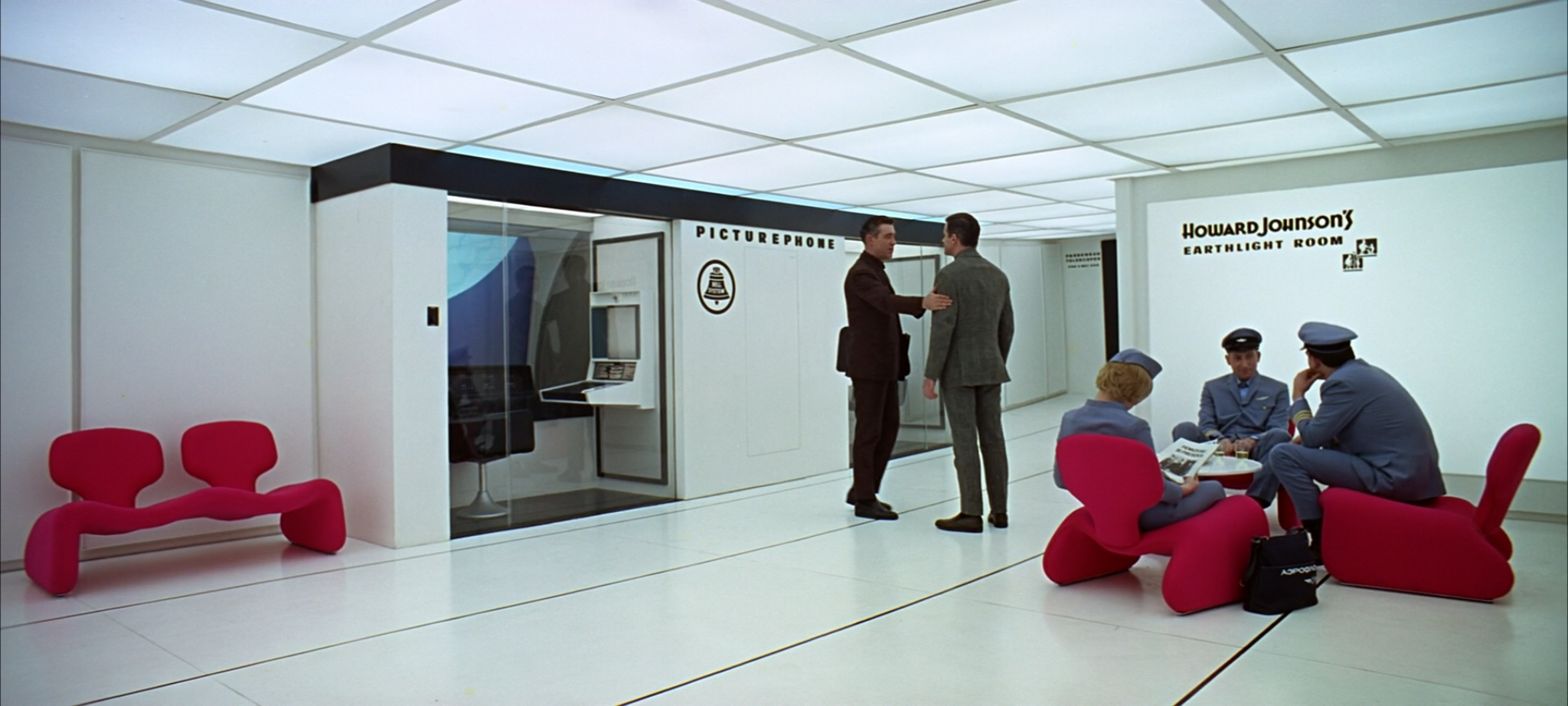
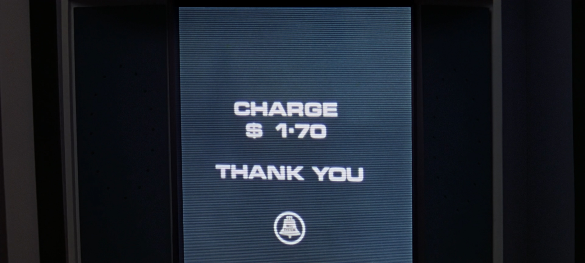
Dr. Floyd’s video call to his daughter sees another use of Eurostile Bold Extended. There’s also another real-world company logo, this time for the American Bell Telephone Company. (Their logo was redesigned by Saul Bass the year after 2001 was released.)
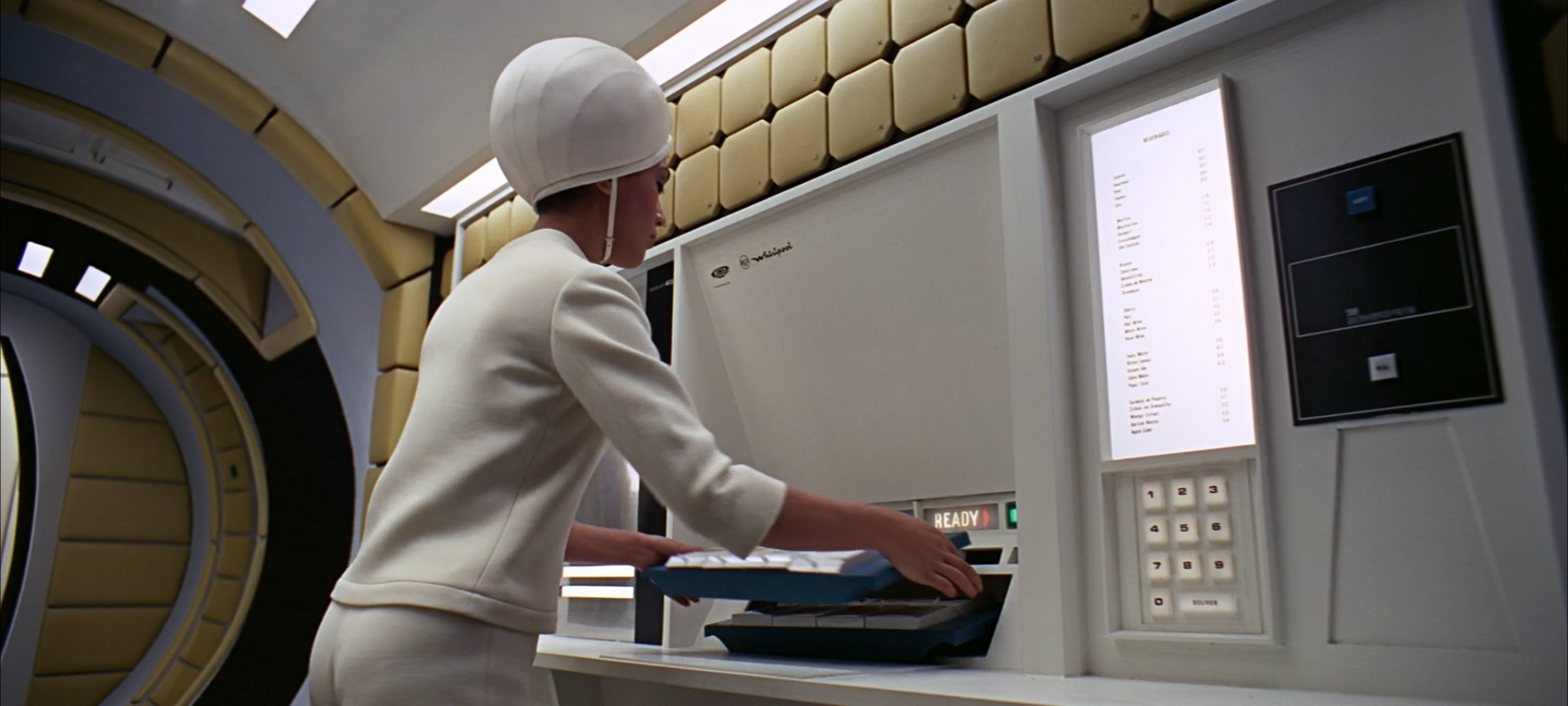
Eagle-eyed viewers may spot a logo for RCA Whirlpool (now the Whirlpool Corporation) during Dr. Floyd’s subsequent flight to the Clavius moon base. This logo (and the name RCA Whirlpool) was dropped in 1966, suggesting that this scene may have been filmed earlier in the movie’s production:
The Clavius flight also features Eurostile Bold (not Extended) in the instructions for the ship’s comedy Zero Gravity Toilet. It’s probably very sensible that Passengers Are Advised To Read Instructions Before Use.

Let’s take a brief aside to find out how a Zero Gravity Toilet works. These instructions have been transcribed as best as possible from a HD source.
1. This toilet is of the standard zero-gravity type. Depending on requirements, system A and/or system B can be used, details of which are clearly marked in the toilet compartment. When operating system A, depress lever and a plastic dalkron eliminator will be dispensed through the slot immediately underneath. When you have fastened the adhesive lip, attach connection marked by the large “X” outlet hose. Twist the silver coloured ring one inch below the connection point until you feel it lock.
2. The toilet is now ready for use. The Sonovac cleanser is activated by the small switch on the lip. When securing, twist the ring back to its initial-condition, so that the two orange lines meet. Disconnect. Place the dalkron eliminator in the vacuum receptacle to the rear. Activate by pressing the blue button.
3. The controls for system B are located on the opposite wall. The red release switch places the uroliminator into position; it can be adjusted manually up or down by pressing the blue manual release button. The opening is self-adjusting. To secure after use, press the green button which simultaneously activates the evaporator and returns the uroliminator to its storage position.
4. You may leave the lavatory if the green exit light is on over the door. If the red light is illuminated, one of the lavatory facilities is not properly secured. Press the “Stewardess” call button to the right of the door. She will secure all facilities from her control panel outside. When green exit light goes on you may open the door and leave. Please close door behind you.
I don’t know why Pan Am’s toilet instructions spell ‘coloured’ with a u – or, indeed, why they call it a ‘toilet’, rather than the more typical American name of ‘bathroom’. I also dread to think what a plastic dalkron is, and I’m still not entirely clear when one might prefer systems A or B. But that’s probably for the best.
Let’s move on. Following a brief speech in a moon base, three American chaps take a spacecraft to visit a suspicious-looking monolith. What could possibly go wrong? Either way, their map makes good use of a mix of Eurostile Bold Extended, Futura Medium and something that looks like it’s probably a condensed form of Univers:

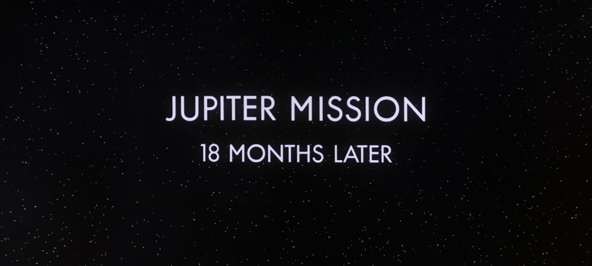
Things do, in fact, go wrong. General badness happens. Next thing we know, we’re looking at a title card for Part 3: Jupiter Mission. This title card is set in the other classic sans-serif font – Futura – but with a few idiosyncrasies. The points of the capital N characters have been softened, and the capital M appears to be borrowed from Gill Sans:
Only two of the Jupiter Mission crew of USS Discovery are awake, with the rest still in hibernation. The two crew members spend some time watching a BBC TV show on their eerily-prescient tablet devices. The channel is BBC 12, which is eight TV channels higher than the present-day BBC transmits. The corporate logo correctly uses its 1960s form of Univers in italicized outline boxes. (It was changed in 1997 to use its modern-day Gill Sans layout.)

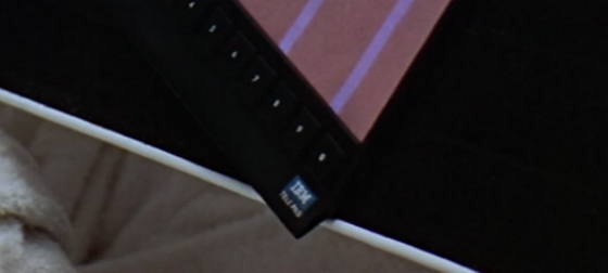
The tablet is made by IBM, like much of the spacecraft’s hardware. It’s hard to be sure, but I think the tablet is called an IBM Tele Pro (although it could be Tele Pad, but I think that’s modern-day device naming trends influencing my eyesight):
Either way, BBC TV is clearly portrait-only in the future. (The device’s numeric buttons along the bottom portrait edge don’t make it look like it’s meant to be used in both orientations.)
The mission’s hibernation devices use Futura for their numeric and medical buttons, and Univers for their Emergency Revival Procedures:

There’s an unfortunate typo on the very first button, which refers to hypothalamus stimulation as ‘hyperthalamus stimulation’. (The spelling of this word changes throughout the instructions below.)
If you need to revive someone in an emergency, you’ll want to make sure you have several hours available. Again, my best attempt at a transcription from HD source:
1. Set level button for hyperthalamus activation in accordance with subject’s AQX chart.
2. Activate electric stimulation of the hypothalamus for 12 minutes.
3. Set blood sugar enrichment level in accordance with subject’s AQX chart (if secondary level indicated, activate primary level (step 4 below) and hold for 75 minutes, then change to secondary level for 40 minutes).
4. Activate blood sugar enrichment for 110 minutes.
[…]spiratory levels in accordance […]
7. Activate temperature B button to increase respiratory rate.
8. Activate thyroxin control at level 4 for 30 seconds, at level 6 for 30 seconds, and at level 9 for 10 seconds to reestablish normal endocrine activity.
9. When subject shivers vigorously awakening is about to take place. Disengage brain monitor, suppressant connector and [thermolator band?].
10. Immediately upon awakening activate vibrator for 2 minutes.
11. Subject may now arise and undergo normal post-hibernation rousing.
By my reckoning, that’s a minimum of four hours and ten seconds to revive someone in an emergency. Let’s hope nothing goes wrong for the crew members who are still in the hibernation pods, eh? (I do like 2001‘s use of in-craft typography to foreshadow events later in the film.)
On that theme: I’m not sure about the typeface used for the hibernating crew members’ vital statistics, although it feels like it may be a slightly extended variant of Univers:

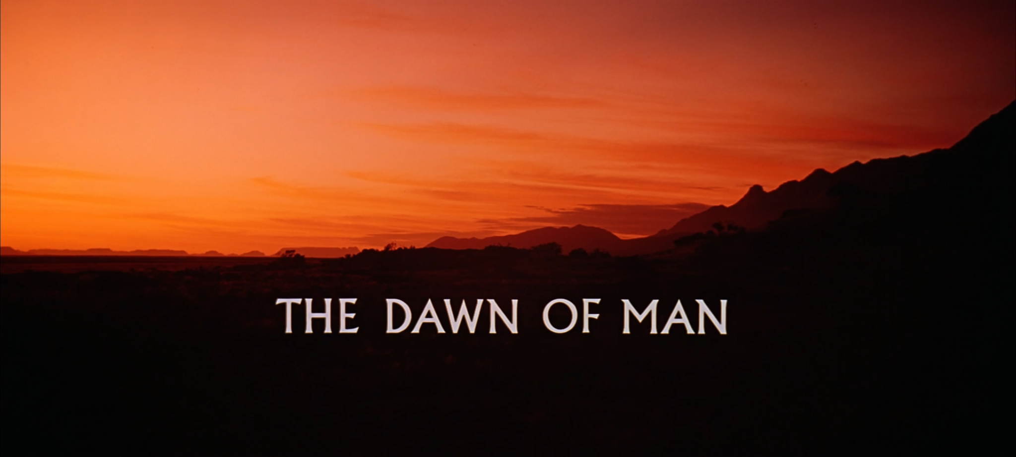
However, I do know that this section of the movie contains some absolutely Eurostile-tastic HAL 9000 screens:

We also get a glimpse of HAL 9000’s own logotype, which could be a manually compressed and outlined variant of Univers, but honestly, it’s hard to tell:
![]()
During the first EVA, we see that Dr. Bowman’s space suit features yet more IBM equipment:

We also get a close-up of HAL’s telemetric displays, in a beautiful data font that appears in many of HAL’s interface displays (and which I’ve sadly not been able to identify):

You can see this telemetry in action on your own computer in the beautifully-crafted HAL 9000 interface screensaver, which is available from the HAL Project web site.
UPDATE: Heather, in the comments to this post, has correctly identified this font as Manifold from the DSG IBM Selectric Type Element Catalog. Thank you Heather – a fantastic spot!
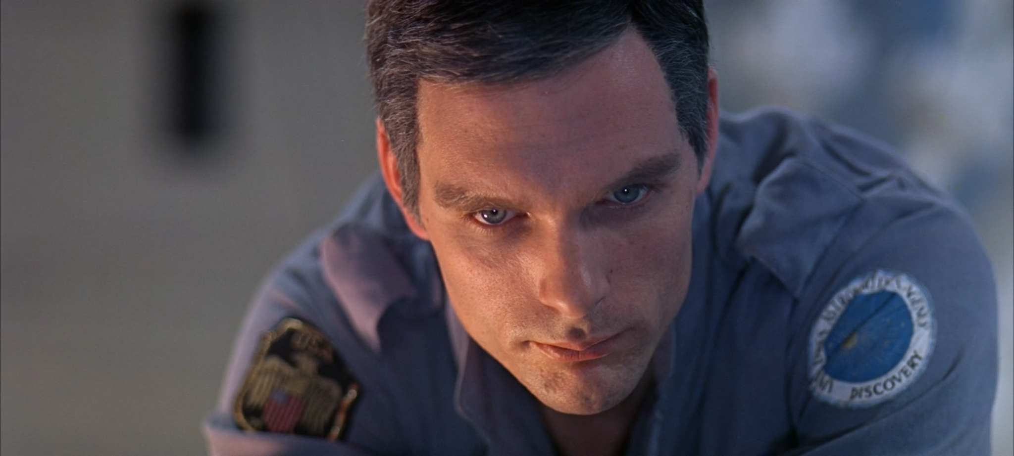
After Dave returns from his EVA, we get a brief and blurry glimpse of the USS Discovery mission patch on his shoulder:
This warrants a brief mention of the timing of 2001‘s release. It’s easy to forget that 2001 actually hit cinemas in 1968, the year before Apollo 11 first put a man on the moon. The movie’s use of spacesuit and spacecraft typography is particularly interesting in light of the mission patches of the Apollo missions building up to Apollo 11’s historic landing. Here are the patches for Apollo 7, Apollo 9 and Apollo 10:

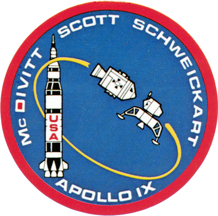

Does the typography remind you of anything?
Apollo 11 took a slightly different typographic tack, opting for Futura instead of Eurostile, but I don’t think Kubrick would have complained:

Much of the Apollo mission documentation and material also makes extensive use of Futura. The USS Discovery is certainly in good company.
UPDATE: Stephen Coles from Fonts In Use notes that the Apollo 11 mission patch is actually set in Spartan, an American knock-off of Futura. You can tell the difference from the flat (rather than angled) terminal on the 1.
Futura is also used to good effect to warn the Discovery crew about the pod’s Explosive Bolts:
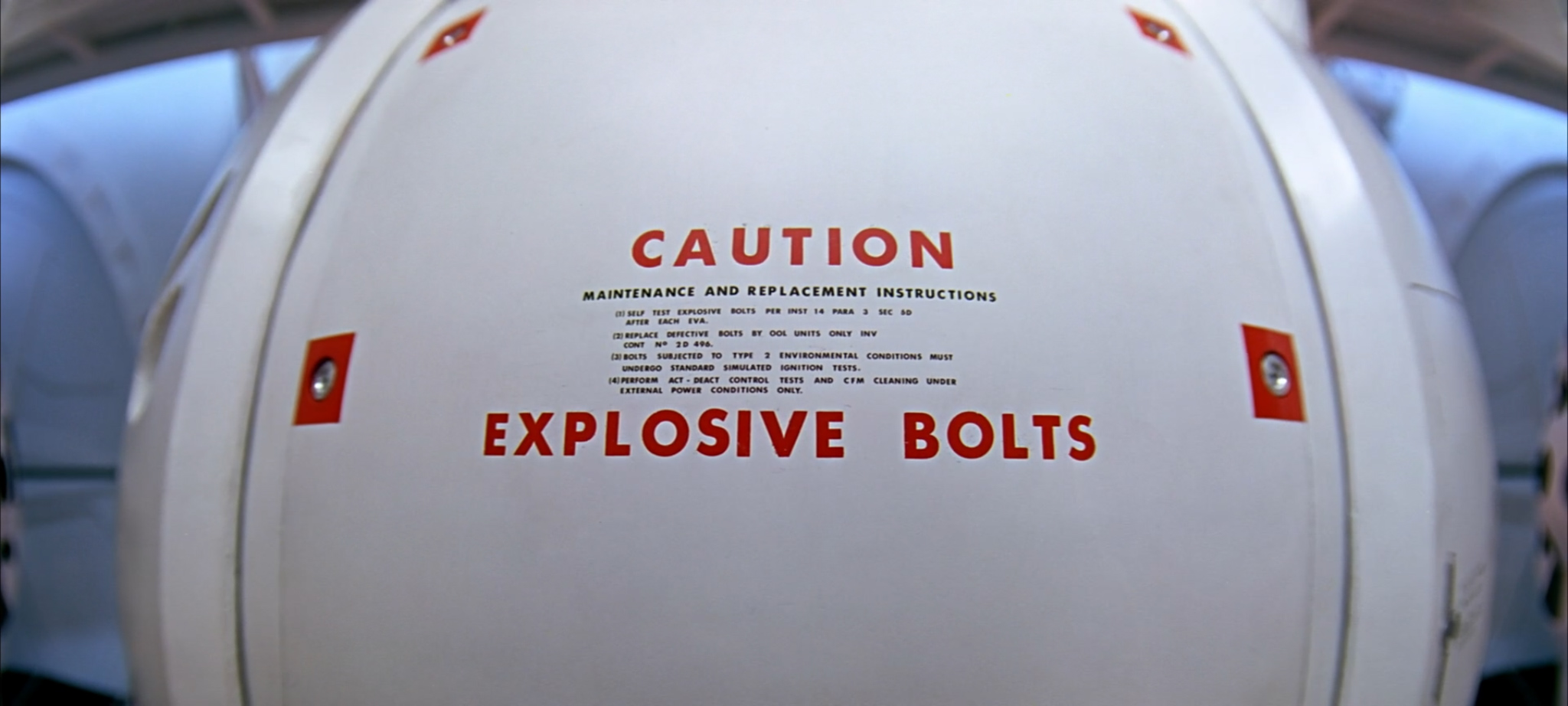
Again, a lovely bit of foreshadowing that still ties in neatly with the overall aesthetic of the craft. (Chekhov’s Typography, if you will.)
Futura also features on the pod communications switches used to cut HAL off from the worried crew’s conversation:

Good lord, is that the time? We should have an intermission!

This time, the title card is Gill Sans all the way. Go and make yourself a cup of tea while the scary music plays.
And we’re back. Frank heads out on another EVA to pop the comms dish gadget back in the comms dish gadget slot. Unfortunately, his pod turns evil and cuts his air supply. Frank spirals away into space. Dave follows him in a pod, attempting in vain to retrieve his body before it’s too late. While he’s doing so, there’s a dramatic…

…in the hibernation pods, which causes the life support machines of the hibernating science crew to start reporting…
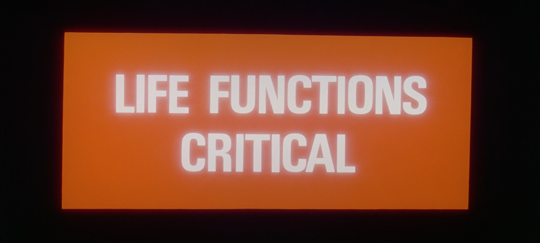
…and end up with their…

…which isn’t what they wanted AT ALL.
Still: if it is going to happen, it may as well happen in what is probably Univers 67 Bold Condensed.
Now: if Dave wasn’t out in the pod trying to catch Frank, he’d’ve been able to instigate the four hours and ten seconds of Emergency Revival Procedures. Remember those? Ah well, never mind.
Worse is yet to come. Dave is locked out of the Discovery by HAL. There’s only one thing for it: open the emergency air lock, and fire the Explosive Bolts. Remember those?

Having just about made it back in, Dave triggers the Emergency Hatch Close (which is just next to the Emergency Umbilical Connect):
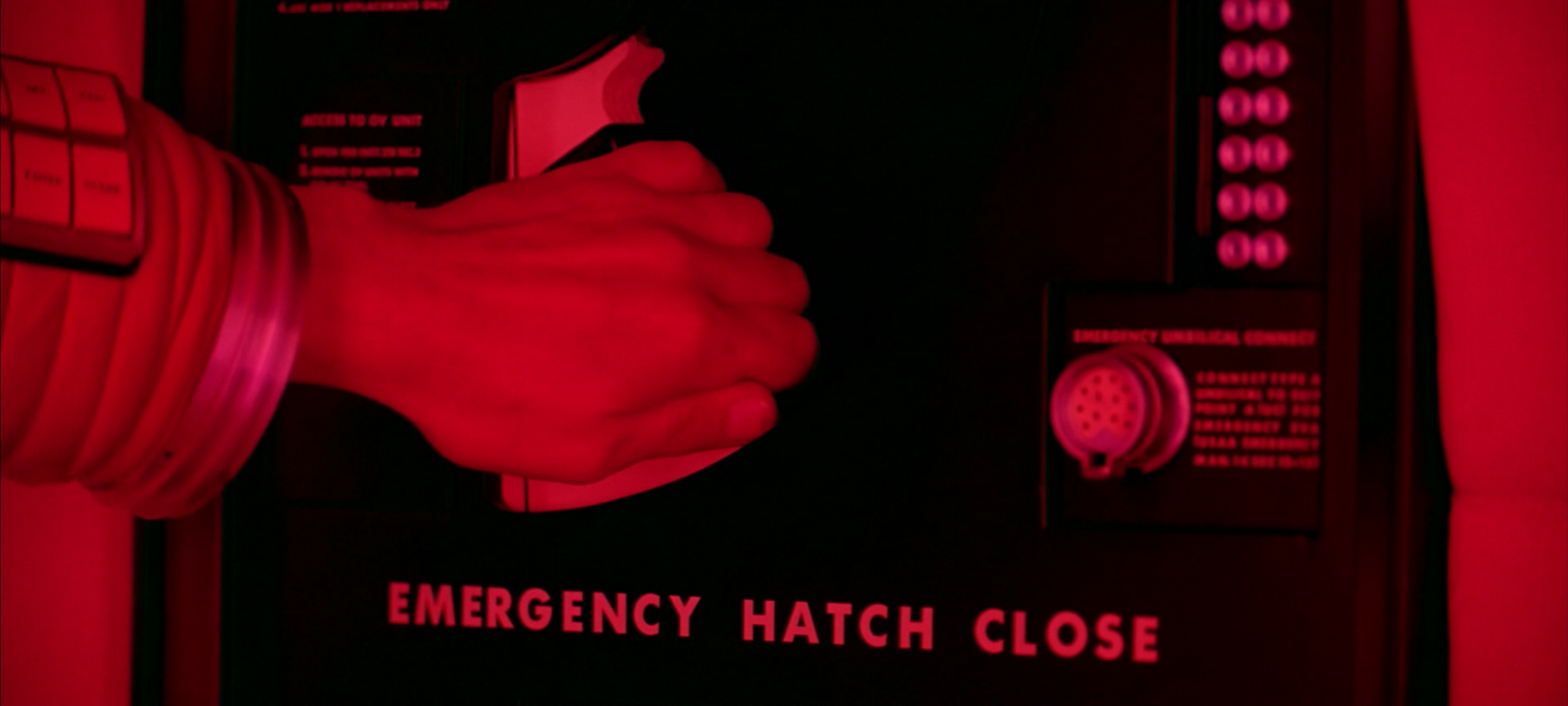
There sure are a lot of things labeled ‘EMERGENCY’ in Futura on this spacecraft. Perhaps the most notable example of all is the HAL 9000 Logic Memory Center:


Dave removes HAL 9000’s memory. HAL sings a song. The typography might be Univers 67 Bold Condensed again, but I’m not convinced by those numbers:

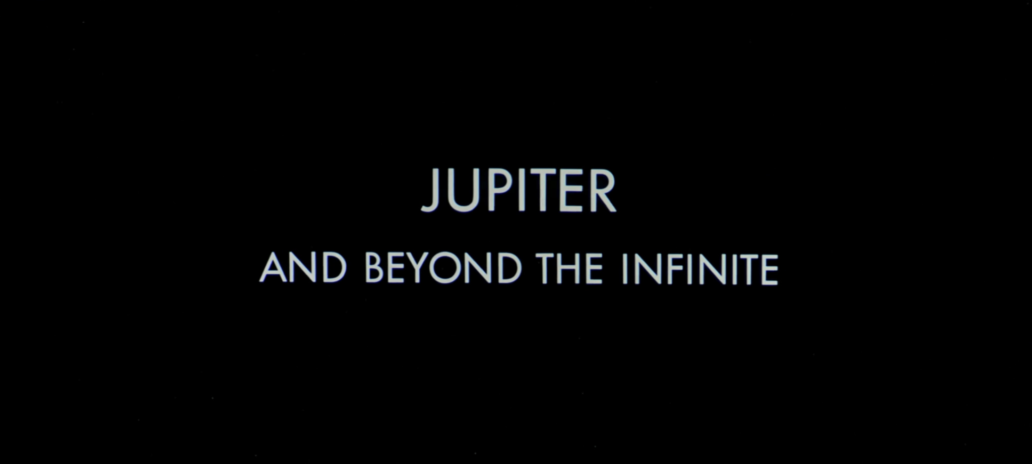
And, as soon as you can say ‘National Council of Astronautics’, we’re in to Part 4: Jupiter And Beyond The Infinite.
Less-pointy Ns notwithstanding, this title card is Futura all the way:
This final part of the film is visually eclectic, aurally stunning and philosophically challenging. Many thousands of words have been penned over the decades to try and fathom the meaning of the monolith, and the genesis and future of the space-baby. However, none of this act contains typography, and it is therefore of no concern to us. Let’s skip to the end credits.

It’s Futura again, with an M borrowed from Gill Sans, and a W that I don’t recognize from anywhere.
Goodnight!


